Google Contacts update brings a more modern scroll bar and a tweak to the main list

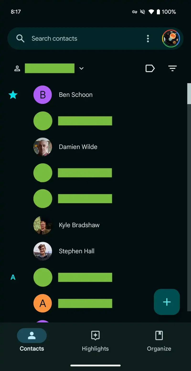
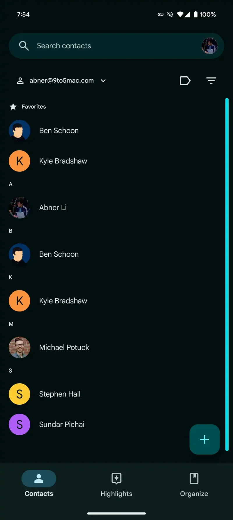
Google Contact is now getting a new scroll bar that is no longer a blocky scroll bar. The previous scroll bar wasn't really matching the modern Material You look that the Google Contacts app otherwise sports. Now, a new tweak to the looks of the app addresses the issue with its scroll bar.
The scroll bar in the Contacts tab that previously appeared when you navigated through the list was rectangular and relatively wide. Its width depended on the page length and it had a persistent track as you moved through the page.
Google Contacts now has a pill-shaped scroll bar that supports the Dynamic Color theming to match the rest of your phone's look. It also doesn't have a track container. Different from the Phone app, the scroll bar goes all the way down instead of ending just above the floating action button.
But that's not all Google Contacts is changing now. The first letter column has been removed and is now integrated into the main list. You might be using the scroll bar a bit more thanks to this little tweak.
The overflow menu has also been removed from the search bar. Now, you can long-press on a contact to select it, while the option to select all of them can be accessed after that.
Right now, it seems this more modern-looking scroll bar and the tweak to the main list are rolling out as a server-side update with version 4.42 of Google Contacts. If you're not seeing the change yet, you most likely just need to wait for it to arrive on your phone soon.
This may be a small design element, but the devil's in the detail, don't you think? I like the direction that Google is going to further refine the look of its apps and unify the overall experience across Android.
The scroll bar dated to older versions of Android, and as you'd imagine, it looked quite out of place. Especially with the Contact list in the Phone app featuring a thinner, more modern-looking scroll bar.
Google Contacts now has a pill-shaped scroll bar that supports the Dynamic Color theming to match the rest of your phone's look. It also doesn't have a track container. Different from the Phone app, the scroll bar goes all the way down instead of ending just above the floating action button.
But that's not all Google Contacts is changing now. The first letter column has been removed and is now integrated into the main list. You might be using the scroll bar a bit more thanks to this little tweak.
Right now, it seems this more modern-looking scroll bar and the tweak to the main list are rolling out as a server-side update with version 4.42 of Google Contacts. If you're not seeing the change yet, you most likely just need to wait for it to arrive on your phone soon.
This may be a small design element, but the devil's in the detail, don't you think? I like the direction that Google is going to further refine the look of its apps and unify the overall experience across Android.
Follow us on Google News





Things that are NOT allowed:
To help keep our community safe and free from spam, we apply temporary limits to newly created accounts: