Google tests cool new feature for the Play Store
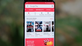
In its never ending battle to improve the Google Play Store, Google is testing a method to allow users to make comparisons between two or more apps. As AndroidPolice mentioned, this comes after Hamburgers were removed from the Play Store menu earlier this month. No, Google wasn't competing with Mickey D's. The Hamburger menu was an icon consisting of three straight horizontal lines that looked like a Hamburger from the side (top bun, meat, and bottom bun) and when tapped, a menu list appeared.
The Compare apps section appears near the bottom of a Play Store listing and at the moment it seems to be limited to a few side-by-side comparisons of media players under the heading of Compare apps. The apps are compared based on things like offline playback, visual quality, ease of use, controls, and whether or not a particular app will cast content. A major assumption is that Google is gathering the information it uses for comparisons directly from feedback from users who are prone to leave reviews.
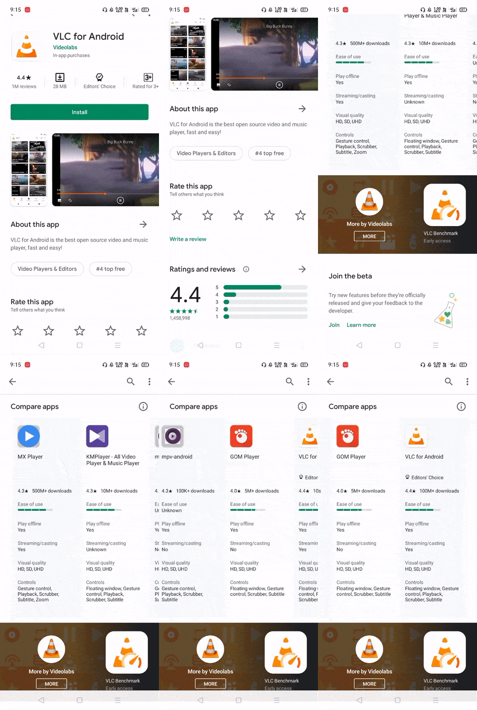
Remember that this is just a test right now and it has appeared in the Play Store when some users are running version 22.4.28 of the app. Being able to compare key elements of two or more similar apps listed in the Google Play Store is sure to improve the experience of using Google's Android app storefront.





Things that are NOT allowed: