Google introduces new camera improvements for the Pixel 6 and Pixel 7 series
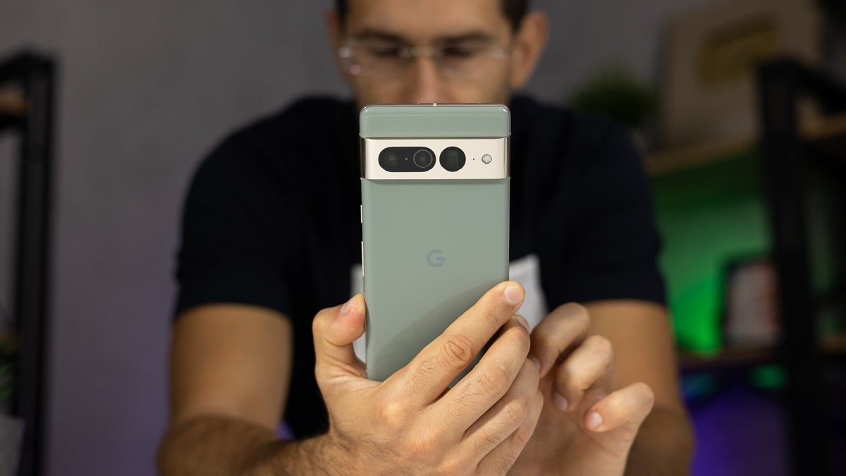
Tech enthusiasts tend to feel very protective about their preferred system, especially when it comes to the long-time rivals that are Samsung and Apple. There are some things, though, that we phone fanatics tend to unanimously agree upon, and one of them is the expertise Google has shown with the camera performance its Pixel phones deliver.
Recently, the Google Camera app got updated to version 8.8, bringing some much appreciated updates to the Pixel 6 and 6 Pro, as well as the current flagships — Pixel 7 and Pixel 7 Pro.
Check out:
Pixel 6 series gets improved Night Sight controls
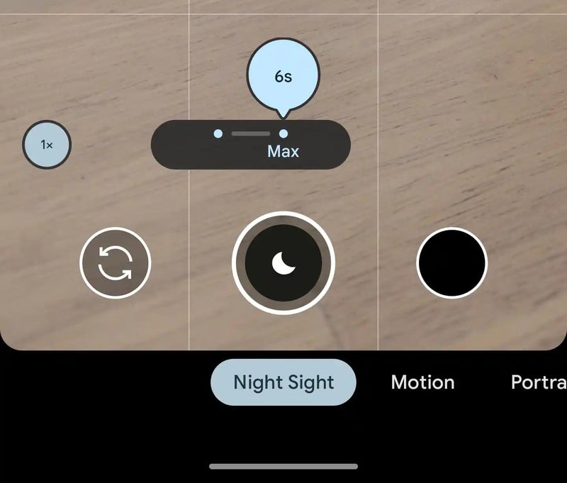
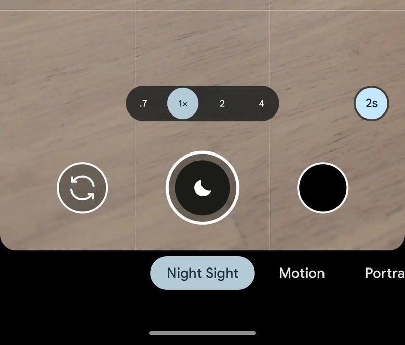
As we learned very recently, Google might be working on improving the Pixel 8 Pro's Night Mode by blending photos. Besides revealing this potential upgrade that could come in the future, the new version also made it possible for Pixel 6 and 6 Pro owners to choose how long it takes for the camera to take a photo while shooting in Night Sight mode. (via 9to5Google)
With the update, you will now see a small circle at the bottom right displaying how many seconds it would take to snap a shot. This way you can reduce the time for a lower chance of any blurriness in the image, or increase it up to 6 seconds to capture more light and make it brighter.
A slight quality of life improvement for the Pixel 7 series
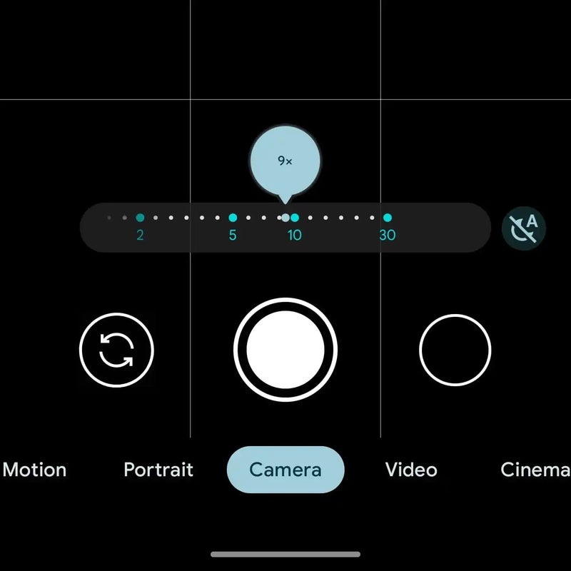
When Google introduced the Pixel 7 and 7 Pro one of the more notable improvements were related to the camera, and more precisely the improvements in the zoom range and quality. With this focus on telephotography, the Google Camera app had a new UI where the exact zoom range was more easy to read compared to before. In contrast, the Pixel 6 and 6 Pro have a simple line with a sliding circle showing the current zoom range.
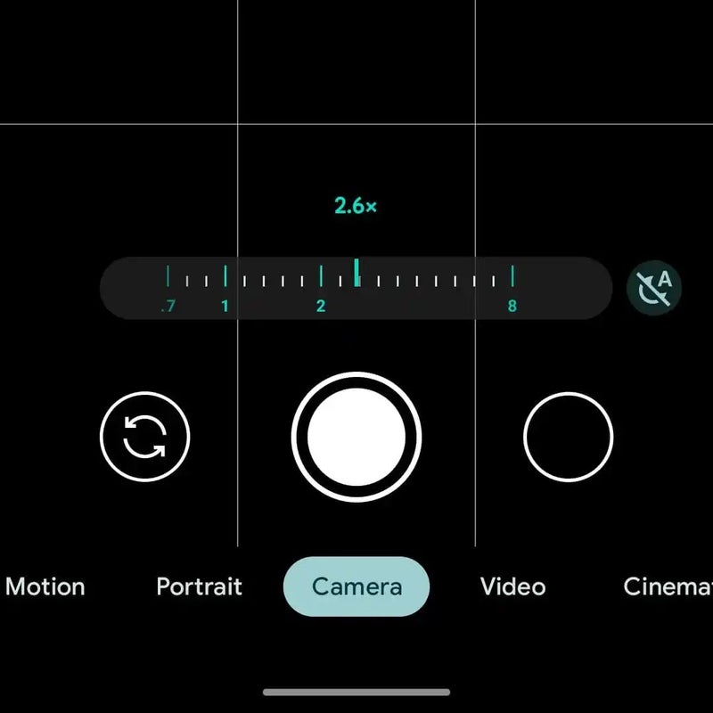
Still, things were not exactly perfect, as the new UI had very disproportionate elements, such as the absurdly small text in the circle displaying your current zoom level. Google has now tweaked this part of its camera app to resemble more what you would see on an actual camera lens.
The circle is now gone and the number representing your current zoom level hovers above the line. The dots that represented each increment have now become lines, with larger ones taking up specific zoom levels. Of course, the highlighting colors in the app still correspond to your phone's wallpaper thanks to Google's Material You design language. (via 9to5Google)
Follow us on Google News




Things that are NOT allowed:
To help keep our community safe and free from spam, we apply temporary limits to newly created accounts: