The Google app on Android is testing a few different browser bottom bar layouts

Google has been experimenting with several updates to its mobile app, including new icons and shortcuts. The latest discovery involves changes to the built-in browser within the Google app. An APK teardown has revealed a few new bottom bars for the in-app browser, which currently doesn't have one.
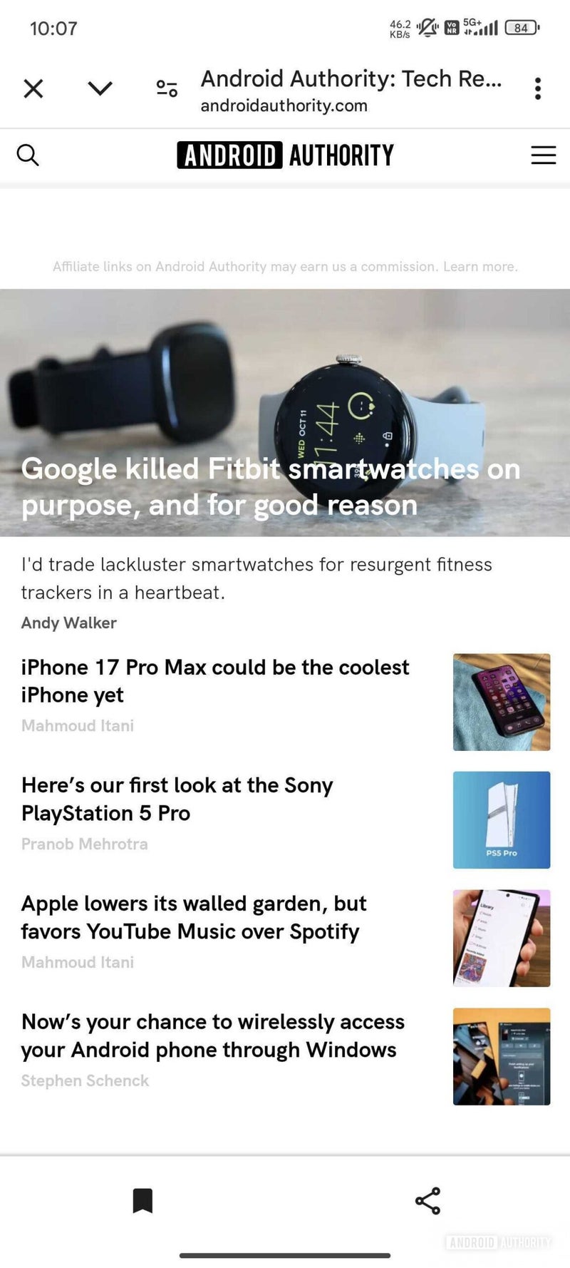
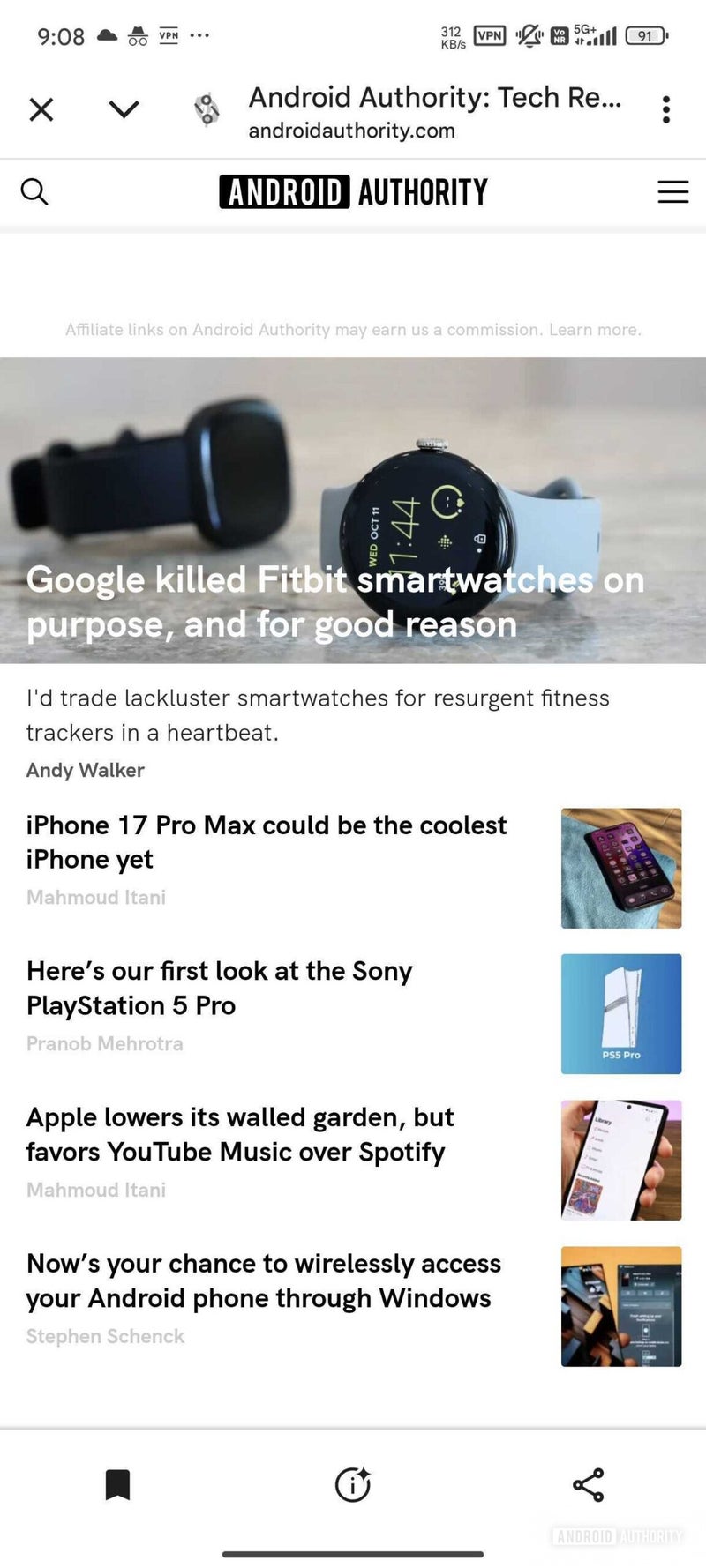
Three variations of the new bottom bar have been spotted, suggesting Google is still fine-tuning the design. The first layout features icons for adding a website to favorites and sharing. The second layout adds a third icon in the middle for "insights," possibly providing additional information about the webpage. The third layout simply rearranges the same three icons.
Three new possible bottom bar layouts for the Google app's in-app browser | Image credit — Android Authority
While not yet available to users, the new bottom bar could bring numerous advantages to Google's in-app browser. It adds functionality directly to the browsing experience, making tasks like saving or sharing websites easier. It also creates consistency between the app's interface and the in-app browser. Google has been experimenting with the search button in the main app's bottom bar, and this change could align the two.
In addition to the three bottom bar layouts mentioned above, a "double-decker" layout that includes a search bar has been spotted. This suggests Google is actively exploring different ways to enhance the in-app browser experience.
There is another flag related to the bottom bar of Chrome custom tabs on Android that allows you to enable different layouts, one of them is a "double decker":https://t.co/gqlOekzHKW pic.twitter.com/AgbqGvYDdH
— Leopeva64 (@Leopeva64) July 27, 2024
Google's ongoing experimentation with its mobile app's browser shows the company is looking for a way to improve the user experience. Currently, there's an additional change already rolling out that redesigns the app's home page with an icon-based carousel UI, where the additional input options formerly appeared as text.
While the new bottom bar isn't publicly available yet, it points to Google's efforts to add more features and make browsing within the app more convenient. It will be interesting to see which layouts, if any, make it to the final release.
Follow us on Google News





Things that are NOT allowed:
To help keep our community safe and free from spam, we apply temporary limits to newly created accounts: