Google app for Android gets cleaner look with carousel redesign
Google is giving its Android app a little facelift, and it's all about making things tidier and easier on the eyes. The focus of this update is the carousel, that handy little row of shortcuts that sits right under the search bar.
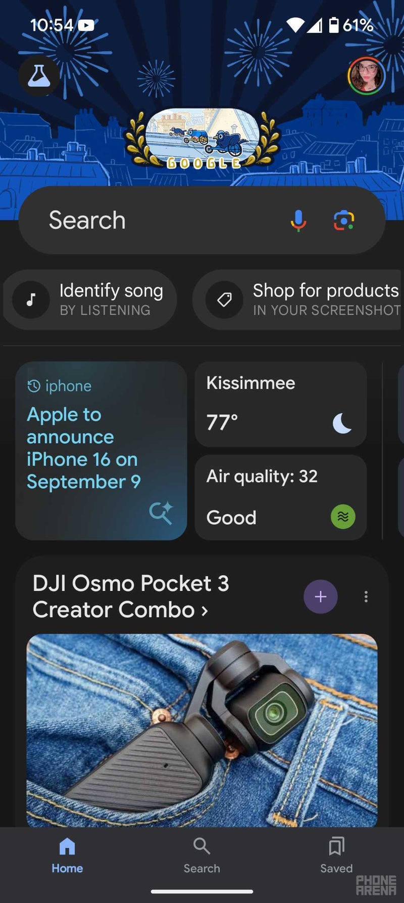
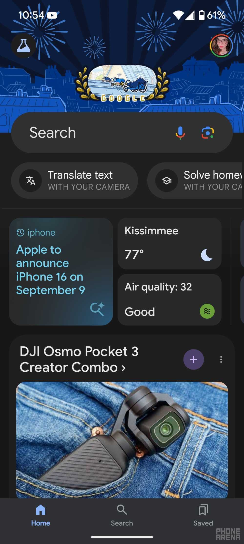
Previously, this carousel was a bit of a mess. It crammed in five shortcuts, each with its own icon, a full name, and even a short description. It was a lot to take in, and the mix of upper and lowercase text didn't help matters. To make things worse, the carousel often split into two rows, making the app feel cluttered and cramped.
Now, Google is taking a page from its iOS playbook and streamlining things. The new carousel features just four shortcuts, represented by simple, colorful icons. No more text, just clear visuals that get the point across. You'll recognize most of these shortcuts as ways to access different features of Google Lens, while the last one is a handy Sound Search tool.


One of the best things about this change is that you can now see all four shortcuts at once. No more scrolling back and forth unless you've recently taken a screenshot that you want to analyze. This not only makes the app look less cluttered, but also gives more prominence to the "Your Space" cards below, which offer quick access to personalized information.
This cleaner carousel design has been a part of the Google Search app on iOS for a while now, and it's finally making its way to Android. If you're eager to try it out, you can find it in the latest beta version of the Google app (version 15.34). Just keep in mind that it hasn't rolled out to the stable version yet, so it might be a little rough around the edges.
While this update might seem small, it's a welcome change for Android users who have been craving a more polished and user-friendly Google app experience. It shows that Google is paying attention to the little details and is committed to making its apps look and feel as good as they possibly can.
It will be interesting to see how users respond to this new design and whether Google decides to bring similar changes to other parts of the app. For now, Android users can enjoy a slightly cleaner and more streamlined Google app, making their search and discovery journeys just a little bit smoother.
Previously, this carousel was a bit of a mess. It crammed in five shortcuts, each with its own icon, a full name, and even a short description. It was a lot to take in, and the mix of upper and lowercase text didn't help matters. To make things worse, the carousel often split into two rows, making the app feel cluttered and cramped.
Now, Google is taking a page from its iOS playbook and streamlining things. The new carousel features just four shortcuts, represented by simple, colorful icons. No more text, just clear visuals that get the point across. You'll recognize most of these shortcuts as ways to access different features of Google Lens, while the last one is a handy Sound Search tool.
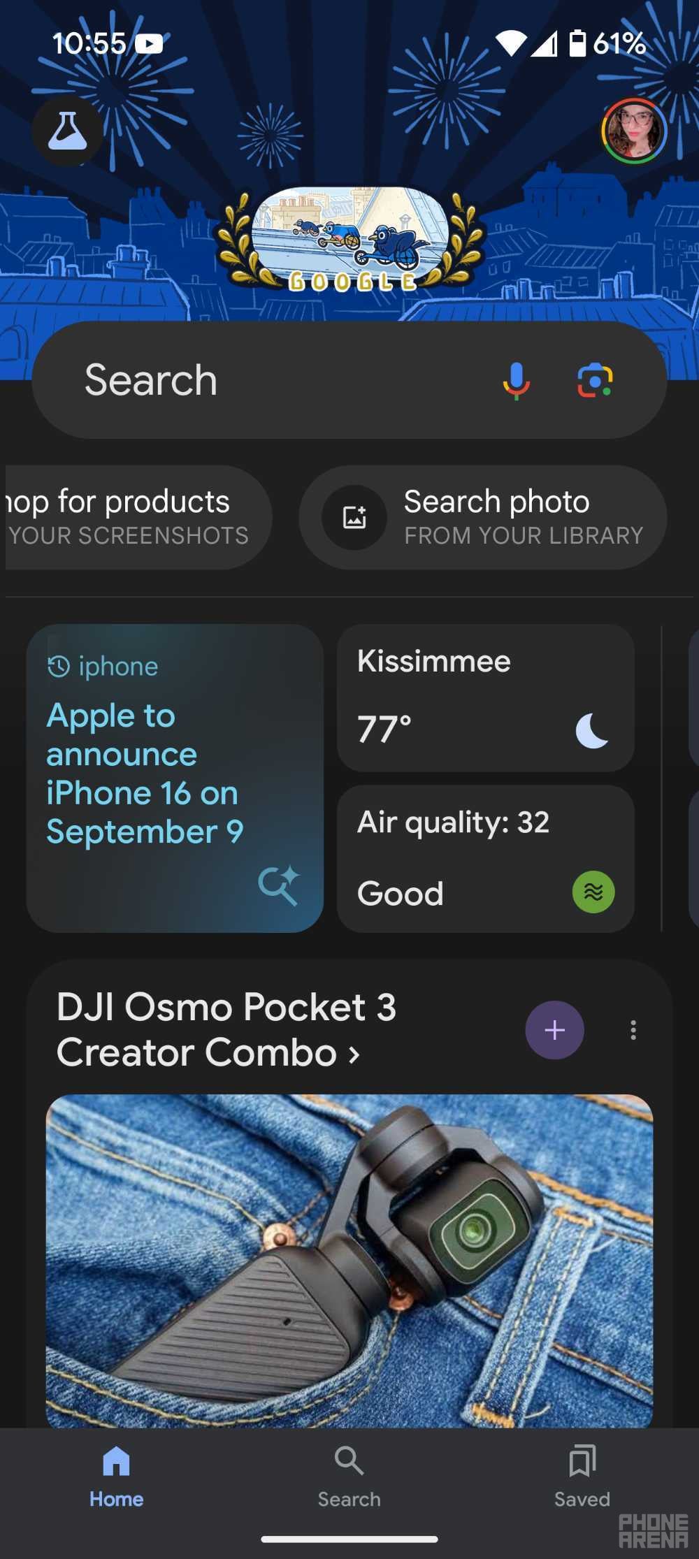

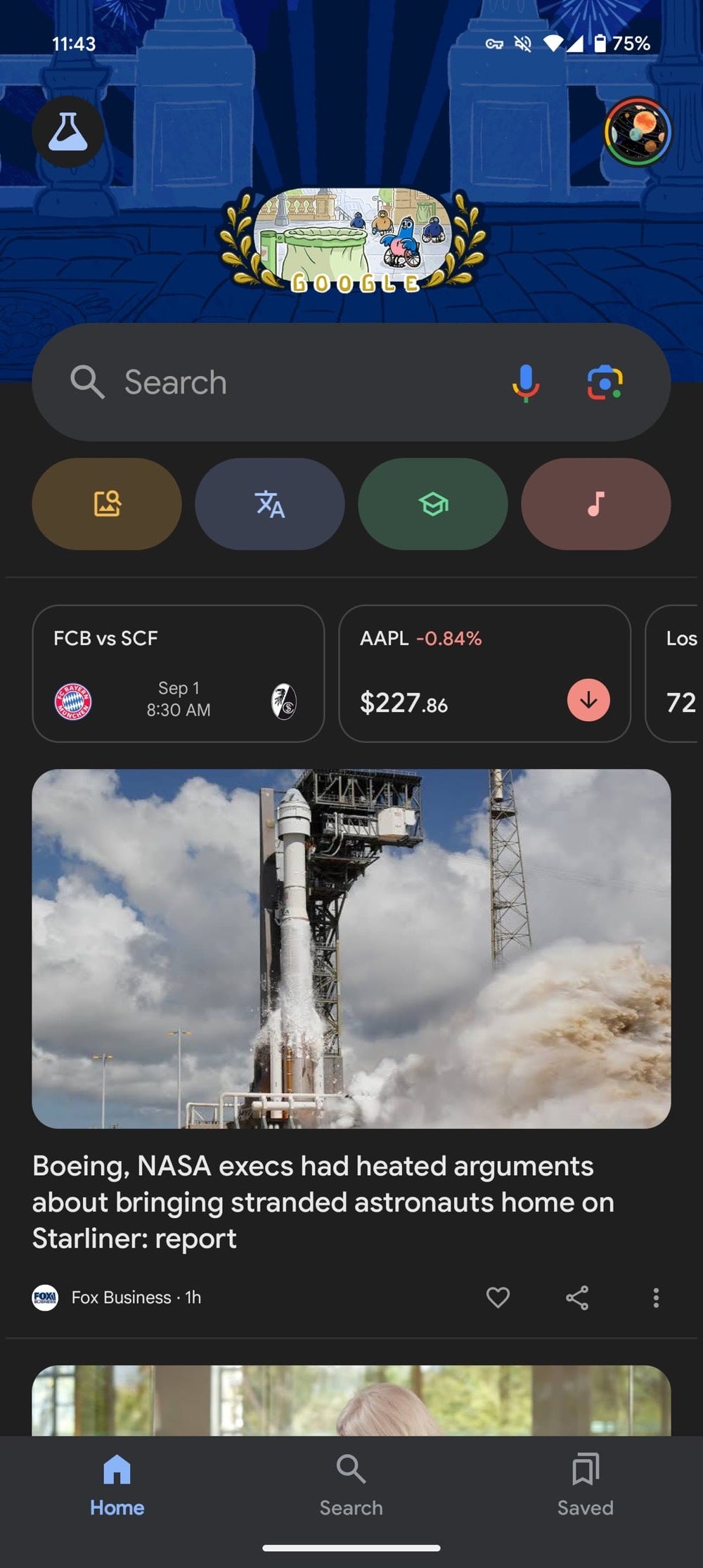
(Left) Google app shortcuts before the redesign versus the new carousel redesign (right) | Right image credit — 9to5Google
This cleaner carousel design has been a part of the Google Search app on iOS for a while now, and it's finally making its way to Android. If you're eager to try it out, you can find it in the latest beta version of the Google app (version 15.34). Just keep in mind that it hasn't rolled out to the stable version yet, so it might be a little rough around the edges.
While this update might seem small, it's a welcome change for Android users who have been craving a more polished and user-friendly Google app experience. It shows that Google is paying attention to the little details and is committed to making its apps look and feel as good as they possibly can.
It will be interesting to see how users respond to this new design and whether Google decides to bring similar changes to other parts of the app. For now, Android users can enjoy a slightly cleaner and more streamlined Google app, making their search and discovery journeys just a little bit smoother.

Popular stories

Latest News

Things that are NOT allowed:
To help keep our community safe and free from spam, we apply temporary limits to newly created accounts: