Google previews Android 12's new color-coordinated 'Monet' interface, and it's Pixel magic
We may earn a commission if you make a purchase from the links on this page.
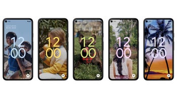
Android 12 Beta 2 that just came out gives you the ability to check one of the biggest visual interface changes since, well, the Lollipop guild. Google's new colored UI dubbed "Monet" is pretty awesome and you can preview it right now with the second beta edition. Lo and behold, it works as advertised even in this early beta form.
To make it increasingly your teapot, Google paints throughout the interface - we are talking lock/home screens, buttons, settings, notifications and others - in the color palette you have chosen for a wallpaper.
Yep, if your background image has yellow accents, Android 12 Beta 2 will pick up on those; if they are green, there will be green hues all over the interface to suit your wallpaper style as if an automatic theme has been applied. You can actually play around with it right now if you get a Google Pixel running the Android 12 Beta 2.
The best part is that Monet works as advertised without breaking a sweat, coloring all interface elements (save for the darkish Quick Settings background) in hues picked around your own choosing.
Google has even chosen Monet as the first of the top three Android 12 features, and you can preview the way it works in its fresh developer video below, dreaming about the time you'll be able to get it on your phone for real.








Things that are NOT allowed: