Galaxy S24 Ultra could feature a new bottom speaker design
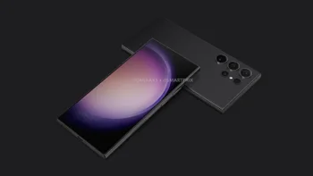
The Samsung Galaxy S24 series, Sammy's next flagship line, should be unveiled as early as January and released in that same month or in February. Earlier this year, the current flagship models were announced on February 1st and released on February 17th. As usual, the spotlight is shining on the top-of-the-line Ultra model, the Galaxy S24 Ultra. Some of the things that we've heard about the phone include the use of an enhanced 200MP sensor for the primary rear camera.
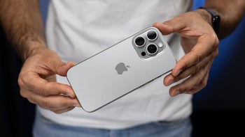
We do expect Samsung to reduce the optical zoom capabilities of the Galaxy S24 Ultra's periscope lens to 5x optical zoom from 10x. Samsung's reason for reducing the focal length of its periscope lens probably is the same one that Apple gave for limiting the Tetraprism lens on the iPhone 15 Pro Max to 5x optical zoom.
Apple's VP of camera software engineering, Jon McCormack, explained that Apple limited the Tetraprism lens to 5x optical zoom due to the stabilization at that focal length. "The 5x zoom is something that we can stabilize incredibly well. If you look at the 10x zoom, unless you have the steadiest hands in the world or a tripod, it's really difficult to use," he said.
The design of the speaker opening on the bottom of the Galaxy S24 Ultra has changed, becoming a long strip design instead of holes. pic.twitter.com/108rQXbs32
— ICE UNIVERSE (@UniverseIce) October 22, 2023
Another change reportedly coming to the Galaxy S24 Ultra is a change in the design of the speaker on the bottom of the phone. Prolific tipster Ice Universe says that instead of using the same design Samsung employed for the speaker opening on the bottom of the Galaxy S23 Ultra (which is made up of six "pill-shaped" holes), the Galaxy S24 Ultra will have a "long strip design" instead.
The tweet from the tipster included an illustration that shows what the new design will look like. Not everyone who looked at the alleged new speaker design for the Galaxy S24 Ultra was sold on it. For example, an "X" subscriber named Tim responded by typing, "Oh gosh... they already did this on older phones like the Galaxy S9 and it looked so bad and cheap. Individual holes look much more premium."
Sometimes you can't tell how good or bad a design change is until you see it in person. Remember the flack that Apple took when the original renders showed the rear camera arrangement for the iPhone 11 Pro series? When the iPhone 11 Pro and iPhone 11 Pro Max were unveiled, it turned out that most people liked the design after seeing what it looked like for real.







Things that are NOT allowed: