The teased Material You redesign of Fitbit on Android appears to have been scrapped or delayed

Last fall, images appeared on the Google Play Store of a planned redesign of the Fitbit app on Android. These screenshots showed the app taking on a Material You theme, keeping with the current trend of Google apps adopting its design language of choice. However, it appears that now those screenshots have been removed, calling into question whether the redesign has been scrapped.
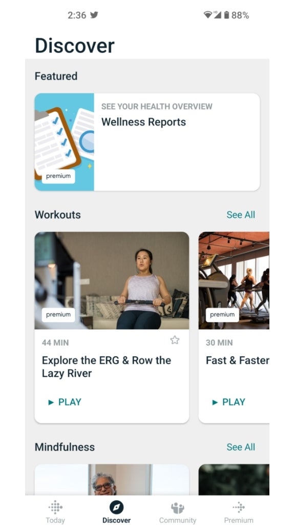
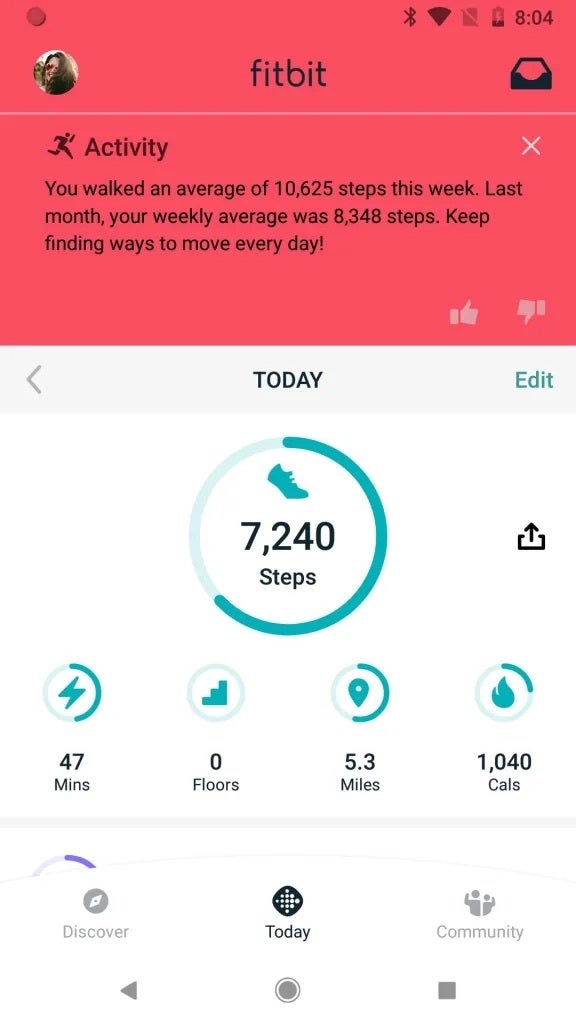
The app redesign included a bottom bar shaped as an arc, which was highly distinct and undoubtedly original. This is in contrast to the solid bottom bar we see on the app now. Additionally, other sections were rearranged within the app, such as the "Today" tab which was moved from the first tab to the center of the screen, the word "Community" moved to the far right, and the word "Discover" moved to the far left.
The currently active tab of the app would also have its icon filled in, but it did't look like plans were made to fit the fourth "Premium" tab that appears in the current app as pretty much just a placeholder to call out the features. However, as noted by 9to5Google, those screenshots are now gone from the listing and replaced with ones that match the design the app has now.
Current Screenshots vs Redesigned Screenshots (via 9to5Google)
Follow us on Google News






Things that are NOT allowed:
To help keep our community safe and free from spam, we apply temporary limits to newly created accounts: