Fitbit app gets a subtle redesign focusing on Heart Rate stats

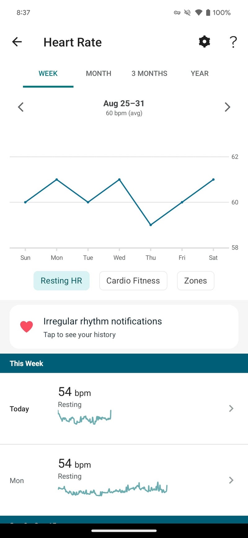
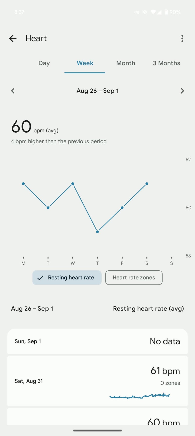
Fitbit continues to refine its mobile app experience in its recent update, placing the spotlight on Heart Rate stats for Android users. While the "Today" tab card remains familiar, the underlying page has undergone a subtle name change, transitioning from "Heart rate" to simply "Heart." This seemingly minor adjustment hints at the deeper changes within.
The heart rate chart itself remains largely unchanged, but the compact list of days in the "Week" view now prevents continuous scrolling through historical data. A new "Health assessments" carousel provides links to key features, improving user experience.
However, despite these improvements, a few minor bugs do linger. For example, the status bar stubbornly clings to light text, creating a less-than-ideal visual experience, particularly in low-light environments. The continued absence of a dark theme, a feature eagerly anticipated by many users, remains a point of contention. Additionally, Fitbit enthusiasts are still waiting for updates to Health Metrics, Body responses, Stress Management, Food, and Water sections of the app, highlighting areas where further refinement is needed.
As of now, this heart rate redesign is exclusive to version 4.25.2 of the Fitbit app for Android, leaving iOS users with the previous interface. While the changes may seem subtle at first glance, they contribute to a more intuitive and efficient way to monitor heart health within the app.
From my perspective as a user of the Fitbit app with my Pixel Watch, this update is just a small stepping stone in a long list of improvements that are still needed. The refined heart rate view is a welcome improvement, but the lingering issues, such as the absence of a dark theme and the need for further updates to other sections, underscore the ongoing nature of app development. Even though development on the UI of this app seems to be happening at a snail pace, I remain optimistic that Google Fitbit will continue to iterate and enhance their offerings. Let's just hope the implementation of dark mode is at the top of the list for that next iteration.
"Heart rate" section of the Fitbit app renamed to "Heart" in this new version. | Images credit — 9to5Google
From my perspective as a user of the Fitbit app with my Pixel Watch, this update is just a small stepping stone in a long list of improvements that are still needed. The refined heart rate view is a welcome improvement, but the lingering issues, such as the absence of a dark theme and the need for further updates to other sections, underscore the ongoing nature of app development. Even though development on the UI of this app seems to be happening at a snail pace, I remain optimistic that Google Fitbit will continue to iterate and enhance their offerings. Let's just hope the implementation of dark mode is at the top of the list for that next iteration.
Follow us on Google News







Things that are NOT allowed:
To help keep our community safe and free from spam, we apply temporary limits to newly created accounts: