Chrome on Android's New Tab Page gets a Material You makeover: thicker bars and rounded cards

Chrome on Android is getting a fresh face, with its New Tab Page (NTP) adopting the Material You design language. While not a major overhaul, the tweaks bring a touch of consistency to Google's first-party apps and enhance the overall browsing experience.
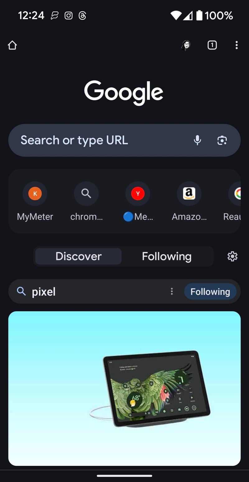
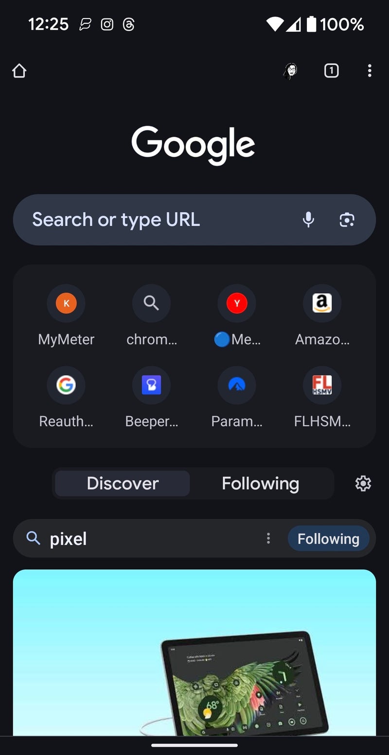
As documented by 9to5Google, the first thing you'll notice is the thicker search bar, mirroring the one in Gmail and Google Chat. This design element seems to be Google's new standard for Android apps, promoting a unified visual language. The search bar also boasts bolder hint text and more distinct microphone and Lens icons, making them easier to find.
Gone are the days of the flat grid for your most visited sites. Now, they reside in a rounded card, visually separating them from the rest of the page. The Discover/Following switcher also gets a similar rounded treatment, while the Discover feed itself remains largely unchanged.
These changes may seem minor, but they pack a punch in terms of visual coherence. The NTP, a frequently accessed part of the browser, now feels more polished and in sync with other Google apps. Plus, the increased padding doesn't impact content visibility, ensuring the focus remains on your browsing needs.
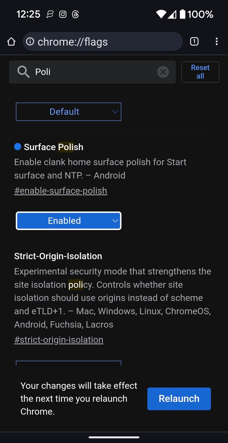
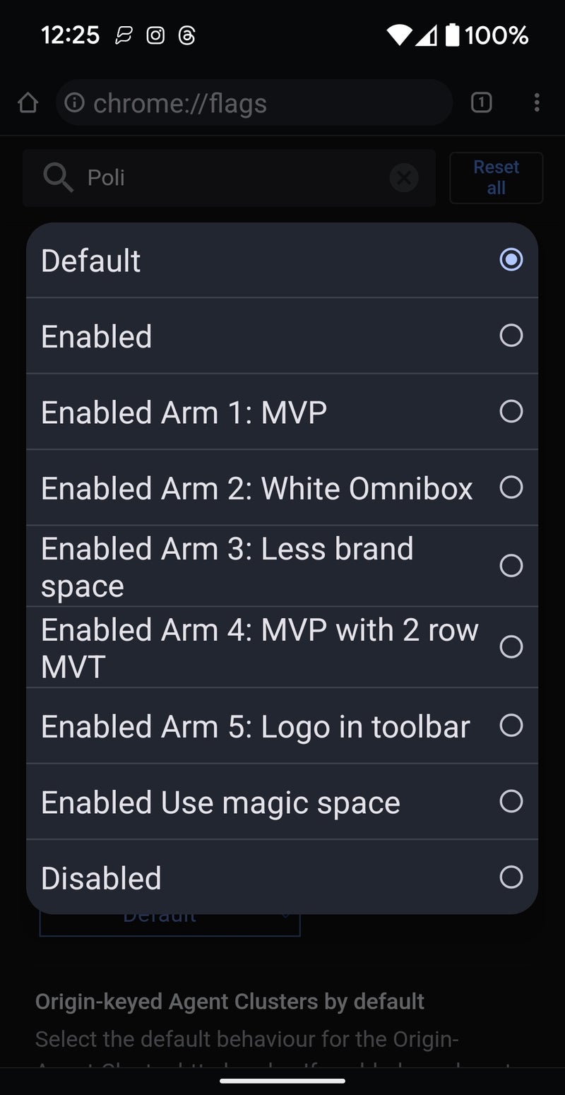
The Material You makeover started rolling out with version 119 and is now picking up pace with version 120. If you're eager to get your hands on it, and you feel comfortable tinkering with feature flags, you can enable this new look by enabling chrome://flags/#enable-surface-polish to experience the 4x2 grid of favicons. You also get additional options within the flag to enable a carousel showcasing 12 frequently visited pages. Additionally, if you're a fan of the old search bar, chrome://flags/#query-tiles-ntp lets you bring back the previous search queries.
This redesign marks a subtle but significant step for Google in unifying its Android app aesthetic. The New Tab Page, now adorned with Material You touches, feels more polished and cohesive, while retaining its core functionality. So, next time you open a new tab in Chrome, be sure to appreciate the subtle changes that bring a touch of Material You magic to your browsing experience.
Old NTP vs New NTP
Feature flag for Chrome's surface polish with all the additional options
Follow us on Google News









Things that are NOT allowed:
To help keep our community safe and free from spam, we apply temporary limits to newly created accounts: