Photo shows that Google is testing Material You design for Android's YouTube app
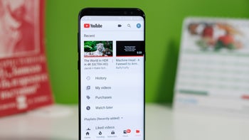
According to Android Police, some new buttons that Google is testing for the Android version of the YouTube app point toward the release of a Material You update for the popular video streamer. According to Google, Material You is "a radical new way to think about design. Material You will transform design for Android, for Google, and for the entire tech industry."
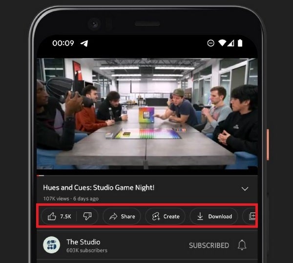
New look for YouTube buttons currently being tested hints at Material You update for YouTube in the near future
The Google News Telegram group has posted a photo revealing that Google is testing a new look for the row of buttons found under a YouTube video that appears to have been taken from the Material Design 3 guidelines that Google released in October. The revised Material You look adds pill-shaped buttons under the video. One button shows the combined number of likes and dislikes. Three weeks ago, Google did away with showing the number of dislikes that YouTube videos have garnered in order to protect their creators.
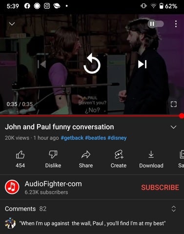
What YouTube looks like on Android now
You might notice that the text revealing the title of each button is now placed next to the icon instead of underneath it which forces the bar to be longer. It isn't known just yet when Android users can expect to receive the new button design which would be the first sign of an impending Material You update for the app.




Things that are NOT allowed: