Android embraces its media player instead of notifications for Cast media controls

Google has made a significant change to the way Cast media controls appear on Android devices. Instead of residing in the notification shade, Cast controls now sit within the dedicated Android media player. This brings Cast controls in line with other media playback controls, making it easier to manage multiple media sources simultaneously.
Previously, Cast media controls were displayed as separate notifications, occupying space in the notification shade. This approach, while functional, lacked the visual integration and ease of access offered by the dedicated media player.
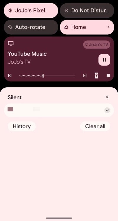
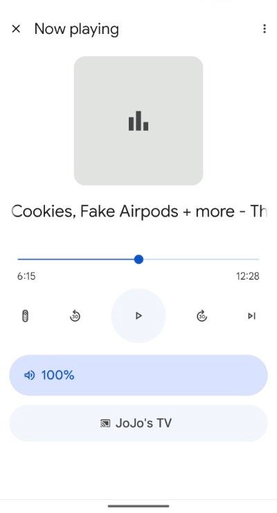
However, as spotted by 9to5Google and replicated by yours truly, the new Cast controls are designed to be simple and unobtrusive. They will show up with a generic icon and no artwork, and you won't be able to use the output switcher or see which media is playing at a glance. You will still be able to control playback (including pausing, playing, skipping, and seeking) and upon tapping the player, you will be directed to the Google Home app's Now Playing screen.
While the current functionality mirrors the old Cast notifications, there's hope for expanded options in future updates. The new Cast media controls are available in version 23.44.14 of Google Play services, which is rolling out to Android devices now. Users can anticipate receiving the update within a few days if it's not yet available.
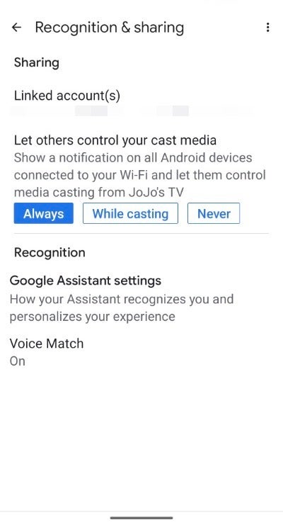
Cast media controls, introduced in 2017, initially sparked confusion and controversy. Users were unaware that others could see their media choices, and some inadvertently interrupted media playback for others while dismissing the unexpected notifications. Google responded by adding the option to disable Cast notifications entirely.
The shift of Cast controls to the Android media player streamlines media management and aligns with the overall Android experience. While the current functionality is limited, future updates may bring additional features and enhance the overall Cast media control experience.
However, as spotted by 9to5Google and replicated by yours truly, the new Cast controls are designed to be simple and unobtrusive. They will show up with a generic icon and no artwork, and you won't be able to use the output switcher or see which media is playing at a glance. You will still be able to control playback (including pausing, playing, skipping, and seeking) and upon tapping the player, you will be directed to the Google Home app's Now Playing screen.
New Cast Media Controls
The introduction of the new Android media player with Android 11 marked a turning point for built-in media playback capabilities. Over time, the media player gained enhanced features, including input switching, improved visuals, and functions linked to updated APIs.
Cast media controls, introduced in 2017, initially sparked confusion and controversy. Users were unaware that others could see their media choices, and some inadvertently interrupted media playback for others while dismissing the unexpected notifications. Google responded by adding the option to disable Cast notifications entirely.
The shift of Cast controls to the Android media player streamlines media management and aligns with the overall Android experience. While the current functionality is limited, future updates may bring additional features and enhance the overall Cast media control experience.
Header image via Android Developers Blog






Things that are NOT allowed: