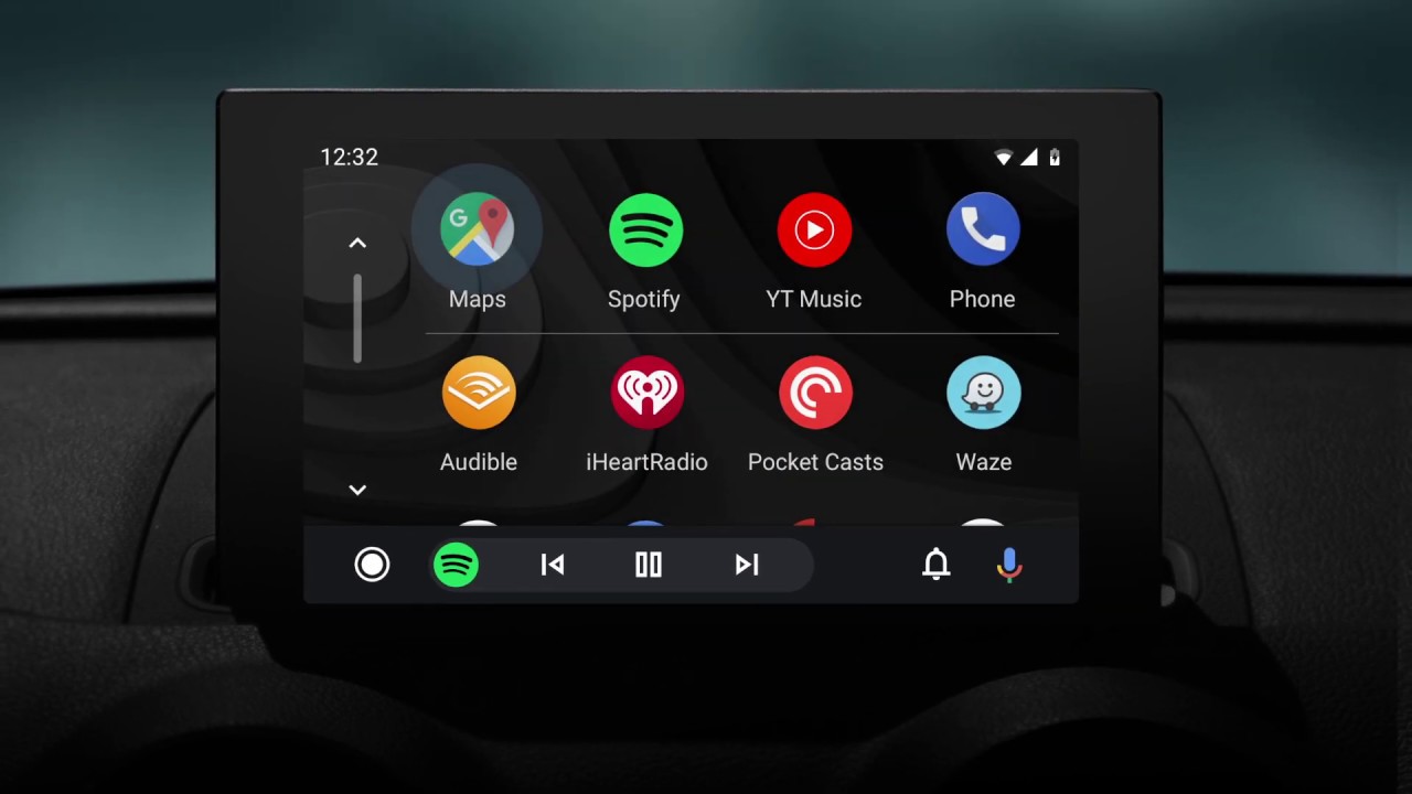
Android Auto is getting a redesigned interface and Dark Mode

Google last month announced an update for Android Auto that would change the way the app looks and works, and it is now finally rolling out to some regions. Google says that the refreshed interface was "built to help you get on the road faster, show more useful information at a glance and simplify common tasks while driving."
To streamline the experience and to make common tasks even easier to perform while driving, the latest Android Auto update introduces a redesigned bottom navigation bar. It allows users to control apps and media, manage incoming calls and notifications, and get directions on the same screen, with less taps required than before.

The redesigned bottom bar also offers a way to better utilize screen real estate. Since Android Auto is a scalable experience, made to work on many types of displays with different sizes, aspect ratios, and resolutions, the UI design changes are aimed at making the app a consistent and well-optimized experience across the board.

Speaking of UI changes, Dark Mode is also a thing now in Android Auto. It's more of a visual change, rather than functional, but it should make using the app during the night a bit easier on the eyes. Google says that the new dark theme was designed to utilize more colorful accents and easier to read fonts to further improve visibility and reduce eye strain.
The update seems to depend on a server-side switch, as is often the case with Google services, and not on the app version you're running. Still, you can check if you're on the latest version by heading to the Google Play Store.
The new Android Auto update has started rolling out in the UK and US, so other regions where the service is available should start receiving the new features in the coming days/weeks.


Things that are NOT allowed: