ZTE Blade V6 hands-on. Is it September 9th already?
ZTE's Blade V6 was just released about 10 days ago, and we are now able to check it out in person, as the company has brought some demo units at the IFA 2015. The phone is a midranger, with a design that reminds us of a well-known handset – we'll let you guess which one! So, clearing our mind of any predispositions, let's take a closer look!
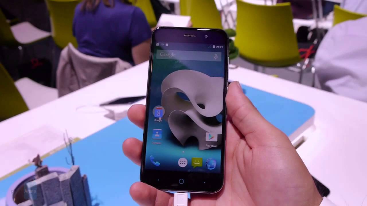
As we mentioned, the Blade V6 looks strikingly similar to the iPhone 6, especially when viewed from the front – we see the same rounded-off glass panel, a similar overall shape of the front, and very similarly-placed plastic strips on the metal frame for the antennas. ZTE's handset is slightly thinner, measuring at 6.8 mm, and slightly lighter, at 122 g. Its power button and volume rocker are both located on the right of the device, making for easy access. Below the screen, we have the capacitive circular home key with the navigational buttons (stylized as dots) on each side of it.
Turning the phone around, we can see that the iPhone 6 inspirations have waned a bit. The non-removable back panel is ever-so-slightly arched, and (gasp) does not have a protruding ring around its camera. There is also a speaker grille located here, instead of it being on the bottom of the phone.
The Blade V6's display has a 5” diagonal and a 720 x 1280 resolution, all resulting in a PPI density of 294 – not the sharpest out there, but you will only see loss of detail in the smallest, most-demanding spots of an image. On first sight, the display seemed slightly cold, with pronounced greens, and punchy reds, though, we'd like to reserve judgment until we've had a chance to spend time with it under natural lighting, and ran some benchmarks, of course.
Surprise, surprise! The Blade V6 rocks an almost vanilla-like Android 5.0 Lollipop. It's quite refreshing to see smartphones that don't hog the hardware and user experience with overly heavy interfaces, especially when the phone's appearance is one that borrows heavily from the iPhone 6. We would've expected to see an iOS-like Android skin when the lights go on, but no – once that display is off standby, we see pure Material Design goodness underneath!
Under the Blade V6's hood, we have a 64-bit, quad-core MediaTek MT6735 SoC, combined with 2 GB of RAM. Not the most powerful hardware out there, but, thankfully, an unskinned Android UI doesn't bog it down too much. Of course, we'd love to test it out extensively, but as a first impression – the phone feels smooth!
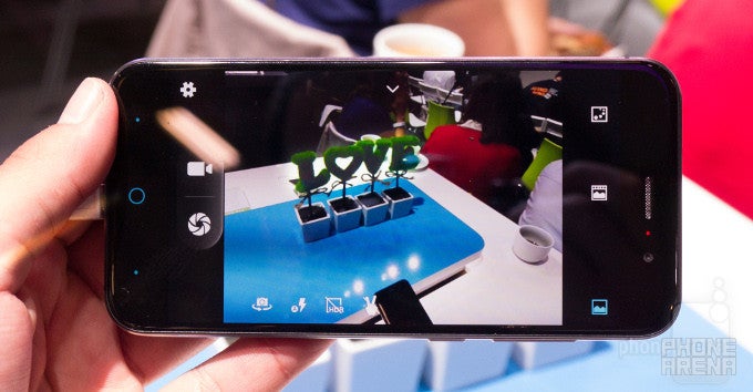
ZTE put a 13 MP snapper for the main camera of the Blade V6. Image quality seems alright, with colors coming out a bit oversaturated. It also seems to us that the camera may have prominent issues with unfavorable lighting, but further tests are needed.
The ZTE Blade V6 looks like a pretty decent affordable smartphone, stuck right in the center of the “midrange” field. Priced at around $280 in Europe, it doesn't offer groundbreaking hardware, but is quite adequate at the price point.
Design
As we mentioned, the Blade V6 looks strikingly similar to the iPhone 6, especially when viewed from the front – we see the same rounded-off glass panel, a similar overall shape of the front, and very similarly-placed plastic strips on the metal frame for the antennas. ZTE's handset is slightly thinner, measuring at 6.8 mm, and slightly lighter, at 122 g. Its power button and volume rocker are both located on the right of the device, making for easy access. Below the screen, we have the capacitive circular home key with the navigational buttons (stylized as dots) on each side of it.
Display
The Blade V6's display has a 5” diagonal and a 720 x 1280 resolution, all resulting in a PPI density of 294 – not the sharpest out there, but you will only see loss of detail in the smallest, most-demanding spots of an image. On first sight, the display seemed slightly cold, with pronounced greens, and punchy reds, though, we'd like to reserve judgment until we've had a chance to spend time with it under natural lighting, and ran some benchmarks, of course.
Interface
Surprise, surprise! The Blade V6 rocks an almost vanilla-like Android 5.0 Lollipop. It's quite refreshing to see smartphones that don't hog the hardware and user experience with overly heavy interfaces, especially when the phone's appearance is one that borrows heavily from the iPhone 6. We would've expected to see an iOS-like Android skin when the lights go on, but no – once that display is off standby, we see pure Material Design goodness underneath!
Processor and memory
Under the Blade V6's hood, we have a 64-bit, quad-core MediaTek MT6735 SoC, combined with 2 GB of RAM. Not the most powerful hardware out there, but, thankfully, an unskinned Android UI doesn't bog it down too much. Of course, we'd love to test it out extensively, but as a first impression – the phone feels smooth!
Camera
ZTE put a 13 MP snapper for the main camera of the Blade V6. Image quality seems alright, with colors coming out a bit oversaturated. It also seems to us that the camera may have prominent issues with unfavorable lighting, but further tests are needed.
Expectations
The ZTE Blade V6 looks like a pretty decent affordable smartphone, stuck right in the center of the “midrange” field. Priced at around $280 in Europe, it doesn't offer groundbreaking hardware, but is quite adequate at the price point.




Things that are NOT allowed: