You got cropped! Galaxy S8 and S8+ video display grief comes in stages, here's why
TL;DR
- Most TV series you'd watch on, say, Netflix, as well as the YouTube content, are meant for 16:9 displays - those get letterboxed on the Galaxy S8 and S8+ by default
-
You lose about 14-22% of the 5.8" and 6.2" screens' real estate, depending on the video app, if you watch the vids in the default letterboxed regime

- You'd have to manually add third party apps to the compatibility mode list in Display settings, so that the full screen toggle appears in, say, Netflix
- Even when you toggle compatibility mode, a 16:9 video will can still be letterboxed, or cropped top and bottom, depending on the app
- Movies and TV series shot in 2:1 Univisium format are your best bet to use the maximum screen area of the S8 and S8+, but those are few and far between
- SMILE! - New 2:1 TV series or movies get letterboxed on those pesky 16:9 phones in their turn, how 'bout dat?
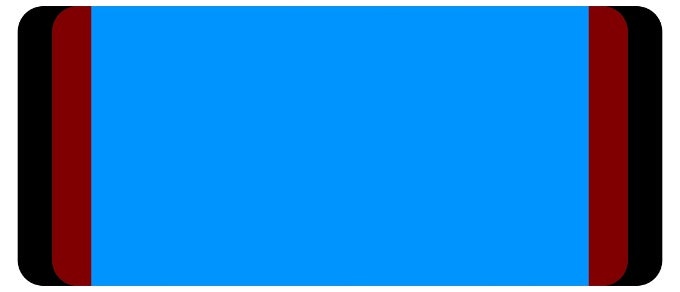
Your 6.2" Galaxy S8+ fits about as much YouTube vid as the 5.5" S7 edge
All of those tricks resulted in phones with 83% screen-to-body ratio. To wit, this is close to the 84% of the current record holder - the Mi Mix - and more than Sharp's infamous EDGEST display designs. Granted, this number is helped by the curved display sides, too, but the slope here is very minimal, and mostly for aesthetic, rather than any functional purposes. The trimming efforts return a brand new design for the Galaxy S-series, plus the S8 and S8+ are also the smallest phones for their screen sizes as a result. Don't get us wrong, the S8+ is still a biggie, but this time Samsung has put a 6.2" panel in a size that big-screen phone lovers are accustomed to anyway. They were just used to having 5.5 or 5.7-inchers in this footprint.
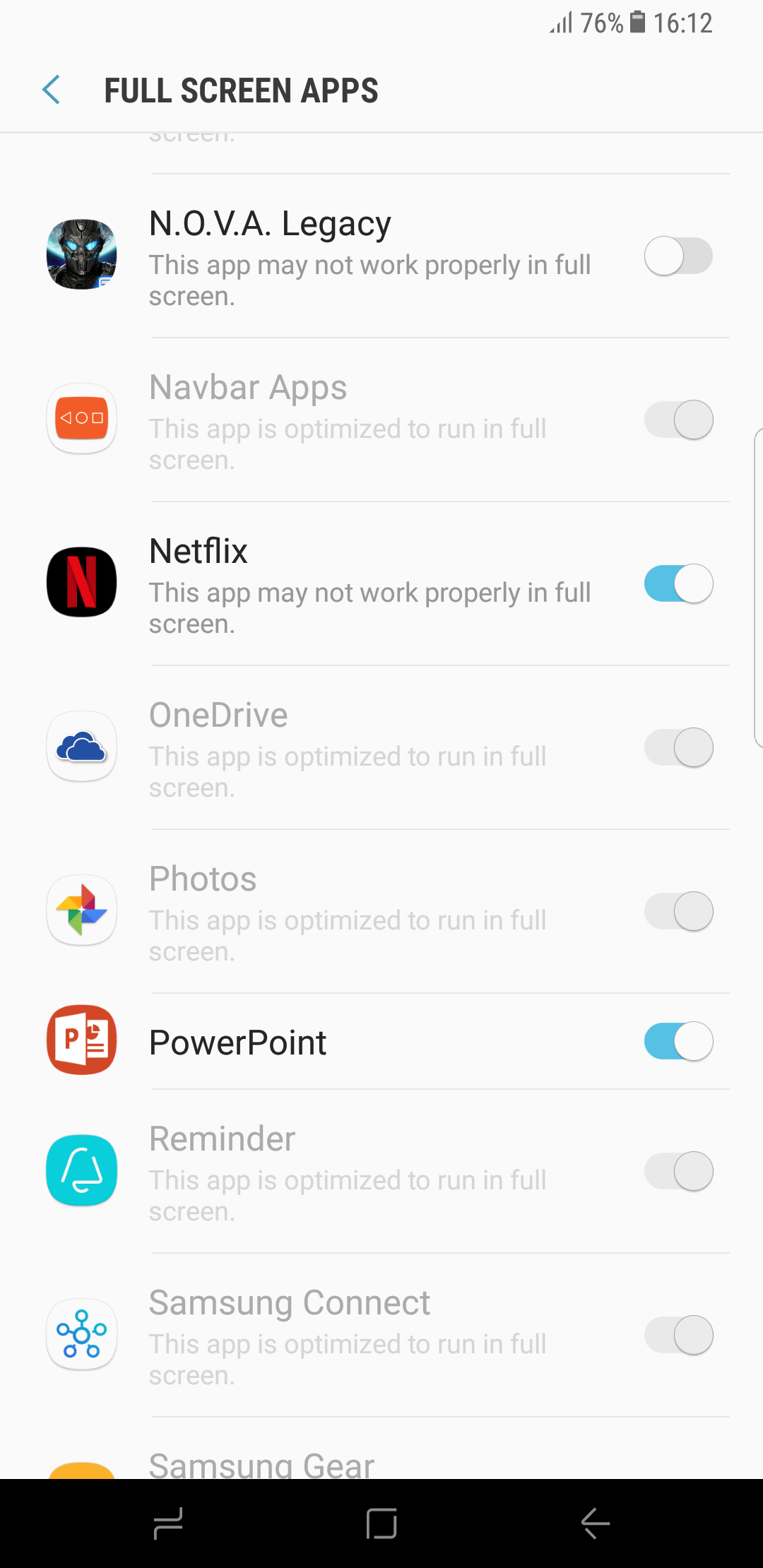
3rd party apps have to be added to the Full Screen compatibility list manually
Well, here's the scoop - not only is video watching on the S8/S8+ marred by the slightly curved display sides and the overly rounded screen corners, but also the new aspect ratio is hit or miss. Go to the YouTube app, for instance, and you will find yourself with black bands on the sides of the screen to fit the standard 16:9 aspect, or with slightly cropped footage in full screen mode. Even if you are streaming one of the new 2:1 Netflix series, they still show letterboxed by default, in offline viewing too, and there is no compatibility button in the Netflix app from the box. You have to explicitly go to the Full Screen option in the Display settings menu to add an aspect ratio toggle for the Netflix app. Upon tapping said button, if the series is 2:1, then you lose nothing by making it stretch and fit the whole display, but if it's 16:9, tough noogies, you got cropped, top and bottom.
Takeaway
What all of that means is that you either lose a portion of the original footage, or don't use the whole real estate of the screen, which on top of that is not as large as it sounds, since in terms of screen area the 5.8" screen with 18:9 ratio is more akin to one of a phone with 5.2" display in the common 16:9 format. How much canvas do you lose if you want to watch your vids as their creators intended? Well, we calculated that about 22% of the screen goes to letterboxing a video that is not in full screen compatibility mode in Netflix, while the black bands in the YouTube app waste about 14%, so on the 6.2" panel of the S8+, you are watching in an area that is about the size that a 16:9 handset with a 5.5" display offers, at best, or 5.1" on the S8, respectively. Coincidentally, exactly the screen diagonals of the S7 and S7 edge.
Oh, well, “those ahead of their time will have to wait for it in the designated places,” as one cuneiform clay tablet in prison states. On the other hand, the 2:1 Netflix "Frontier" series gets letterboxed on all those pesky 16:9 phones, and there is no full screen compatibility toggle with those retro critters. Don't you feel vindicated already?





Things that are NOT allowed: