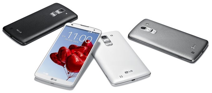
With the G Pro 2, LG continues its buttons-on-the-back trend. How do you feel about that?
34comments

In general, people tend to instinctively resist change – most of us get an awkward feeling when we're forced to break a habit or change a routine. That is why it was was risky, to say the least, for LG to launch a flagship smartphone – the LG G2 – with buttons placed on the back, not on the sides. After all, there was no knowing whether potential buyer would embrace the idea, or immediately reject it regardless of the smartphone's technical capabilities.

But from the looks of it, LG has no intention of abandoning its unique button design. The LG G Pro 2 was made official yesterday, and just like the LG G2 and the LG G Flex before it, its power and volume keys are placed on the back.

Now, LG's buttons-on-the-back concept isn't disastrous by any means. In fact, it has its benefits – the lack of side buttons allows LG's engineer to make smartphones less wide (read: easier to grasp). It takes time, however, for one to get used to using these keys, as we mentioned in our long-term LG G2 review, so they aren't an ideal solution either.

How do you feel about all this, guys? Are you okay with LG's unorthodox button design? Or would LG's high-ends stand lower on your "Want It" list because of their button placement? Cast your vote below!

Buttons on the back – aye or nay?

I'm okay with my smartphone's buttons being on the back.
72.99%
Bad idea. I'll pass.
27.01%

Recommended Stories

Loading Comments...
FCC OKs Cingular\'s purchase of AT&T Wireless