Why I traded the brute power of the Nexus 5 for the personality of the Moto X
This article may contain personal views and opinion from the author.
The original decision
In order to deal with the huge number of choices in the Android ecosystem, I have set myself a fairly strict budget for buying a new device each year, which has acted to limit my choices. I only buy unlocked devices (with the exception of the 1520, which is really just a test device), because I am a T-Mobile customer and I travel internationally a couple times a year (although with the new international features from T-Mobile, I don't even swap my SIM anymore because I get free data, texts, and incoming calls from U.S. numbers.) Lastly, I prefer the Google Android experience, which also serves to limit my choices to a more manageable level. Basically, my device of choice for this year fell into one of three categories: a Nexus device, a Google Play Edition (GPE) device, or a Moto X.
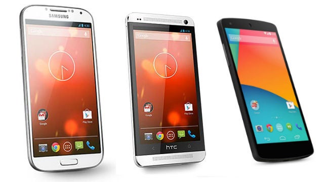
I have been living the Nexus life since I traded in my iPhone 3GS for a Nexus One. The N1 was followed by a Galaxy Nexus, Nexus 4, Nexus 7 (traded in for a Nexus 10), and briefly a Nexus 5. When I was considering what device to buy, my specific choices were: the Samsung Galaxy S4 GPE, the HTC One GPE, the Moto X, or the Nexus 5. The final decision was delayed until the release of the Nexus 5, so I could make a proper decision. Looking purely at a specs to price ratio, the Nexus 5 was the clear winner, because of the Snapdragon 800. If I prioritized build quality and speaker quality, the HTC One GPE came out on top. If I prioritized battery life and camera quality, the Samsung Galaxy S4 GPE was the winner. If I prioritized the gut feeling of which one I wanted the most, the Moto X was the winner, but I refused to buy a Moto X without being able to use Moto Maker, which was unavailable for T-Mobile until a full week after I purchased the Nexus 5.
My decision to purchase a Nexus 5 boiled down to this thought: It's best to buy one and not want it, than to delay and face the inevitable supply issues that will come. Given that the shipping times for a Nexus 5 quickly jumped as high as 5 weeks, I'd say my thought was the right one. I was able to get back my money in selling the Nexus 5 and use that to pick up a Moto X. Many of you are quick to point to the battery life as the worst part about the Nexus 5, but I never found it that bad. The device would make it through a full day of normal usage for me, and on heavier days I was still able to make it through because of the combination of the small battery and the extra fast charging afforded by the Snapdragon 800. Less than an hour of charging would usually be enough to bump my Nexus 5 battery up about 50%, and with the wireless charging orb, that was very easy to do.
Unfortunately, while I liked the Nexus 5, I still wasn't quite sold. I've always preferred AMOLED displays on my phones, and the benefits of the extra power of the Snapdragon 800 was quickly lost on me because I do the majority of my mobile gaming on my Nexus 10. (My hands are big enough that even the 5-inch display of the Nexus 5 feels cramped for anything more than Dots, Temple Run, Candy Crush, or maybe some Cut the Rope.) The big thing was that I realized that I didn't want the pure Google Experience anymore. I wanted the Motorola experience.
The things I knew I wanted
There is really no good way to explain it to those of you who haven't held a Moto X in your hand (which means all of you who don't live in the U.S. or Canada,) but the Moto X is the first phone that I've had that really just feels at home in my hand. If you look at the spec sheet, you'll see that the Moto X is 10.4 mm thick, which is relatively fat compared to the likes of the Galaxy S4 (7.9 mm), Nexus 5 (8.59 mm), or the iPhone 5s (7.6 mm). But, what a spec sheet doesn't tell you is that thin doesn't necessarily translate to easier to hold or more comfortable in the hand. The far more telling part of the spec sheet is that the Moto X as a whole is just barely larger than an iPhone 5s, the Moto X packs a larger screen and simply feels better in the hand because of superior ergonomics (as John V mentioned in his comparison).
That feel in the hand was something I noticed from the first time I held the phone on its announcement day back in August, and it was something that always stuck in the back of my mind. Beyond that, the relatively small customizations done by Motorola fit exactly what I wanted. As I mentioned before, I've always loved AMOLED displays, but devices have almost never taken advantage of them properly. Enter: Active Display, which finally shows off the power of AMOLED by only lighting up the pixels you need while still giving you constant, rich notifications.

Second, I use Google Now quite a lot, and I have constantly looked for the easiest way to access the voice commands. I've tried Utter! which offered the Moto X Touchless Control experience before the Moto X came out, but battery life took a huge hit. I also tried various custom lockscreens with quick links to Google's voice search, but nothing worked all that well. Then Touchless Control came to answer all of my wishes. Now, I don't need to touch my device in order to make a note, email someone, or perform a Google search. It doesn't work perfectly (as I'll get into in the next section), but it is by far the closest to what I've been wanting that I've found yet.
Lastly, one of my favorite things about Windows Phone handsets is the dedicated camera button, which makes it incredibly fast to launch in to the camera. Google has made it easier by adding the camera to the lockscreen, and in my testing of various lockscreen replacements, there have been different ways to easily access the camera. I wasn't really expecting much from the Moto X quick camera gesture, but it actually helped me realize why I've always loved the dedicated camera button on WP devices: you don't even need to look at the device in order to launch the camera. Any solution with the Android lockscreen still requires that you look at the display to get at the camera. With WP or the Moto X, you can be in the camera app by the time you have your device in front of your face and you're ready to take a picture. Of course, the Moto X camera again isn't the best, but I'll get to that in a bit.
Personality galore
Beyond the things that I knew I wanted, the Moto X is the first device I've had that has surprised me with all of the little things that I never expected to find or to fall in love with. As much as I've loved my Nexus devices, Google has never really been a company that is known for its personality. It has been getting better here and there, but the vast majority of Google's personality comes in the form of the Google Doodles. Nexus devices are inexpensive powerhouses with a clean user experience, but it's hard to argue that any of them really have any personality. Motorola is a different company though, and the Moto X is filled with little bits that add to the personality of the device. Top of that list is the lock/unlock sound on the Moto X, which is the likely least important thing possible when talking about using a phone, but it has given me endless joy. Consider just how many times a day you lock or unlock your phone. Now, think of a sound that you love, and have never gotten tired of. Combine those, and that's what the Moto X has for me.
I was one of those kids who would always take the cap to a bottle of juice or Snapple, and I would pop the cap for hours and hours after I had finished the actual drink, simply because I loved the sound that the cap made. That is the same sound that the Moto X makes as its lock/unlock sound. Because of that, I find myself unlocking and locking my device constantly throughout the day, just to hear that sound. And, each time I unlock my device normally, it is made a bit more pleasant because of that sound. It feels like Motorola made a conscious effort to focus on little details like this and offer them as the "premium" experience (because you won't find that sound on the Moto G).
On the same vein as that is the Moto X's default ringtone (also the default on the Moto G), which is absurd and wonderful. It annoys my wife to no end, but luckily she's the one who calls me the most, so she doesn't hear it that often. The best thing I can say about the default ringtone is that it is the first ringtone I've found that I haven't replaced with the theme song to It's Always Sunny in Philadelphia. Similarly, the Moto X boot animation was incredibly well done from the start, and then there was an unexpected and enjoyable update surprise for the holidays.
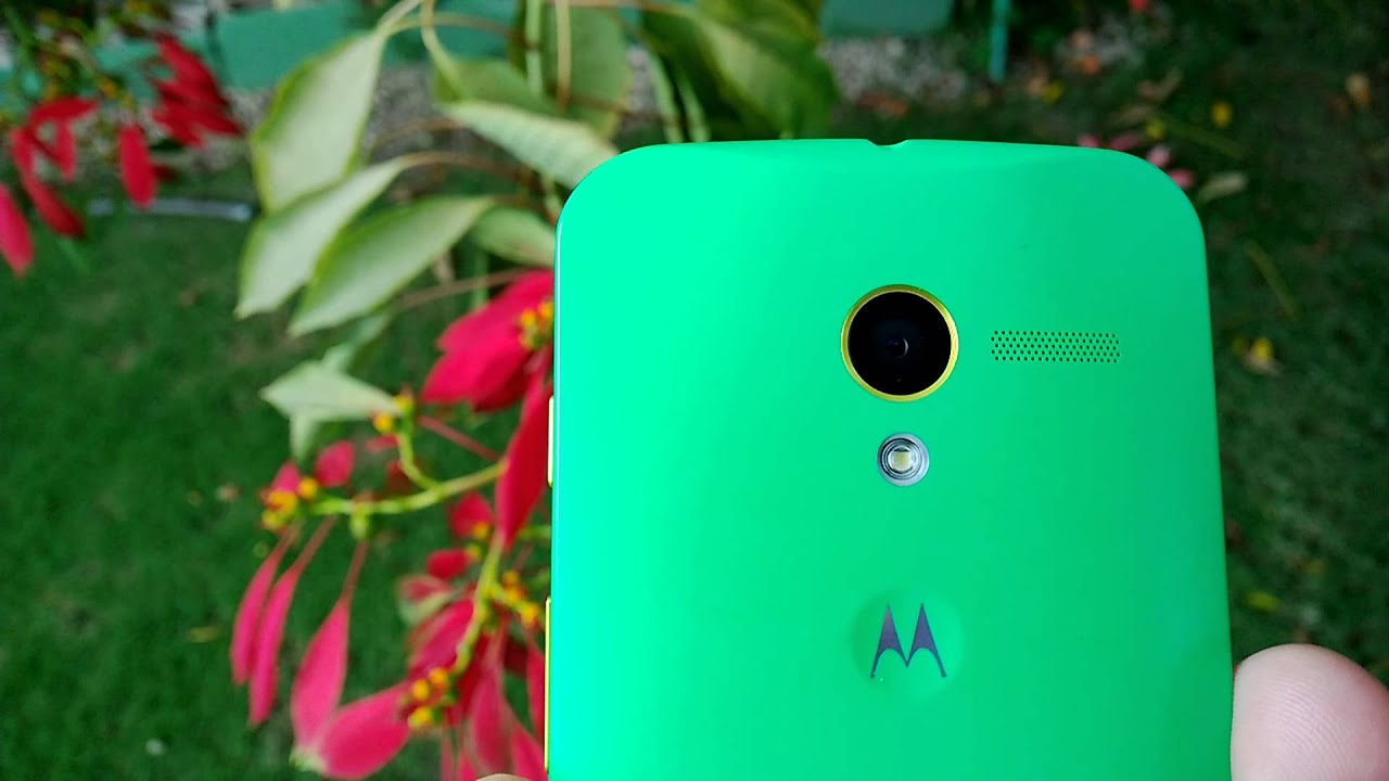
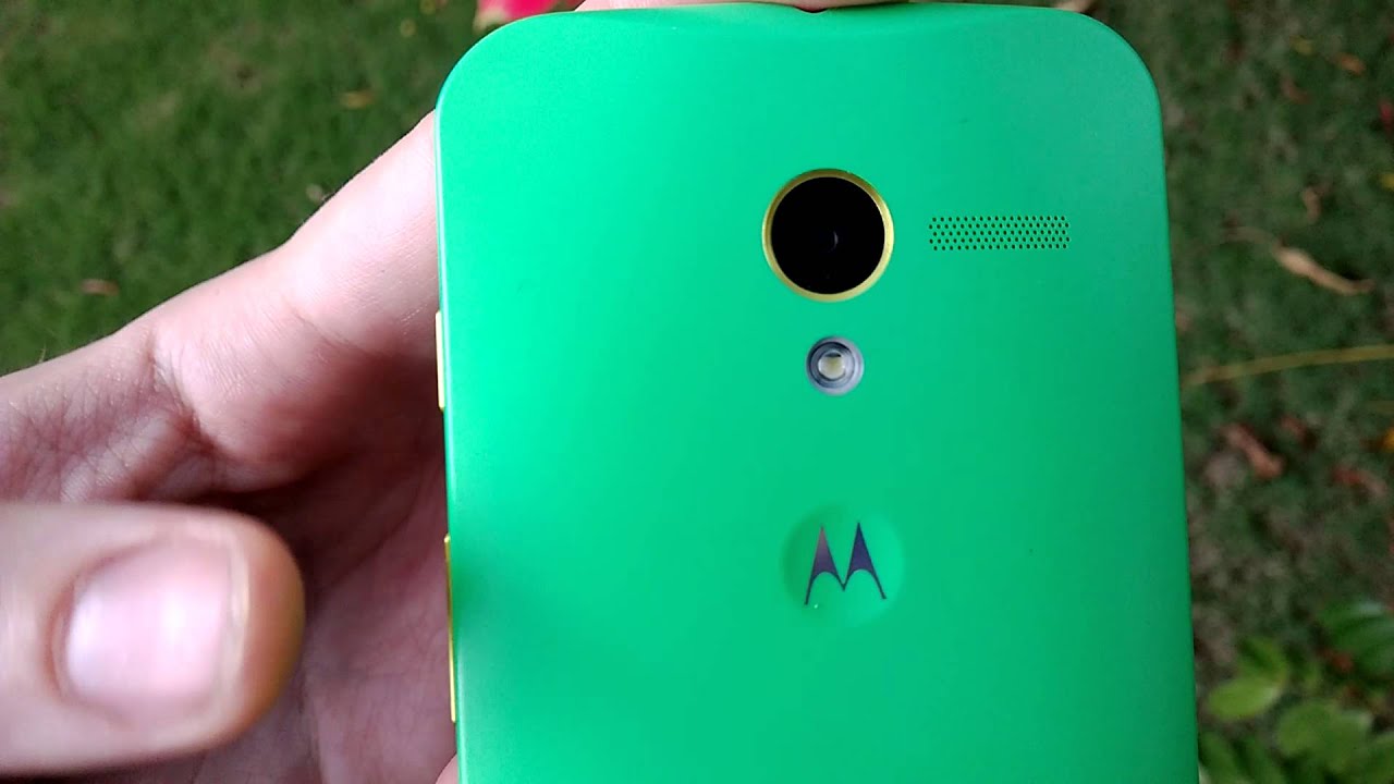
Another pleasant surprise has been the slight dimple that holds the Motorola logo on the back of the device. Again, it isn't something that necessarily changes how you use the device, but it will add to the pleasure you get from the device. I've always been someone who loses track of my hands sometimes, and will ultimately find them picking at a loose thread on my clothes, or petting an especially soft spot in my beard. That dimple on the back of the Moto X helps to quiet my need for tactile stimulation without me firing up my device and wasting battery life by idly flipping through apps.
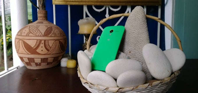
Lastly has been the customization of the device itself, which lets you add your own personality to the device itself. I spent an inordinate amount of time going through the various color options on the hardware before making my final choice. I tended to focus on the spearmint green and royal blue backs with different combinations of accent colors and front colors. Had the option for an ebony wood back been available, the choice would have been easy, but unfortunately, that option still isn't around. In the end, I was choosing between a blue back with orange accents and a black front (Syracuse colors) or spearmint green with yellow accents and a black front. I chose the latter, which happened to not only be the same choice John V made with his, but also they are Jamaica's colors. This was a fact that no one pointed out to me despite the fact that I live with two Jamaicans. Needless to say, it was awkward to say I didn't realize it when my sister-in-law mentioned what I had done upon my arrival to Kingston, but that quirk aside, I love the color choice I've made. I actually decided to not engrave my Moto X, to make it easier to resell in the future, but part of me wishes that I had added that extra bit of personality as well. Had I realized that I was making a smartphone tribute to Jamaica, I might have had it engraved with "One love." Still, having a device that is customized to what I want has been wonderful for the same reasons as all of the other little things listed in this section.
Side note: Android 4.4 was waiting for me when I first got my Moto X, so it wasn't a pleasant surprise to get such a fast update. But, it has certainly been a big plus for the experience. Additionally, Motorola knows what it is doing with radios, and that is seen in the quality and efficiency of the Moto X radio. Nexus and Google Play devices notoriously suffer from battery issues related to subpar radio software, but the Moto X doesn't have this problem. Google can learn a lot from Motorola in this regard.
Not a perfect experience
Obviously, no device offers a perfect experience yet, but the Moto X is as close as I've seen for what I want out of a device. As noted above, the headline feature of Touchless Control is still hit or miss sometimes. I'm still learning where and when I can use it and have the device not only catch the trigger phrase, but then get my entire voice command as well. In the car, I have to be careful to not leave the microphone pointing down in the cup holder where I keep my phone, because it won't catch what I'm saying. I've tried to use Touchless Control while in the shower (after turning off the water of course), and while the Moto X did catch the trigger phrase, it didn't get my voice command. And, in some situations even when I'm in a quiet area, the Touchless Control will stop listening part way through a command, meaning I'll do a search for "What's the population?" or issue a command saying, "Remind me to call." Not exactly helpful.
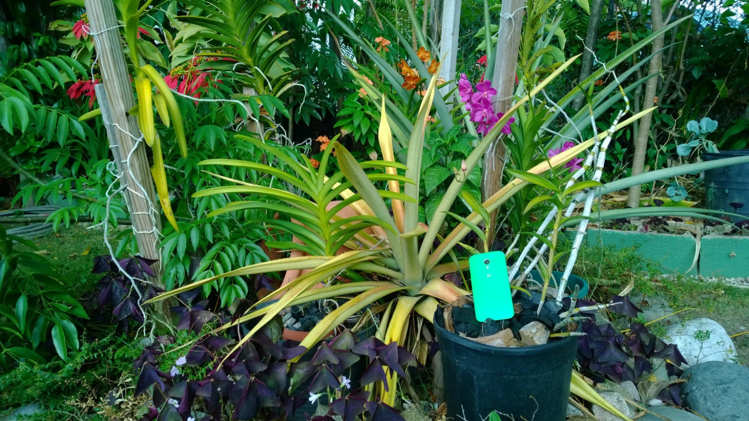
Also as mentioned before, and as has been mentioned by most people who have talked about the Moto X, the camera is not the best. It has gotten better with updates, but it still has its share of problems. My biggest issue is that if you try to take a picture too quickly sometimes, the white balance will be off, which nullifies the speed benefit of the quick camera gesture. Additionally, the camera app itself is one of the biggest changes from Google Android. In general, it's not so bad, but Motorola has removed the manual white balance controls, which is a problem that is made worse by the white balance issues I just mentioned; and, the camera app also removes Photospheres, which has been one of my favorite things in recent versions of Android. It is nice to simply hold down on the screen for burst mode though, especially with Google+ Auto Awesome GIFs.
Because this is Motorola not specifically Google, the Moto X also doesn't offer the Google Experience that you get on the Nexus 5. I've sideloaded the Google Experience launcher, bringing Google Now back to my home screen, which is a feature that I really loved about my Nexus 5. Unfortunately, I would have to root my device in order to get the full feature set of the wonderful new Dialer, which is something I do miss, but hasn't yet been a deal breaker.
The last big issue with the Moto X is one that many of you face: availability. As much as I want to recommend the Moto X to people; and, as much as people love the device when I show it to them (literally everyone I've shown has said some variation of the phrase, "I love how it feels", because you wouldn't expect a screen that size in such a compact and comfortable frame,) the Moto X is only available in the U.S., Canada, and Mexico. Even worse, the Moto Maker customizations are only available in the U.S.. It's hard to recommend a device when the person you're telling can't actually purchase the phone.
Conclusion
As I've talked about before, comparing specs and brute performance of devices may be a fun pastime for some, it doesn't actually lead to a better experience when using a device. You likely won't notice the difference in quality between the Nexus 5's 1080p display and the Moto X's 720p display, but you will notice the benefits of the AMOLED display in battery life and Active Display notifications. The spot where you'll notice the performance boost of the Snapdragon 800 over the Moto X's impressive X8 is in charging speeds, and not so much in actual usage (unless you are comparing side-by-side).
If you're like me, what you will notice between the Nexus 5 and the Moto X are the little details like the feel of the device in your hand; the feel of the Motorola logo dimple; the sound of locking/unlocking the device; the ease of Touchless Controls; and, the other small surprises that Motorola offers like the change in boot animation or the bouncing hat to show you that an impressive interactive story is available. You likely do the same things each day on your device, so a fraction of a second speed difference, or slight clarity of the display will become routine quickly enough. So, it will be the out-of-the-ordinary things that will catch your attention - the personality of a device that makes the difference. It is one reason why so many people prefer the iPhone, it may be short on customization, but Apple knows how to convey personality through sounds and animation; and that seems to be a lesson that Motorola understands.
Follow us on Google News







Things that are NOT allowed:
To help keep our community safe and free from spam, we apply temporary limits to newly created accounts: