Why I think $800 is too much for the Galaxy S7 edge
This article may contain personal views and opinion from the author.
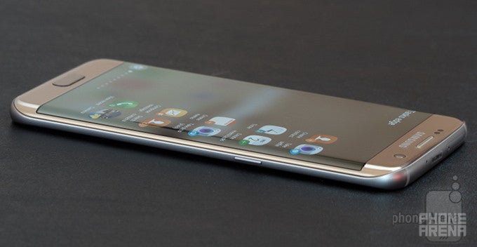
It is born out of glass and metal, with cutting-edge tech in tow. Its goal is to offer everything to everyone, to be a no-compromise solution, a one-stop shop for high-end smartphone buyers. In short, it wants to be the ultimate smartphone. But is it? After a week of using it, I can say there are things about it that make the Galaxy S7 edge appear markedly underperforming for an $800 phone.
Remember the phrase "$800 phone", because it's key. Nowadays, not many smartphone makers keep selling products above the $600 mark, let alone close to $800. Which is wise on their part, because few Android manufacturers have been able to deliver such value-packed devices, except those decked out in stuff like titanium, alligator leather and gemstones. There is no doubt the Galaxy S7 edge is a versatile, powerful smartphone, but does it really live up to its exorbitant price? The answer will be unique to each consumer, depending on what's important to them. To me, the S7 edge does not live up to the expectations set by its incredibly high cost.
The quest for premium
The word "premium" is heavily abused by tech media these days. Everything that involves just a tiny bit of metal or glass is immediately called "premium". But this feels like a blatantly shallow understanding, no? A premium smartphone, at a premium price (which is what I consider the tiers above $600), should not only look great and feel great – it should also behave delightfully. It should make you feel good, even special, in many subtle ways. Pay attention to the minute details, though, and you'll see that Samsung's Galaxy S7 edge is not close enough to offering this type of premium experience.
What is relevant, however, is what comes after the buzz, the hype of the rushed-up reviews, and the reoccurring thirst we have for something new. This is where the Galaxy S7 edge's user experience started showing its ugly face for me. I'll share with you some examples of the things that, to me, hold the S7 edge back from achieving greatness. There are many other issues (some of which I'll mention afterwards), but I'll use the following five to illustrate what I mean.
Exhibit 1: The confused ambient light sensor
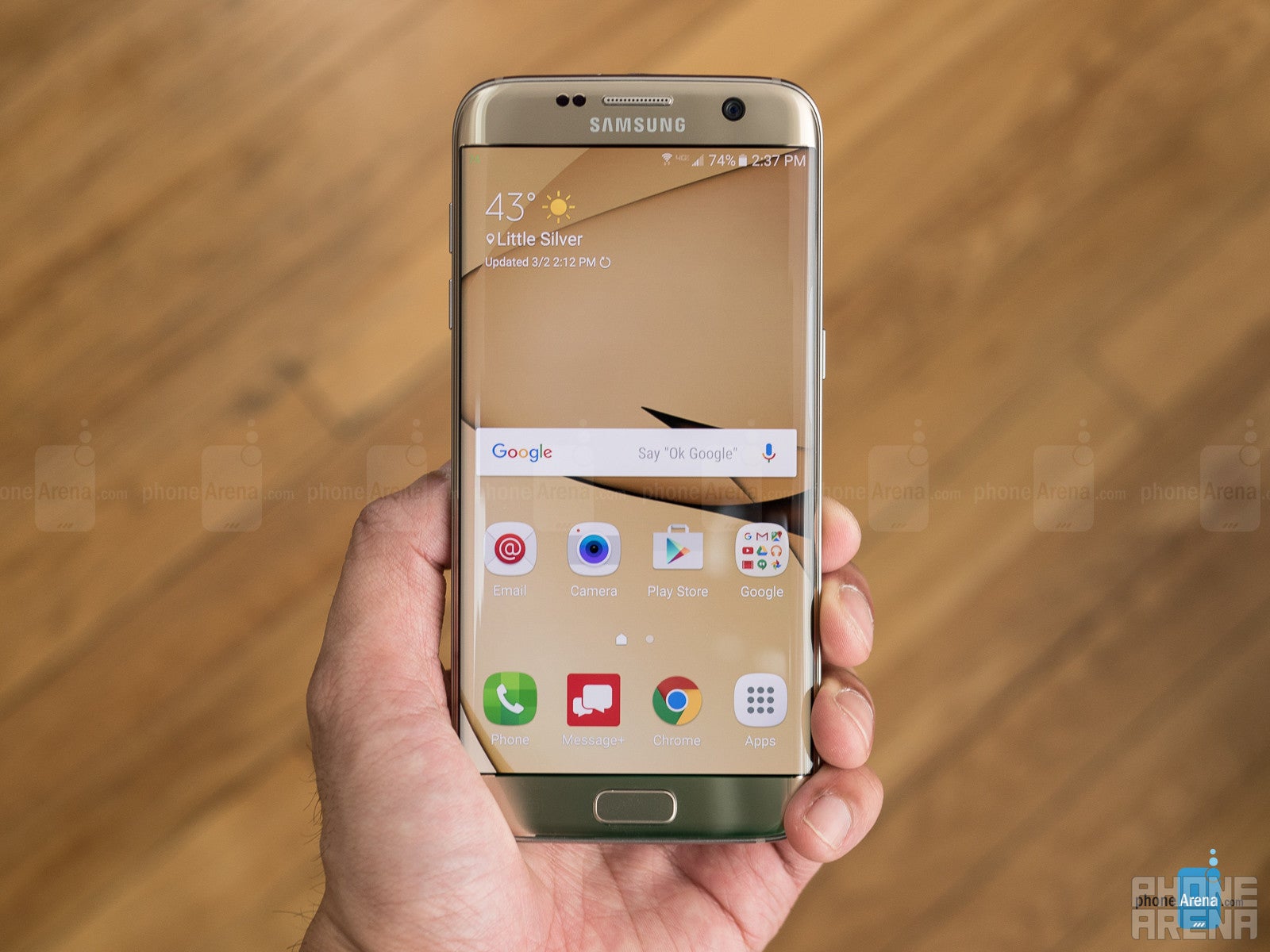
The last Galaxy S smartphone I personally owned was the Galaxy S4 from 2013. One of the bigger gripes I had with it had to do with the automatic brightness feature, which was remarkably consistent in setting the wrong brightness level. The display was either too bright in dark conditions, or too dark in bright conditions. Very rarely would it guess the correct brightness level. Three years later, the Galaxy S7 edge isn't any better at setting the proper brightness levels automatically. This became yet another occasion for my 2006 car to delight me, as I found out that it actually auto-adjusts the brightness of its prehistoric infotainment system more accurately than the cutting-edge GS7. Go figure! Anyway, the sensor of the S7 tends to be too generous with the brightness, and it's also too sensitive – it reacts too sharply to even the slightest changes in ambient light.
I would say the S7 edge sets a precise brightness level in about 50% of the time. This is a huge detractor from the experience of not just premium phones, but of any modern-day smartphone. But if this could be of any help: I'm generally not the type of user who likes to “max it out”, be it brightness or volume. I like things nice and balanced, so if you're the type who has no problem with the screen blasting away at full brightness all the time – this issue (and probably the following ones as well) shouldn't bother you too much.
Exhibit 2: The almost-there fingerprint scanner
Whether due to the specific shape of the home button or something else, the Galaxy S7 edge's fingerprint scanner doesn't work seamlessly. My success rate with it has gravitated around 70%, which is dangerously close to the 'occasionally irritating' mark.
Exhibit 3: The distracting always-on display
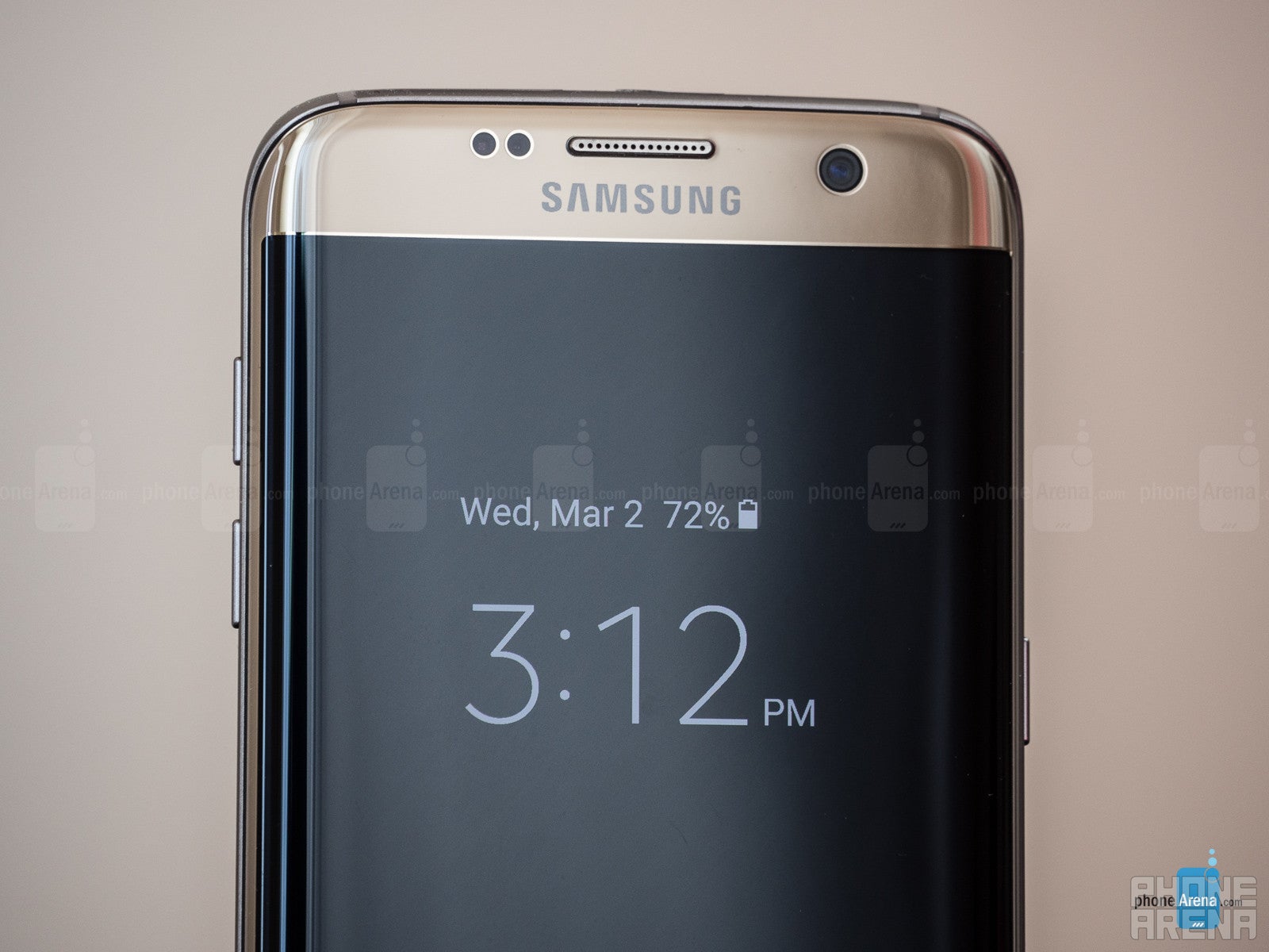
The always-on display of the Galaxy S7 (edge) is a new feature that is not available on most other phones yet. However, I'm bringing it up because, to me, it's a very good example of a feature that's forward-looking, but not yet ready to be part of the premium smartphone experience. Why?
As Samsung uses an AMOLED screen, it's forced to change the position of the always-on clock or calendar every, like, 30 seconds. Otherwise, the burn-in effect may start to manifest, which means that if a single, static image is displayed for too long on the screen, it may temporarily or even permanently “imprint” onto the AMOLED screen – it remains visible like a faint trail on the display, even though you've moved on to viewing other stuff. Because of this, the clock's position changes quite often, and so does its brightness from time to time, which proves to be an annoying and unnecessary distraction. Because of the change of state on the screen, the user's glance is frequently drawn to it, only to find that nothing has really changed.
I agree this issue may smell like 'first world', but so does the Galaxy S7 edge, which is an $800 phone. It should know better than to distract its first-world user unnecessarily.
Exhibit 4: The outdated forecast
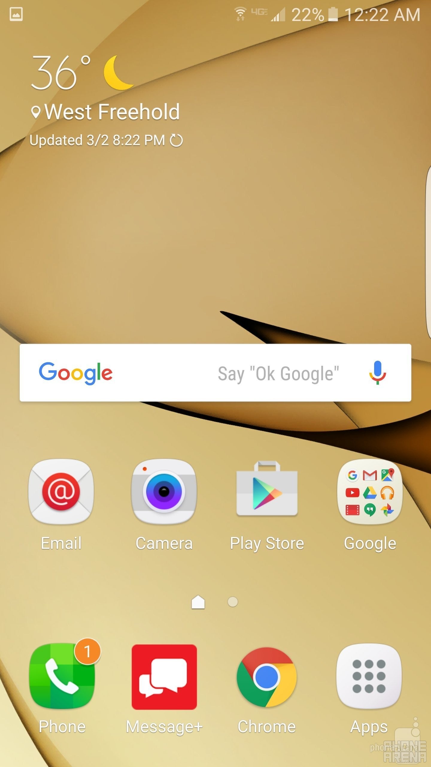
So why does the Galaxy S7 edge present me with an outdated, often multiple-hours-old weather forecast on the homescreen? This is not TV, we shouldn't need to 'wait' for the nightly weather forecast, to learn what the weather is probably going to be like tomorrow. These days, our smartphones have constant and relatively cheap internet connection, so the data they feed us with should be always up-to-date. Yes, there's an option to change the update interval, but the thing is the default state should make sense, and on the S7 edge, it does not.
Exhibit 5: The weird gaming experience
Samsung is touting the Galaxy S7 edge's gaming features, with the new Game Launcher app and all, but for me, the gaming experience was pretty much broken out of the box. The S7 edge unit I used made the colors of games appear grotesquely 'boosted'. As in, with severely increased contrast and saturation. This happened even with the Basic screen mode, which isn't supposed to have any “adaptive” features. As a gamer and normal human being, I find this type of system behavior atrocious. There was no clear option to turn this “feature” off – I even tried disabling the Game Launcher, which didn't do it either. I was pretty much stuck with ugly colors in all games.
At some point, somewhere, I did something that eventually fixed it, but as the experience often is with this phone's software, I couldn't understand what it was that did the trick. I think it got fixed when I disabled (in one of the obviously many possible ways) the Game Launcher. Then, upon re-enabling, the issue didn't reappear. The other S7 unit we have here in the office doesn't seem to show this problem, so it might have been a bug of some kind.
I'll stop here. There are many other issues I've noticed in the S7 edge that make it seem unworthy of the “premium” title in my eyes, such as the occasions when I had to tap multiple times on the Spotify play button on the lock screen for the touchscreen to even register my action (maybe it has something to do with the button being close to the curve of the panel?); or that one time when the S7 lied on the desk, playing its notification tone every 15 seconds for no apparent reason – absolutely nothing was happening on the phone, and no actual notification was coming in; or just how easy it is to accidentally touch the capacitive multitasking or back keys and cause further frustration; or how the whole touch interface likes to “jiggle” around your finger, as if the touchscreen is excessively sensitive (which it may be).






Things that are NOT allowed: