HTC's newest flagship is certainly going off on a different tangent than the
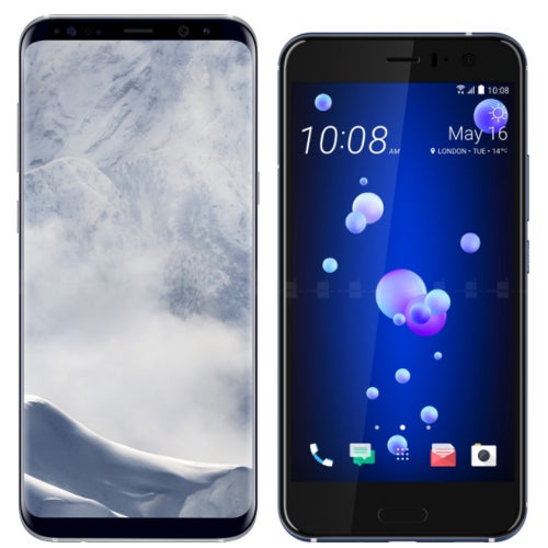
HTC 10's heading. While 2016 HTC said "let's make a solid, basic, no-nonsense metal phone", this year's decision was more in line with "Go shiny and try a different gimmick!". Not necessarily bad, experimenting keeps this industry from going stale, and we certainly appreciate the super-shiny liquid finishes on the
HTC U11 phones. But that squeeze feature? Eeeehhh...
On the other hand, we've got the
Samsung Galaxy S8+ — another shiny flagship that tried to... expand borders. Sammy's phones have that super-long display with a ratio of 18.5:9. Additionally, they have that dedicated Bixby button, which some might say is just as annoying and nonsensical as a squeeze feature.
So, yeah, both phones have their positives and their “meh”s, but if you had to choose one — which one would you buy?
Read the latest from Preslav Kateliev











Things that are NOT allowed:
To help keep our community safe and free from spam, we apply temporary limits to newly created accounts: