What's your preferred phone screen aspect ratio? (poll results)
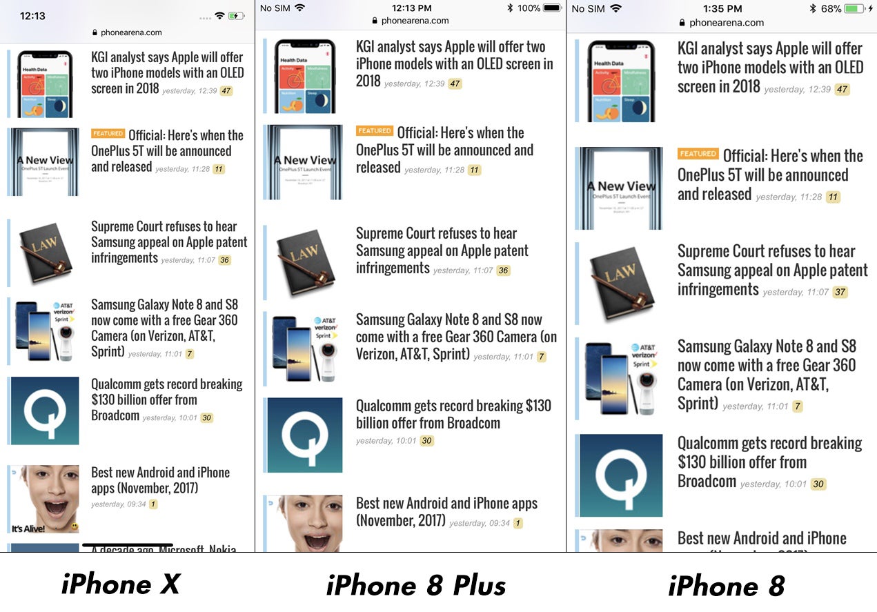
The new aspect ratio of the iPhone X does fit more content than the iPhone 8 on one screen, but it depends on the scaling, too, while video display compatibility
/www.phonearena.com/news/You-got-cropped-Galaxy-S8-and-S8-video-display-grief-comes-in-stages-heres-why_id93264" title="You got cropped! Galaxy S8 and S8+ video display grief comes in stages, here's why" class="previewtooltip" data-id="93264" data-type="article">is in favor of the legacy design
If it ain't broken, don't fix it - that seems to be the takeaway from our latest poll on mobile phone screen aspect ratio preferences. In the year when flagship phone displays from most major brands grew taller and narrower, shifting from 16:9 aspect ratios to 18.5:9 (Galaxy S8), 19.5:9 (iPhone X), or straight up 2:1 Univisium standard (LG V30), we wanted to ask you if that's ok with you, and whether you miss the older standard. It turns out that the new format is somewhat forced on users, as more than half of our 2530 respondents prefer the standard 16:9 ratio that is compatible with most everything out there. Sigh.
What's your preferred phone screen aspect ratio?
Legacy 16:9
54.56%
The new ~18:9 tall and narrow screens
45.44%
The thing is, the 2:1 ratio or the ones gravitating around it, is shifting downmarket to midrangers, and next year we might see most phones moving to the tall and narrow paradigm. There are downsides and advantages to both formats, but, needless to say, the old one of, say, the iPhone 8, is compatible to every app and video out there, whereas on the iPhone X those have to be rewritten, or clips run in stretched-out and cropped or black-barred modes. Ditto for the difference between the Galaxy S8 and S7, for instance.
The advantage of 2:1 (or 18.5:9, or 19.5:9), is that it allegedly can fit more content on one screen while browsing or reading, but something tells us that once the first manufacturer went tall and narrow, allowing them to boast a 6" display in a heretofore 5.5" body, everyone felt obliged to follow, regardless that the screen area remained largely the same in both formats. Watching YouTube vids, for instance, makes you lose up to 20% of your screen real estate in black bars on the new display format, or stretches it out of proportion, cropping some content in the process.
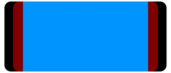
Your 6.2" Galaxy S8+ fits about as much YouTube vid as the 5.5" S7 edge
Furthermore, whether or not there will be more content shown on the display of the tall and narrow phone depends more on the scaling and fonts used, so the iPhone X often doesn't show much more of it compared to, say, the iPhone 8 or 8 Plus, even though it uses seemingly smaller fonts, as you can see in out UI comparison above.
Follow us on Google News




Things that are NOT allowed:
To help keep our community safe and free from spam, we apply temporary limits to newly created accounts: