Welcome to a brand new PhoneArena
Hey everyone, did you know that PhoneArena recently turned 20? Yes, it's actually been that long, and if you think about it, so much has changed since our humble beginnings. Mobile technology has evolved tremendously, playing a key part in shaping the world of today, which in turn has become a very different place from the world of 20 years ago, no matter if you look at it from a technological or lifestyle perspective.
Things have changed, that’s for sure, but you know what? They’re bound to continue changing and evolving. And we’re immensely excited about the future, the impressive innovations that are no doubt right around the corner.
We're launching a complete rebranding of PhoneArena, which evolves our role in the mobile technology publishing space, so that it can better answer the needs and habits of tech enthusiasts today.
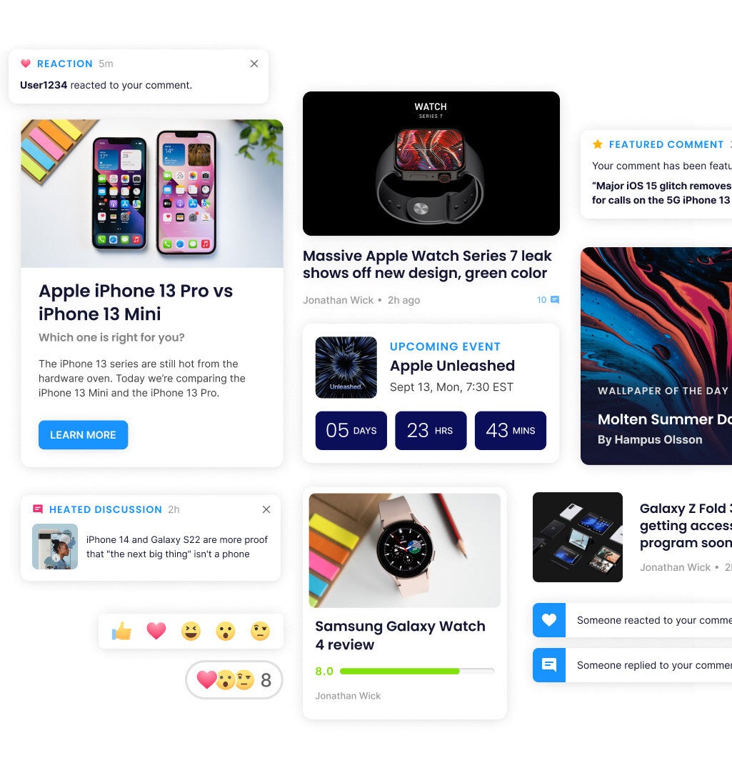
What further differentiates the new PhoneArena brand is that it'll create a space filled with positive energy that makes it a pleasure for all to consume content, as well as to interact with fellow enthusiasts. Our belief is that mobile technology aids us in living richer, more connected and productive lives, which is why we are optimistic about what comes next. We’re always looking forward to the products of the future – the gadgets and services that are going to enhance our lives tomorrow.
New PhoneArena logo
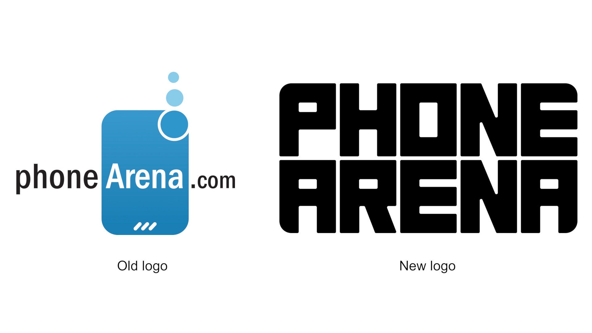
Let's begin with the brand new PhoneArena logo. The one thing it has in common with the old one is that it's extremely memorable and recognizable. Aside from that, it signifies PhoneArena's bold position in the current mobile tech publishing landscape – we're expansively creating space for mobile tech enthusiasts to inhabit, while keeping the basic shape of the phone, as this is in our DNA.
Vibrant color palette
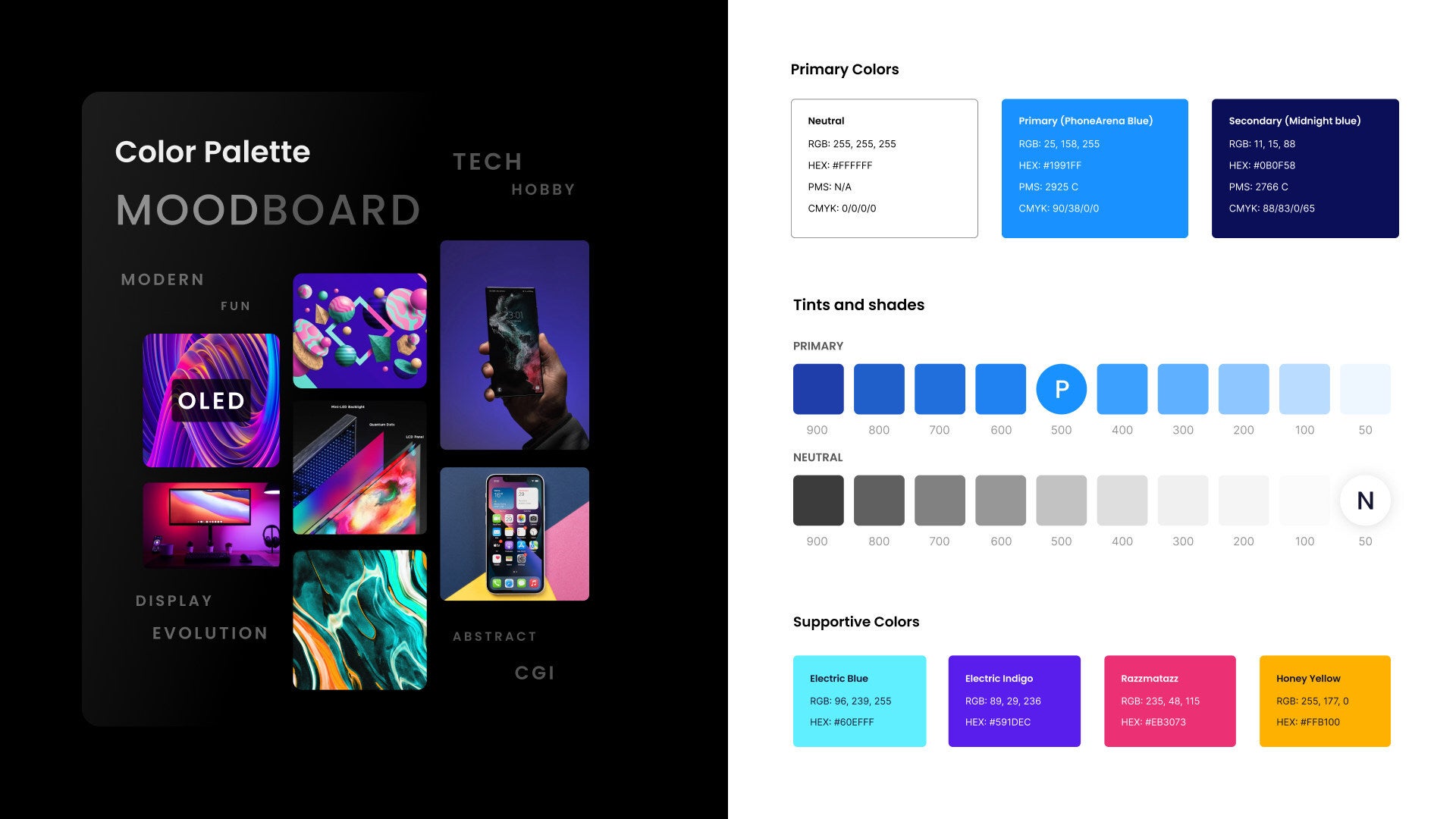
The new secondary colors work to bring our playground concept to life, and to establish a nice contrast with the primary color. This way, they serve to mark points of interest across the site's interface.
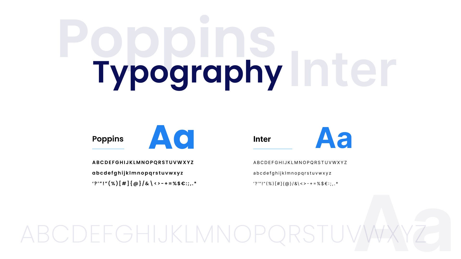
Clean and modern typography
Redesigned homepage
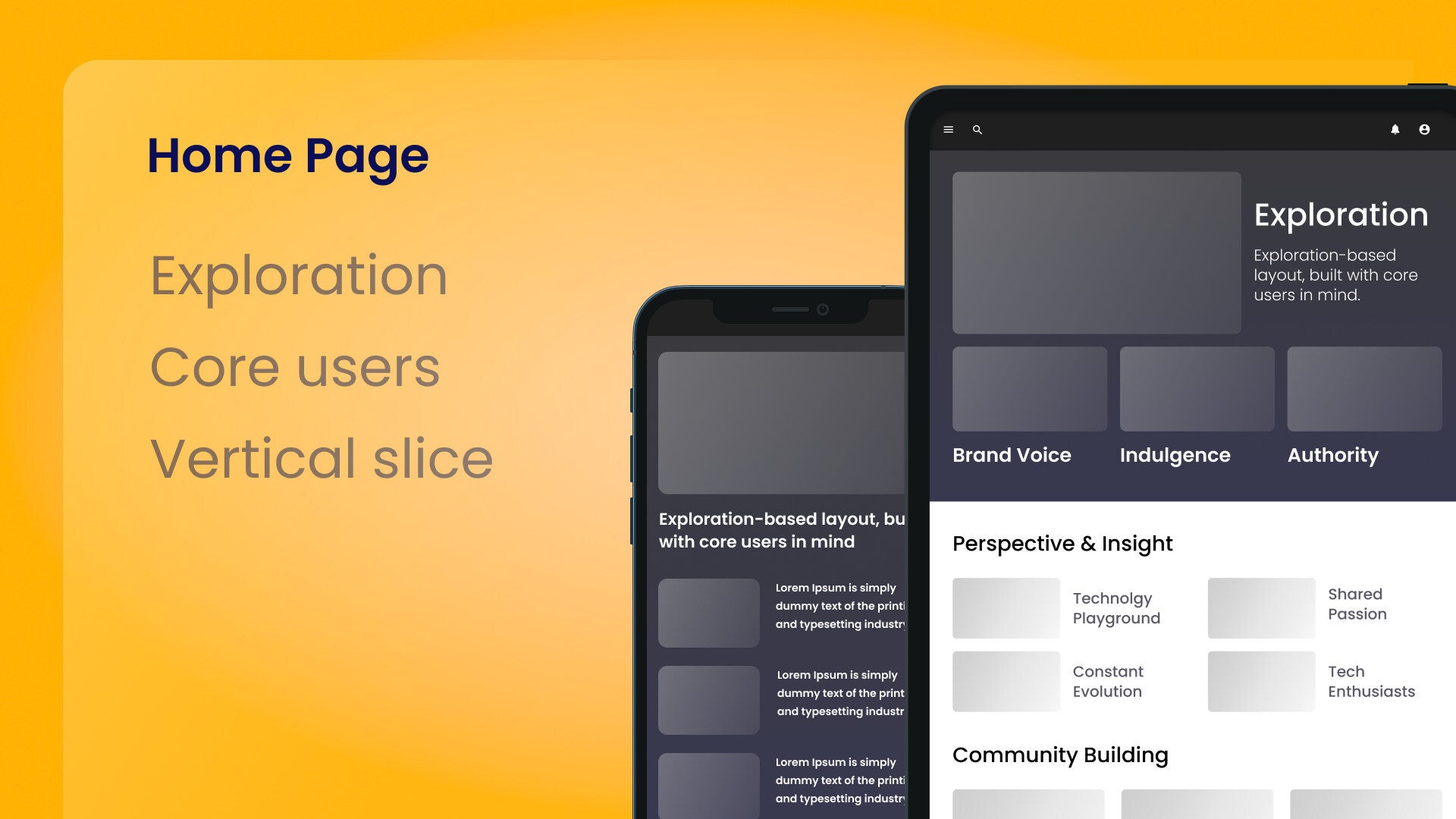
Sprinkled with visual treats as you scroll through it, the new home contains new Author Spotlight and Community Highlights sections to bring forth the voices of both our writers and members of the community. And to further drive home our focus on indulgence, we’re also launching a new ‘Wallpaper of the Day’ widget, in collaboration with Hampus Ollson, the artist behind wallpapers from OnePlus phones.
Purposeful Tone of Voice
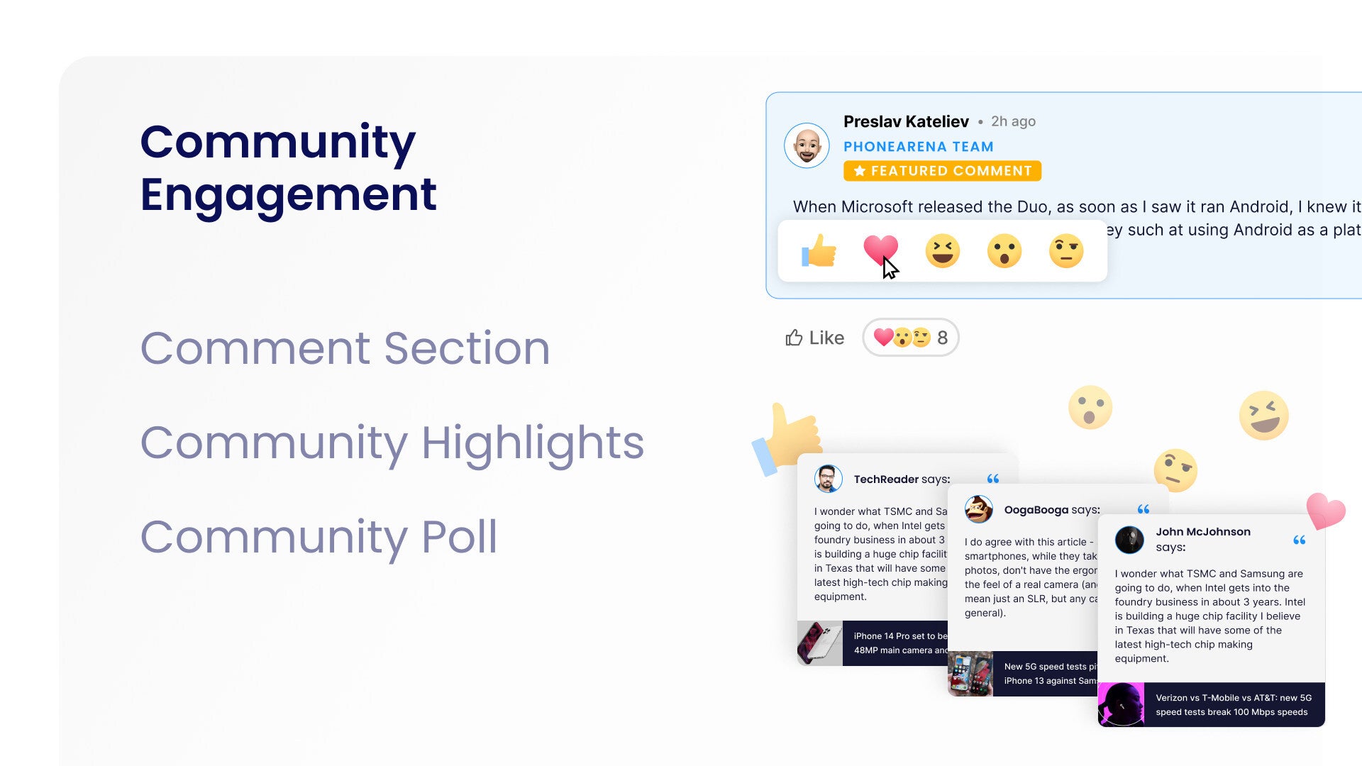
Vastly improved comments experience
You now have a much richer ability to express yourself with new formatting options, as well as to interact with the comments of others through the new Reactions feature. A considerably optimized layout to comment and reply threads is also coming, allowing for an easier and more comfortable viewing of threads. What's more, we're now pushing personalized notifications in our Notification Center whenever an event specific to you has happened, such as a new reply or reaction to a comment of yours.
Because the connection element is so central to our new brand identity, one of our major new initiatives aims to dramatically enhance the interaction between our writers and members of the community. You've already seen it happen, and you can definitely expect our writers to join the discussions below articles way more often.
Advanced user profiles
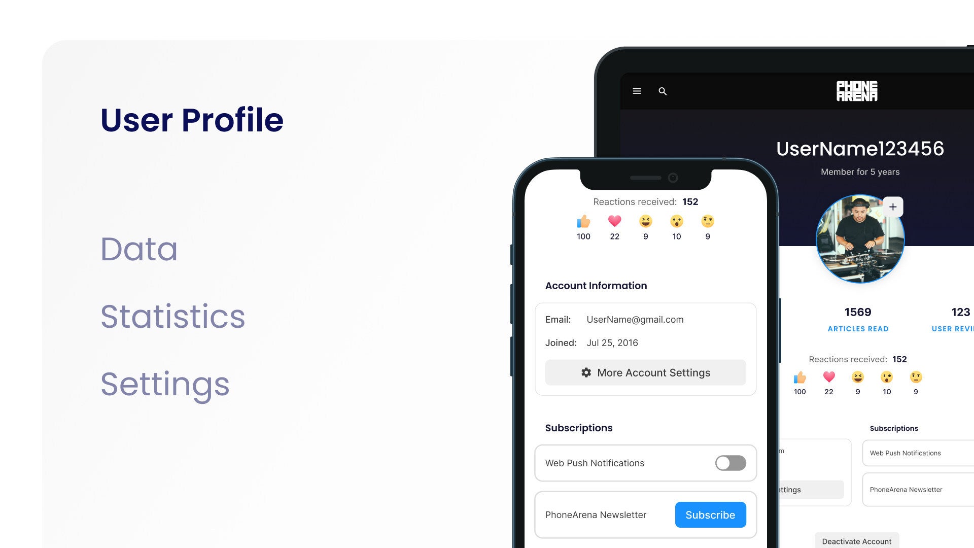
User profiles are incredibly important, which is why we've given them a much needed overhaul. The initial batch of improvements includes richer data and statistics about the user's experience on PhoneArena (such as the number and type of reactions they've received, the number of articles they've read, or the user reviews they've posted), as well as advanced settings for more granular control.
New content formats
We're so happy to have you here, because it is you, our readers, who make PhoneArena both possible and useful. We welcome you today, to a brand new PhoneArena, and we're just getting started.
Follow us on Google News








Things that are NOT allowed:
To help keep our community safe and free from spam, we apply temporary limits to newly created accounts: