We got to see plenty of the redesigned Pixel launcher at Google I/O
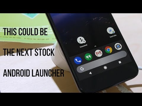
While I was collecting video footage of Android Instant Apps, the Googler who was helping me out said, matter-of-factly, "What do you think of the redesigned Pixel launcher?" He was so nonchalant about it that it did not even occur to me it was something new that would make the interwebz would go all abuzz.
First, it offers up a better use of space. Second, it makes even a larger-screened device more accessible for quick searching since it eliminates the need to reach up and across the screen to begin typing a search (assuming you cannot just talk to it), though I wonder if anyone at Google has observed a higher incidence of erroneous thumb taps on search instead of the apps that are docked for quick access.
What do you think about this idea? Another Googler told me that this redesign is only an experiment, but perhaps he was just trying to wave me off the trail.







Things that are NOT allowed: