Watch a short summary of the Windows 8 BUILD conference presentation detailing the new interface

Lifehacker has gone through the trouble to sum up Microsoft's epic 3 hour BUILD keynote presentation last night to eight minutes visually detailing all the info spilled about the upcoming Windows 8 so far.
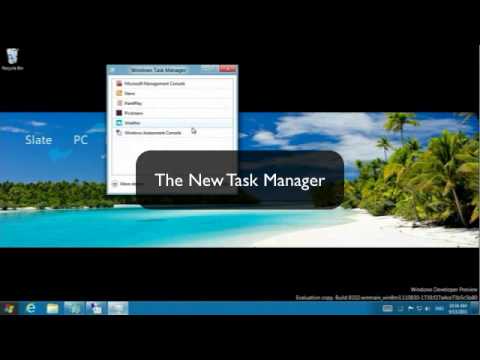
The big change, of course, is the simplified touch-friendly interface inspired by the Metro UI on Windows Phone, including the ability to show the old desktop interface on one monitor, and the new one with the Live Tiles on another. There are smaller tidbits, however, that we would have been talking about a lot more if Windows 8 was just an incremental update to the current desktop version of Windows 7.
These include reading into and mounting disk image files directly from Windows, as well as an antivirus program built-in, but also numerous other thingies, like the ribbonized navigational bar on top of windows, as well as new Explorer, Task Manager and Control Panel interfaces. Execution seems a bit rough around the edges, but let's not forget we are still in the developer preview stage and things are likely to become way more polished for the time when the first tablets with Windows 8 hit the shelves next year.
source: Lifehacker







![Some T-Mobile customers can track real-time location of other users and random kids without permission [UPDATED]](https://m-cdn.phonearena.com/images/article/169135-wide-two_350/Some-T-Mobile-customers-can-track-real-time-location-of-other-users-and-random-kids-without-permission-UPDATED.jpg)


Things that are NOT allowed: