Google Play Store redesign gets pushed out once again
Earlier this year we told you that Google was rolling out a redesigned UI for the Google Play Store. However, the update that was started in May and continued in June was eventually halted by Google and pulled before it was widely disseminated. Those who had received the new UI would suddenly find the old interface when they opened the Android app storefront.
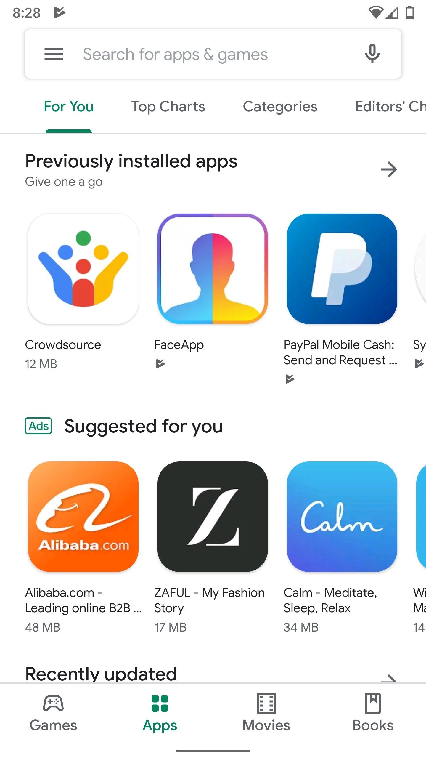
According to some Reddit posters (via Droid-Life), it would seem that the rollout is back on track. The update includes the new Material Design with the use of Google Sans font. And of course, there is plenty of bright white background available to melt your retinas, but there is no dark theme to soothe your eyes. However, Android Q with its system-wide dark theme is just weeks away.
One of the best changes being made to the Google Play Store UI moves the tabs from the top of the screen to the bottom. This way you won't have to perform some difficult finger calisthenics in order to tap on one of the options such as Games, Apps, Movies, and Books. The Music tab has been removed although it is available from the menu that slides out from the left side of the screen.
The Google Play Store update is getting another try
The Google Play Store redesign has yet to reach all Android users, but should be arriving on your handset soon.







Things that are NOT allowed: