Upcoming Note 7 'Grace' UX beta vs TouchWiz on the Galaxy S7 (video)

Samsung is test-driving a new TouchWiz interface version, which will probably make a cameo with the Galaxy Note 7 in August, hence the name Note UX. It is currently being employed to beta testers with Note 5 handsets in Korea, and known internally as Project Grace.
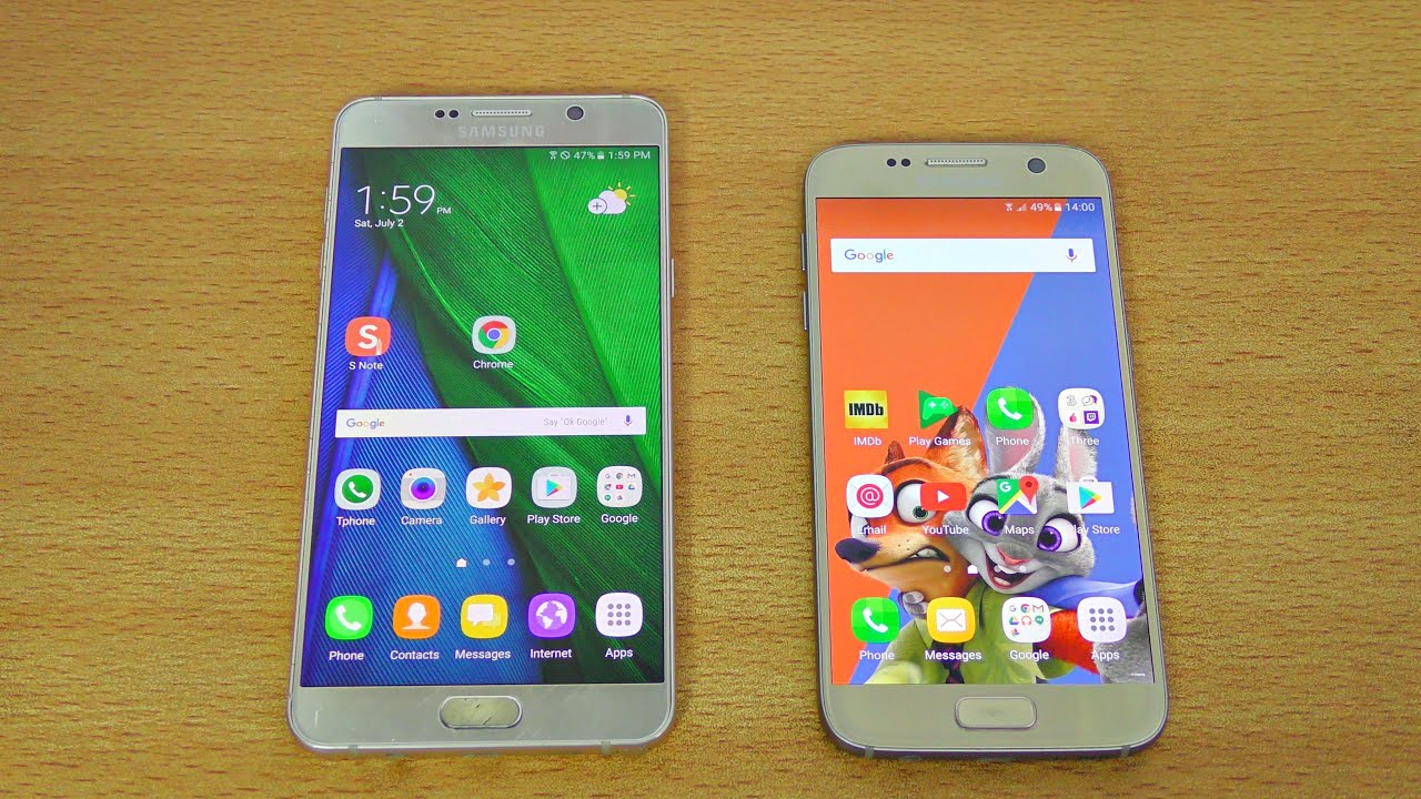
While the new interface keeps the general shape and familiar form of TouchWiz, the icons have been smoothed out and made more consistent - a common complaint with Samsung's overlay - but there are also other changes, like unifying the Action Memo or S Note into one apps called simply Notes, or adding a blue light filter in the status bar toggles.
Until you wait for Project Grace to grace your handset, which won't happen before the Note 7 hits the shelves towards the end of the summer, you can preview all the changes that the beta version brings being compared to the current TouchWiz iteration on the Galaxy S7. Keep in mind that this is still not a final iteration of the Note UX, so some features might be added or subtracted, but still, you will get a pretty good overview from the comparison video below.







Things that are NOT allowed: