Ubuntu Touch preview for phone hands-on (Nexus 4)

Canonical released the Ubuntu Touch Preview today, so obviously we had to wipe our Nexus 4 and load up Ubuntu for a hands-on test. You've likely already seen the videos and release info for Ubuntu's new phone optimized OS, so we'll just jump into it. The Touch Preview is version 12.10, and the final phone version is planned for 13.10 (October 2013), so this is a very early build, and as such, just like in the Nexus 7 Ubuntu hands-on, there are a lot of things missing and not working so well.
As we mentioned, the Ubuntu installer tools and instructions are all Ubuntu terminal commands, so there's no Windows or Mac support just yet. Luckily, that doesn't phase us and the install was actually extremely easy. The first thing we noticed upon booting up Ubuntu is that the device is pre-populated with contacts, and fake Twitter/Skype/Facebook/email notifications. The reason for this seems to be because the core apps are still in the process of being built by the community, so there are only web apps available in the preview image. There is no way to pull your mail, contacts, or social networking data into the system, so you don't really get the full effect of the "personalized artwork" on the welcome screen. Instead, it constantly tells you about the same "14 tweets received".
Overall, Ubuntu looks really nice. Everyone else may want to use other operating systems as reference for what you see in Ubuntu mobile, but to me the OS felt like Ubuntu. I have been using Ubuntu on my laptop as my primary OS for quite a while now, and the experience on the tablet felt like I was still in Ubuntu. The home screen is a modified Dash, and the launcher is the same as the Unity bar. The OS uses big bold graphics, and looks great. The only thing that was a bit annoying with the presentation is that the OS is locked into portrait mode on the Nexus 4. We actually haven't seen anything with a landscape view on the phone, so it's unclear if that's going to happen or not.
Unfortunately, navigation isn't very intuitive all the time. The gestures to get to the Unity launcher, or switch through open apps is nice, but once you're inside apps, navigation isn't very consistent. In some cases there is a carat near the top to bring you back, and sometimes you have to swipe up from the bottom to get at the back button. There's still a lot of time to fix this stuff, but it did make things a bit disorienting. It was a little better on the Nexus 4 compared to the Nexus 7, because the gesture from the bottom edge to get the controls was easier, but still not great so far.
Ubuntu is looking really nice. Even though you can make calls and send texts, it's nowhere near ready to be your primary driver, and really isn't even ready to be your backup OS just yet, but it has a lot of potential. And, since there's still about 8 months before the official release, there's plenty of time to put things together. For more, check out the video below, and be sure to check out the Nexus 7 hands-on as well.
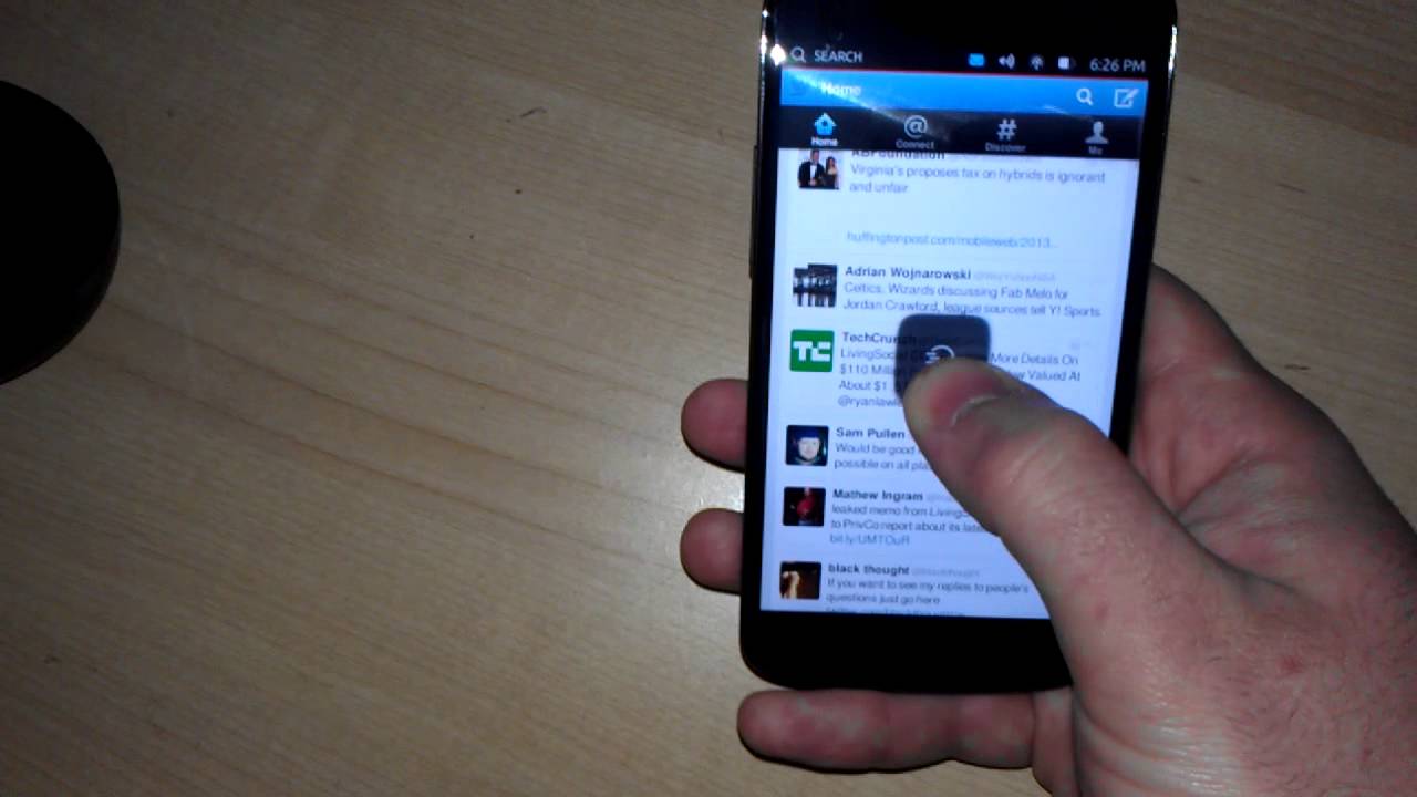
Unlike the performance on the Nexus 7, which was not very good at all, the Nexus 4 runs Ubuntu very well. This is partially because the Nexus 4 is a more powerful device than the Nexus 7, but also likely because Canonical has been putting more work into getting the phone side done, because it is due out first. The tablet optimization isn't due to be final until April 2014. The OS is smooth, transitions are pretty crisp. There is some lag here and there, but nothing compared to what we saw with the Nexus 7.
Overall, Ubuntu looks really nice. Everyone else may want to use other operating systems as reference for what you see in Ubuntu mobile, but to me the OS felt like Ubuntu. I have been using Ubuntu on my laptop as my primary OS for quite a while now, and the experience on the tablet felt like I was still in Ubuntu. The home screen is a modified Dash, and the launcher is the same as the Unity bar. The OS uses big bold graphics, and looks great. The only thing that was a bit annoying with the presentation is that the OS is locked into portrait mode on the Nexus 4. We actually haven't seen anything with a landscape view on the phone, so it's unclear if that's going to happen or not.
Ubuntu is looking really nice. Even though you can make calls and send texts, it's nowhere near ready to be your primary driver, and really isn't even ready to be your backup OS just yet, but it has a lot of potential. And, since there's still about 8 months before the official release, there's plenty of time to put things together. For more, check out the video below, and be sure to check out the Nexus 7 hands-on as well.






Things that are NOT allowed: