This is the new LG G4's UX 4.0 interface
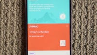
After months of rumors, and more recently – official teasers – the LG G4 has arrived. You and us both will be spending quite some time discussing the many aspects of the device, but right now we wanted to focus on just one of them: the UI.
There are a few rather major developments taking place here. First off, LG is transitioning to a new version of its custom interface, dubbed UX 4.0. As you can imagine, the new code is based on Android Lollipop – the 5.1 build in particular – and is adhering to Google's Material Design philosophy behind it. And secondly, the company is following the likes of Samsung by at least partially de-bloating the standard pack of apps and features that come built-in.
Indeed, UX 4.0 has done away with the enduring LG-made internet browser, and users will now have to make do with Chrome. Furthermore, certain (gimicky) features have been removed in order to streamline the user experience and (likely) lower the performance overhead. At the same time, new goodies are coming our way, including a major redesign for the camera app, which is now far more feature rich than what the LG G3 has on board. It will give you full control over the shooter, including the ability to tweak shutter speed. LG also has an answer to Samsung's Quick Launch feature, which allows you to quickly open the camera app and take a snap, called Quick Shot. All you need to do is simply double tap the volume down key at the back.
To show off these features, we took a number of shots of the interface, and we've arranged them for your viewing below. Take a look and let us know what you think of LG's most recent efforts.





Things that are NOT allowed: