This is how the Windows 10 phone interface looks like, release date tipped for September
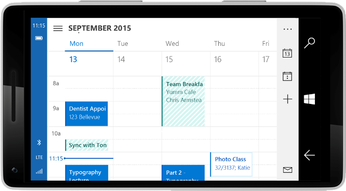
A landscape interface mode will be making a cameo in Windows 10 for phones
Microsoft made an uber-lengthy keynote yesterday, where it detailed the cross-platform realities of the upcoming Windows 10 edition, which will run one and the same app on phones, tablets, laptops, hybrids and even TVs alike, with only an interface redraw. It also laid out bare the Internet Explorer browser successor, Microsoft Edge, and made demonstrations of assorted HoloLens gear for its futuristic Windows Holographic undertaking.
What interests us most are the mobile-related announcements, though, and there were quite a few of those. Besides the opening of the Windows platform for easy porting of Android and iOS apps, Microsoft demonstrated Continuum, or how one and the same app, like Outlook, can start off on the phone, then move to a tablet, then to a laptop or even a much larger screen. The kicker is that not only your work seamlessly transitions between those, but the interface morphs to adapt for the different input methods on all of these devices. What the Windows Phone chief Joe Belfiore didn't show much of during the keynote, was the actual interface that will grace your handset when the new Windows phones hit the market later this year, but now the gaps have been filled with a dedicated post.
The official Windows blog spilled the beans on the peculiarities of the new interface, but, above all, provided a number of pictures to demonstrate it, using the Outlook app. Apparently, there will be the tried-and-true "hamburger" menu, which, unfortunately is placed at the same uncomfortable left-hand side, while most of us are holding the phones with the right. On the other hand, Microsoft will only be using it where it makes sense, and not in the Gallery app interface on phones, for instance.
Moreover, the "three dots" context menu we are accustomed to from you know which mobile OS, is present, too, but thankfully situated in the lower right corner, reachable with your thumb only. Microsoft is still mulling over the tiniest details, like whether the recent apps in the task switcher should be arranged left-to-right, or vice versa. Another very welcome novelty, and something that stock Android and iOS still don't have (save for the iPhone 6 Plus interface), is the landscape mode, which quickly redraws content and navigation imagery to fit a wider, shorter aspect narrative. Take a look below, and tell us what you think - judging from the September 2015 heading in the Calendar example, that might be the timeframe when Windows 10 for phones will hit the market.
source: Windows Blog






Things that are NOT allowed: