This is how future iOS apps' design should incorporate iPhone X's signature display notch
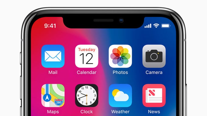
Hate it or love it, it's probably here to stay due to the simple fact that it makes the handset that much more recognizable in the vast sea of same-looking phones out there. What's more, we will probably have to get used to it because it was clearly stated that the iPhone X's design will inspire the majority of upcoming iPhones in the next few years.
So, when life gives you lemons, you quickly need to learn how to make lemonade, and that's exactly what app developers are currently doing in preparation for the iPhone X's belated November market launch. Some will do better than others, and we suspect that designer Luboš Volkov will be responsible for some sleek-looking and well-designed apps that will perfectly intertwine with the display notch.
His app design mock-up shows us an image editing app that perfectly incorporates the notch in the interface, making it look like a slide-out drawer that tucks away a cornucopia of image-editing tools. It's simple and immensely effective, proving that app developers are as courageous as Apple in their own game. At the moment, there's no information if the demonstrated design will make its way to a real app down the line, but it's pretty certain that someone, somewhere will eventually adopt this or a rather similar design philosophy into their app.
We can't wait to see other developers 'implement' the notch that good into their apps!
I was working on this idea of blending app design with the #iPhoneX notch. pic.twitter.com/lj2AhxWNeE
— Luboš Volkov (@0therPlanet) September 18, 2017source: @0therPlanet
Follow us on Google News









Things that are NOT allowed:
To help keep our community safe and free from spam, we apply temporary limits to newly created accounts: