The great selfie camera comparison: Galaxy S8+ vs LG G6 vs iPhone 7 vs Google Pixel
You can now read:
- iPhone X vs Galaxy Note 8 vs LG V30 Camera Comparison
- Google Pixel 2 vs iPhone X vs Galaxy Note 8 Portrait Camera Comparison
- Big 2017 phones Camera Comparison
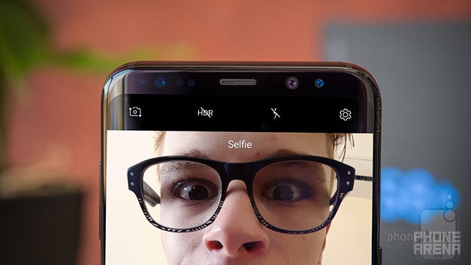
I took way too many selfies... and then compared them
People still do selfies, right? I imagine they do, seeing as manufacturers insist on including a selfie camera in pretty much every smartphone nowadays. Flagships, however, often promise better-than-average image quality, and thus constantly one-up each other. So I decided to put four of the biggest devices out there, the Samsung Galaxy S8+, LG G6, Apple iPhone 7, and Google Pixel, to the test.
But to make things a tad more interesting, I decided to take the quartet out for a spin in the Real World. So without further ado, here's how I spent my weekend:
Ready to hit the city
I decided to spare you the nitty-gritty details of my waking up and getting dressed, so here's a few shots of me just about to go out. At the time I thought I'd covered up what a mess my living space really is, but judging from the background, that doesn't really seem to be the case, unfortunately.
Anyway, right off the bat we have some very apparent differences: my apartment doesn't get that much direct sunlight, meaning all four phones had to compensate for the bad lighting conditions, which they did with varying degrees of success. The S8 shot is a tad too overexposed and saturated, as a result of which my face has lost some detail, giving the impression of the picture being airbrushed. The G6's colors are more realistic but blander, lacking contrast while also being too noisy. The iPhone 7, on the other hand, is way oversaturated and looks as if I've applied a bad Instagram filter. The Pixel did the best of the bunch here, with about the same amount of detail as the iPhone, but with a better color profile, though still a bit too reddish.
Take me to church
Unsurprisingly, the phones had some difficulty coping with a bright background / dark foreground combo. The Pixel chose to darken the whole scene, revealing details in the clouds but making everything else drab and lifeless. The other three devices, on the other hand, turned up the brightness, resulting in an almost-white background. One thing to point out here is the visible benefit of the iPhone's narrower field of view, which helps keep head proportions nice and natural, also leading to more perceivable depth.
Overall, the iPhone is better than the rest with its more natural-looking colors, despite the loss of detail in the clouds, though the G6 is a close second. In any case, however, all four pictures are pretty awful since they were taken from below (a major no-no in the selfie world; look it up if you don't trust me).
I got tired so I sat on a random bench
The G6’s pic seems like the best one here, since it’s the only one with realistic colors. The S8 and the Pixel are both too red, with the S8 also turning up the brightness and thus losing some detail, while the iPhone’s photo is just horribly yellow.
Later I met with a couple of bros
It’s good to have friends you rely on being there for you night and day, even when they’re made of metal and are also dolphins.
The sky really wasn’t as dark and cloudy as it appears in these shots, though it did rain for a bit later on. It looks that way because of the direct sunlight hitting my face, though the S8 doesn’t appear to have gotten the memo – thus, the horrible overexposure. The iPhone would have gotten the crown here if only it weren’t for the yellow tint (spoiler alert: this is a recurring theme throughout this shootout). The Pixel’s contrast is just way too high, while its tint goes hard on the magenta, which leaves us with the G6, whose colors are once again the most realistic, though the picture itself is just a bit too bright.
Then I went to the beach
The weather really wasn’t ideal for any sort of water activities, but that didn’t seem to stop all the people at the beach, whom I conveniently left out of the frame. It also didn’t stop the crazy guy taking selfies with four different flagships in a very public place, either. Also, just for the record, this is my favorite set of pics from the day.
It’s hard to mess up a beach scene, particularly one as perfectly set up as this one. And, really, neither device did – all the results here are spectacularly good, though the iPhone and Pixel shots both carry the burden of their device’s quirks: a yellow and red/magenta tint, respectively. This is perhaps the first time the S8 actually did the best, with the G6 being a very close second, but also noticeably grainier.
A very pretty flowerbed
Primary colors are hard to take good photos of, and this rule is in full force here: while the tulips were quite bright and colorful in real life, only the G6 manages to capture their actual looks without oversaturating the picture. The Pixel gets close, but its affinity for deeper reds ultimately betrays it. The iPhone is, once again, too yellow, while the S8 just turns up the saturation like there’s no tomorrow (my eye color isn’t nearly as bright as in this photo).
The G6’s photo is also the least lively of the bunch, despite offering the most accurate color representation. The moral? Real life kind of sucks.
Finally, I had some pasta
It was absolutely delicious, by the way. I found that out a bit later than I’d have liked to, however, as I was too busy taking selfies to begin eating it. And even though I took extra time to make better shots here, it didn’t seem to work out regardless: the seat I was given in this restaurant was just too dark, it seems.
Bonus: I dyed my hair!
This article has already turned into a massive vanity fair, so I might as well share these, too. I’m now officially a (fake) ginger! It’s okay, though – I never had a soul in the first place.
Here the iPhone, again, makes everything way too yellow, but, surprisingly, the Pixel does even worse with its overexposed colors. The G6 and S8 photos are almost identical, though the S8’s is slightly more saturated, and thus a bit less realistic-looking than the G6.
Here the iPhone, again, makes everything way too yellow, but, surprisingly, the Pixel does even worse with its overexposed colors. The G6 and S8 photos are almost identical, though the S8’s is slightly more saturated, and thus a bit less realistic-looking than the G6.
And the winner is… no one?
| Final score | |
| LG G6 | 8.0 |
| Galaxy S8+ | 7.8 |
| iPhone 7 | 7.5 |
| Google Pixel | 7.3 |
So there you have it – the scores indicate that, despite some problems of its own, the LG G6 is the best selfie-taking flagship from the bunch, though the Galaxy S8 comes at a close second. Both the iPhone 7 and Google Pixel did somewhat worse, but this isn’t really that big of a deal: their pictures are by no means bad, and as I said, neither of the four devices is a clear-cut winner. So rest assured, if you own either of these phones, chances are your selfies will be completely fine. Well, if you take them in good lighting and strike a good pose – but I really can't help you with that, unfortunately.



Things that are NOT allowed: