Locking your phone via fingerprint is pretty much a standard feature in high-end smartphones today. Made popular by Apple, with the TouchID introduced on the
iPhone 5s, the finger scanner has slowly become standard. And, for most of the time, it has found its home on the front of the smartphone it belongs to - almost exclusively embedded into the home button.
Experimenting with placement
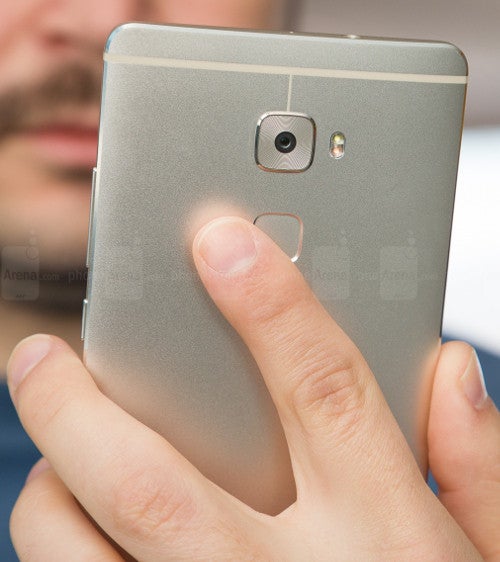
The Huawei-signature fingerprint scanner, as seen on the Mate S
Recently, manufacturers have started experimenting with different locations for the scanner. This is only natural – one needs to differentiate themselves when competing on an oversaturated market and design plays an integral part in making a product stand out. We’ve seen the fingerprint scanner moved to the back, most popular on Huawei’s devices where it's placed in a dedicated touchpad dimple, or on LG’s
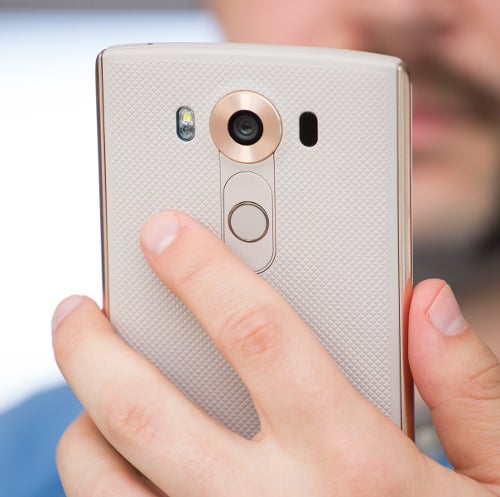
V10 where it is integrated into the power key. We’ve also recently seen it placed on the side of the smartphone with Sony’s
Xperia Z5 line where the biometric scanner is combined with the power key sitting on the right edge of the phone. But after testing and living with a lot of different handsets, I can't help but feel like the only place I would ever want the fingerprint scanner to be is on the front of the smartphone.
Of course, it can be argued that this is a matter of personal preference. So consider this opinion piece subjective, as it most certainly is, but allow me to lay out the reasons why I find the front of the phone to be the best place for a fingerprint scanner, preferably not integrated with any type of power key.
Imagine this – your phone is lying on a table and you get a chat notification...
The LG V10's fingerprint scanner is embedded into the power button on the back
The main reason for my wanting the fingerprint scanner on the front and nowhere else is — and prepare for Captain Obvious here — the ease of unlocking your handset when it’s lying flat on a surface. Sometimes we listen to music on our phone and want to quickly look for a different track, sometimes we just want to check a notification and reply quickly. In these moments, one is not planning on lifting their phone at all. A scanner on the front allows us to operate the device just this way – with no extra motions or rituals involved. A scanner on the back forces us to either lift the device, or unlock it via PIN, both variants taking more time than they should. A scanner on the side is somewhere between, but it still obliges the user to awkwardly fondle the phone until they place their registered fingertip on the sensor – by this point, they might as well have lifted the phone, or entered their PIN.
Please, separate it from the power button
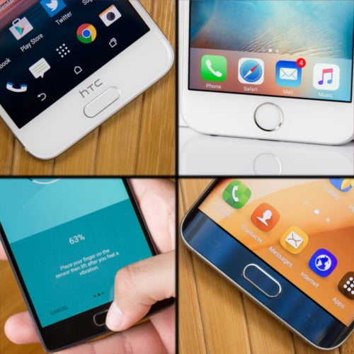
No matter whether it's a hardware button, or just a capacitive one, the home button with integrated fingerprint sensor should always be able to wake the phone
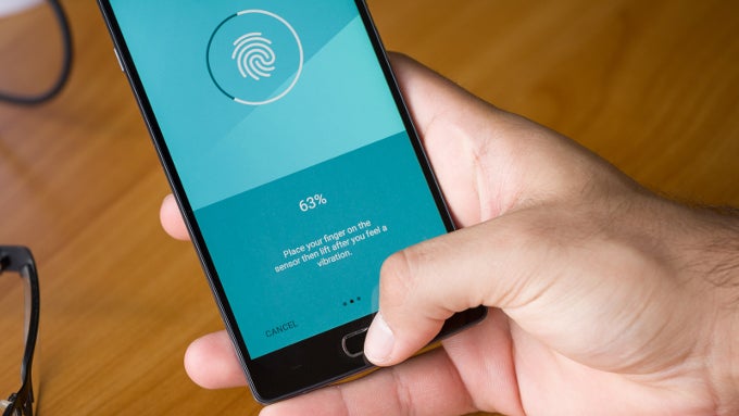
Ideally, the coveted front scanner will also have the ability to wake the phone, but be separate from the device’s actual power button. For example, it could be a physical home key, like the ones on the Apple iPhone and Samsung Galaxy devices, or, if it has to be a capacitive sensor, it should always wake the device whenever it detects a touch – like the scanners on Huawei's handsets or the
OnePlus 2. The idea here is that the phone’s power button should remain autonomous in its function of lighting the handset's screen without unlocking it — useful for times when you just want to check the time, for example. With the speedy scanners of today, waking the device with the same button that houses the fingerprint scanner almost immediately results in an unlock, completely bypassing the lock screen and leaving its huge digital clock and list of recent notifications somewhat useless.
Granted, popular phones that have the fingerprint scanner embedded into the power key will usually also have a tap-to-wake feature, so the user can wake the screen by double-tapping it.
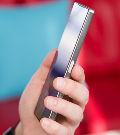
The Sony Xperia Z5 fingerprint sensor is easy to reach when phone is in hand, but not so much when it's lying on a surface
This may seem like a case-closed-ideal-solution, but is not such for users who would prefer to disable tap-to-wake. Why would they disable it? Well, in the recent time I spent with one such phone, I found that its tap-to-wake doesn’t have in-pocket protection, so I opted to disable it due to accidental unlock concerns. This could've all been easily fixed would the manufacturer have had optimized the phone's software properly, but continuing on this tangent will lead this article in the very different direction of "If you are going to make your phone have stand-out features, make sure everything works well in tandem", so let's stop that right here and keep talking about biometric scanner placements.
A side fingerprint scanner's function could easily be hampered by a protective case
Why don't fingerprint sensors belong on the side of a smartphone, you ask? Aside from the issue with operating phones that lie on flat surfaces, which we touched upon already, there is also another concern, which is a bit invisible at first. And that’s the problem with smartphone cases.
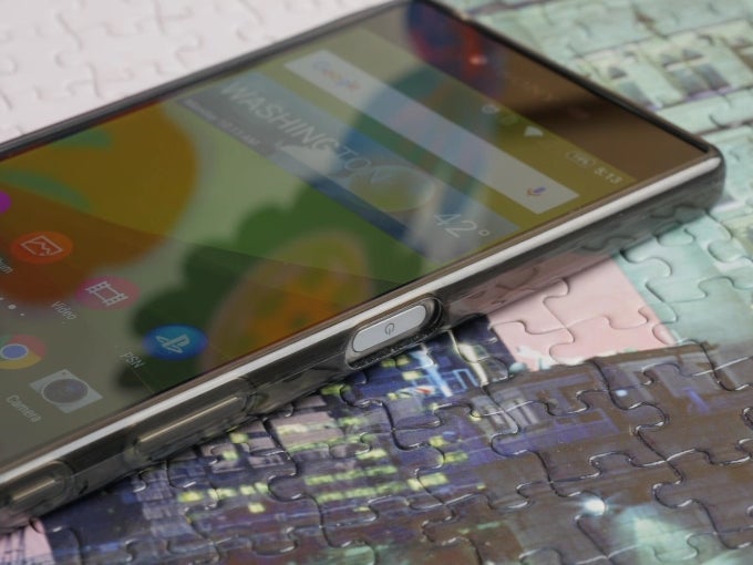
The case for the Xperia Z5 Premium made it hard for the scanner to get a proper read of my finger
At first sight – there shouldn't be much of an issue there – manufacturer makes case, case has an opening around the power button, user has access to fingerprint scanner. Sounds simple enough. But the fact is that side-mounted buttons will always end up being thin and long, sort of rectangular in shape — after all, they need to fit the profile of a rather slim smartphone. As a result, if a case is made as a tight fit for the phone, this means that access to the power button will be through a tight and narrow pocket – one that will deform the user's finger as they press in to touch the fingerprint sensor, and will more often than not result in a failed reading. The solution here is – either use a case that has a large crater around the power button (if such are designed for your handset), use a thin case (if available), don't use a case at all, or don't use the fingerprint scanner lock. And this just doesn't ring right, especially when we are talking about high-class smartphones.
Read the latest from Preslav Kateliev






Things that are NOT allowed: