The evolution of Samsung's TouchWiz UI: From the Galaxy S to the Galaxy S5 (visual comparison)

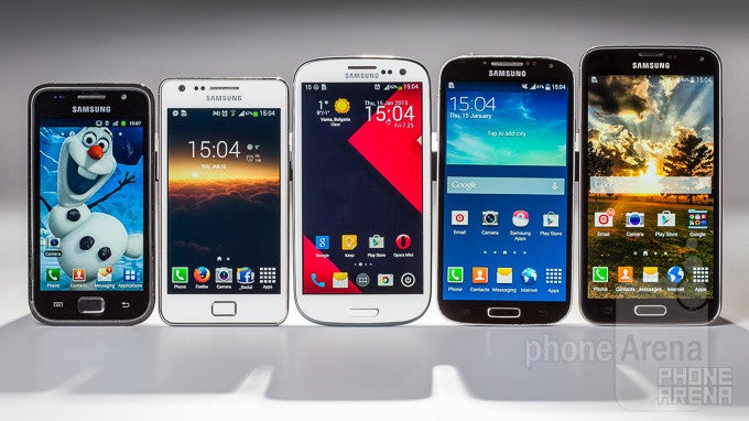
The Samsung Galaxy S family. From left to right – Galaxy S, Galaxy SII, Galaxy SIII, Galaxy S4, and Galaxy S5.
Back in March 2010, almost five full years ago, Samsung announced its first Galaxy S line smartphone. Like a clockwork, the South Korean giant has been reiterating on its flagship vision annually since, and we're now on our way to witness the sixth consecutive refresh of the Galaxy S series at MWC 2015. For the time being, however, the Galaxy S5 is the company's top-of-the-line flagship (Note series notwithstanding), and we felt compelled to showcase the kind of changes Samsung's polarizing TouchWiz interface went through over the years.
Starting with the Galaxy S, which runs TouchWiz with Android 2.3.4 Gingerbread as base, through the Galaxy S II (Android 4.2 Jelly Bean), the Galaxy S III (Android 4.3 Jelly Bean), the Galaxy S4 (Android 4.4 KitKat), all the way to to the just-updated, Android 5.0 Lollipop-with-TouchWiz-touting Galaxy S5, we'll be showing you how much (or little!) certain parts of the interface have changed. This is purely a comparison of design, of course, so keep in mind that even though some parts of the UI hardly changed much over the years, a lot of extra functionality was added on top, not to mention newer, more powerful built-in apps were also made available.
With the above in mind, jump right in and witness for yourself what 5 years of development meant for Samsung's TouchWiz.
Make sure to enter the below slideshow gallery's fullscreen mode by clicking the rectangular button on the top right!


Things that are NOT allowed: