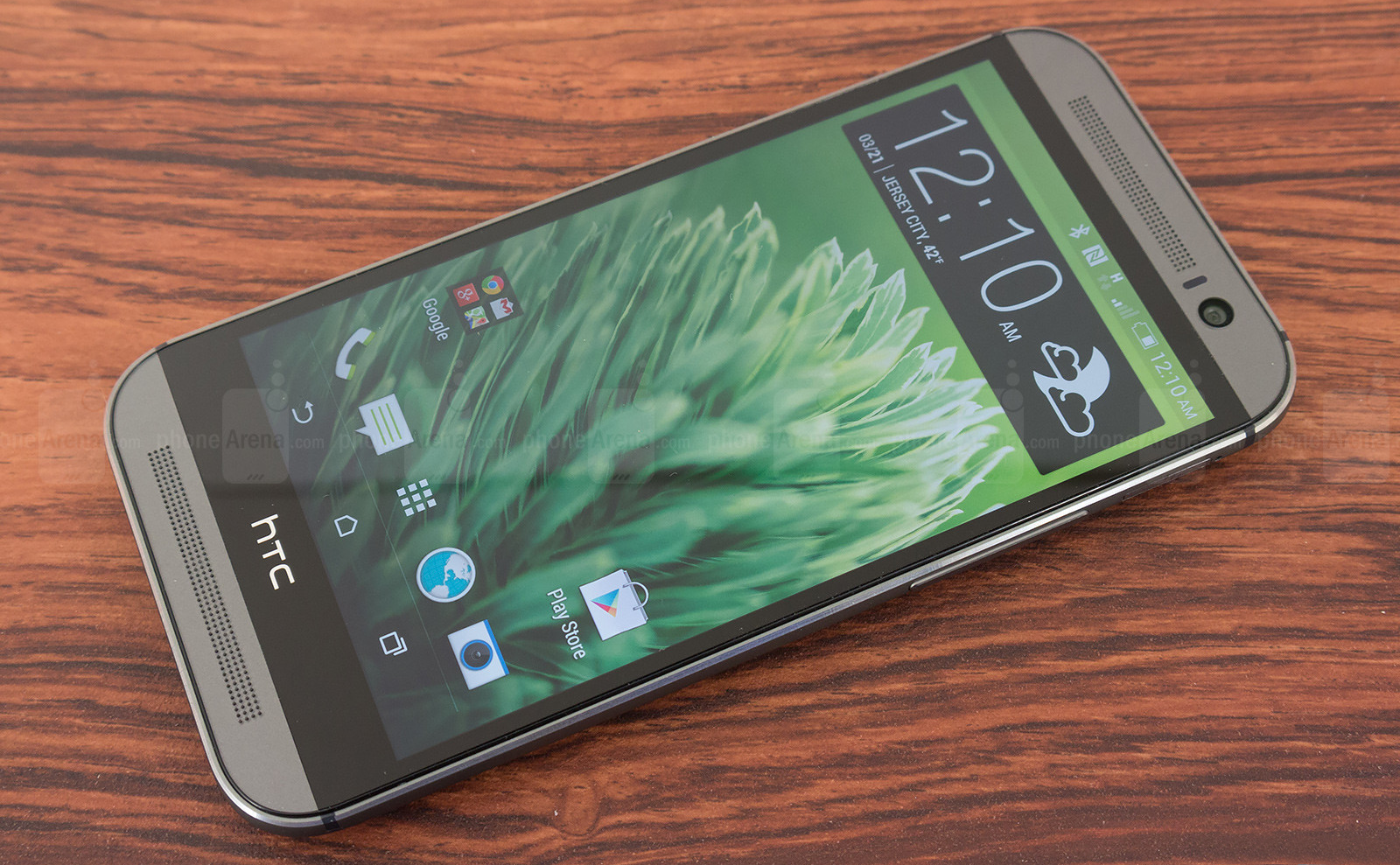
When the HTC One M8 was officially announced (and launched) last month, quite many people complained about the bezel size around its screen, and about the apparently unused space just below the display, where the HTC logo is positioned. Since the new handset comes with on-screen buttons, why is there need for that space (which included capacitive buttons on
the 2013 HTC One)?
Well,
there may not be an actual
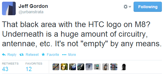
need for it, but Jeff Gordon, Senior Global Online Communications Manager at HTC, is making sure that you know it’s not just “empty” space there. He recently tweeted that underneath the “black area with the HTC logo on M8” there's "a huge amount of circuitry, antennae, etc.” He also mentioned that "stretching the screen" to cover that area "would destroy the aspect ratio."
So the M8 is what it is in the end. It is true that the handset isn’t offering the best
screen-to-size ratio among flagship smartphones, but customers who like it are probably overlooking this aspect anyway.
The One M8 went on sale in the US and the UK on March 25, with Canada, Taiwan and other markets getting it shortly after that. It will be gradually released around the world starting this month. If you haven’t done it yet, you should check out
our HTC One M8 review here to find out more about this new Android KitKat smartphone.
source: Twitter
(1),
(2)








Things that are NOT allowed:
To help keep our community safe and free from spam, we apply temporary limits to newly created accounts: