The Gboard redesign tailored for tablets might be getting some additional tweaks
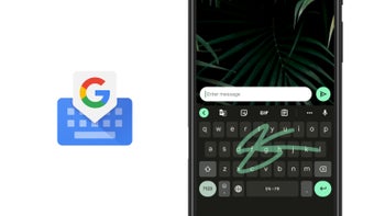
Google has been working hard at a Gboard redesign, including a foldable-friendly UI tweak that we reported on back in July as a possible Pixel Fold feature. Additionally, since the month of August, the Shortcuts toolbar on Gboard has also been the subject of redesign efforts.
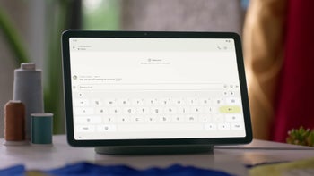
As reported by 9to5Google as part of their findings after an APK breakdown of the most recent Gboard beta released this week, it appears that Google has decided to modify the user interface to be more tablet friendly. As part of this redesign, the row of shortcuts and tools on Gboard has been given a facelift that makes them look more like keys. Each one is then placed inside of a rectangular container that has rounded corners. The layout of the container makes it possible for an additional item to be displayed because the ellipsis has been removed.
There is also one additional change to the user interface that directly affects the tablet layout. The full tablet Gboard UI debuted back in October, but should the changes in the code pan out, it looks like we will get an additional "?123" shortcut in the bottom-right corner. This would take the place of the dedicated key that hides the keyboard as seen in the below screenshots from 9to5Google:
As usual, with APK teardowns there is no guarantee that any of these features will actually make it to the final product or when exactly they will be implemented. However, because so much work has already been done by Google to promote tablet mode, perhaps in preparation for the Pixel Fold's debut, I believe there is a really good chance we will be seeing these changes happen sooner rather than later.




Things that are NOT allowed: