The 10 best new Android launchers that popped up in 2014

The year that just passed was a big one for Android launchers, with companies big and small braving to take on the established names like Nova, Apex or Go with their own take on how your phone or tablet's homescreen can look and perform. The trend of small, lightweight launchers with tiny footprint that won't be as much of a drain on your phone's resources as the big boys continued at breakneck pace, culminating in no-frills pieces that measure less than 1 MB, and get to the point for a fraction of a second.
Google itself issued a standalone launcher that anyone can peruse, and even a household name like Nokia chipped in with its Z undertaking. Meanwhile we got a number of context-oriented launchers that centred around theming, social networking or our own personalities. We've rounded up some of the best launchers that popped up last year so that you can make sure nothing's been missed or untried. Who knows, you might just like some of these newcomers and leave them as your go-to Android look and feel.
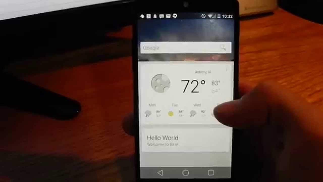
Google has been working on the Google Now Launcher (formerly known as the Google Experience Launcher) for a bit before its official launch last year, slowly expanding the availability of the app to more devices. It ultimately released the Google Now Launcher into the Play Store free for all, though. The best two features of the Google Now Launcher are, not surprisingly, ways to access Google Now/Google Search faster. If you have a supported device, and you were to install the Google Now Launcher, Google Now itself would permanently fit itself to the left of your default homescreen. And, if you want to get at Google Search, you just have to say "OK Google" when you're on your homescreen. The launcher can even import your homescreen setup from your current launcher if you want.

The new hotness this year is all about contextual alternative launchers for Android. The list of options already includes Aviate, EverythingMe, Terrain, Firefox Launcher, and Cover; but, Nokia also wants to jump in on the fun with its Z Launcher, which is now available in the Google Play Store. Like any good contextual launcher, Nokia Z will keep track of what apps you use, and when you use them; then, it will automatically adjust the shortcuts it offers at different times a day, in order to offer you the most relevant apps at all times. Although, Nokia Z seems to only focus on the time of day, and doesn't go as far as others, like Cover and Aviate, which also use your location to serve up shortcuts when you're at work or driving. One interesting feature that Nokia Z brings is "scribble", which is basically like Google Gesture Search, and allows you to draw a letter on the screen, and it will show your apps and contacts that start with that letter.

Ever wondered how your phone will behave with an extremely light and extremely barebones launcher? Well, this day has arrive, as the new APUS launcher has "small" and "fast" right into the title in the Play Store. The developer mentions that APUS is just 1 MB, which is ten times less than popular launchers like NOVA, GO, or APEX. In addition, the claims are for two times faster turning of homescreens, precisely on account of the tiny footprint of the new launcher. Naturally, you can't expect the layers and layers of features and functionality that are available with most of the popular full-fledged interface replacements, either. APUS houses apps, folders, shortcuts and widgets on your homescreen, has an app drawer and basic settings and connectivity toggles in the notification bar, and that's that. The only perk you are given are smart folders for app categorization, and the ability to get curated app search and recommendations from the launcher itself. Long story short, if you want your launcher out of the way, and would like it to consume the least amount of resources, while keeping its basic functionality intact, give APUS a try.

EverythingMe uses contextual awareness and tries to predict what app you may need at any given time. Yes, such homescreen replacement apps usually fail to deliver, but that's certainly not the case with EverythingMe – based from our experience with the app, it will successfully guesstimate the most suitable array of apps 9 times out of 10. How does it do its magic? Well, pretty simple – EverythingMe does not only take the time of day and your location into account. For example, it will show you news-related apps right after you get up in the morning, office-based ones throughout the day (while you're most likely working at the office), and even suggest you restaurants or similar venues if it finds out that you are having a walk in the evening. Being the contextual launcher it is, EverythingMe is touted as gradually becoming better and more accurate as you use it. Still, the launcher has a pretty limited set of customization options, but that's not the point of EverythingMe, after all. Thus, customization fans might see this as a potential deal-breaker, however, they may end up pleasantly surprised by the features that this contextual launchers has in tow. If you are into contextual-aware apps and launchers, such as the likes of Aviate or Cover, then you should totally go ahead and give EverythingMe a try.

Another time and location-aware launcher, it sounds a lot like Google Now to us, and we’d indeed call Aviate the Google Now of launchers. Aviate features one dynamically changing main home panel called ‘Spaces’, a second one with ‘Collections’ of apps, a third one that is an alphabetical list of all your apps, and a last one with settings and nearby places. The first and the last one feel like the bread and butter of the launcher, as they are the ones you’d use the most. All in all, Aviate is about simplicity and getting rid of clutter. Minimalists will love it - it brings relevant information in a clean and modern interface.
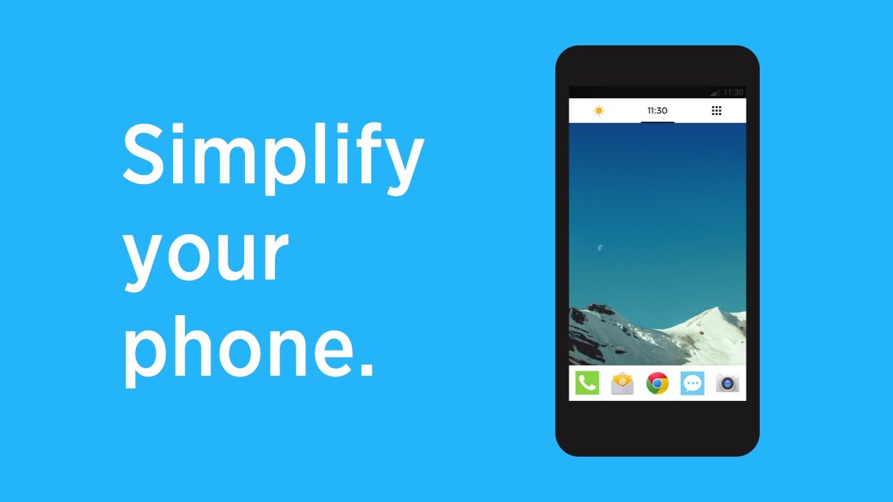
A custom Android launcher called Terrain Home that functions similarly to Google Now has arrived on the Google Play Store, but with even more cards to show you all the information you need at a quick glance. The launcher aims to make your Android user experience “simpler and more streamlined by putting everything you care about in one place,” and the app is made by a developer, sponsored by Samsung’s Accelerator start-up incubator. Terrain Home has three home panels: a central one that looks like regular Android, one on the left (swipe to the right to bring it up), with a Google Now-like card interface, and another one on the right, with an app drawer that you can easily search through. After playing with it for a while, we are definitely left with the impression of this being a mix of Google Now ideas and Aviate-like aesthetics. It is indeed a simple launcher that allows a bit more flexibility than Aviate, and it takes pride in having no battery impact. You can take a look at it below - it’s free to download.

UR Launcher is an amazing new piece, just released a few days ago, and already amassing accolades. It features the oh-so-trendy minimalistic and lightweight take on the Android launcher paradigm. It's a no-frills launcher that helps you get to your apps faster, fitting everything you need in a handy pop-out bar. Just touch the tab and get access to your recent apps, phone settings, and customization options. No more endless searching in your app drawer. Apps are sorted by profiles, called UR moods, that group together your apps by activity. Apps you need most are shown right when you need them. Moods are changed according to activity, location and preference.
In addition, UR Launcher sport a Recommended Apps section, where you can preview curated apps for each mood, discovering up-and-coming apps before everybody else. Lightning-fast search filters results from the web, your apps and your contacts. Get results fast, sorted by what you use most. Last but not least, there are tons of HD wallpapers and beautiful icon packs to make your phone one-of-a-kind. You can even assign a different wallpaper to each mood, how about that.

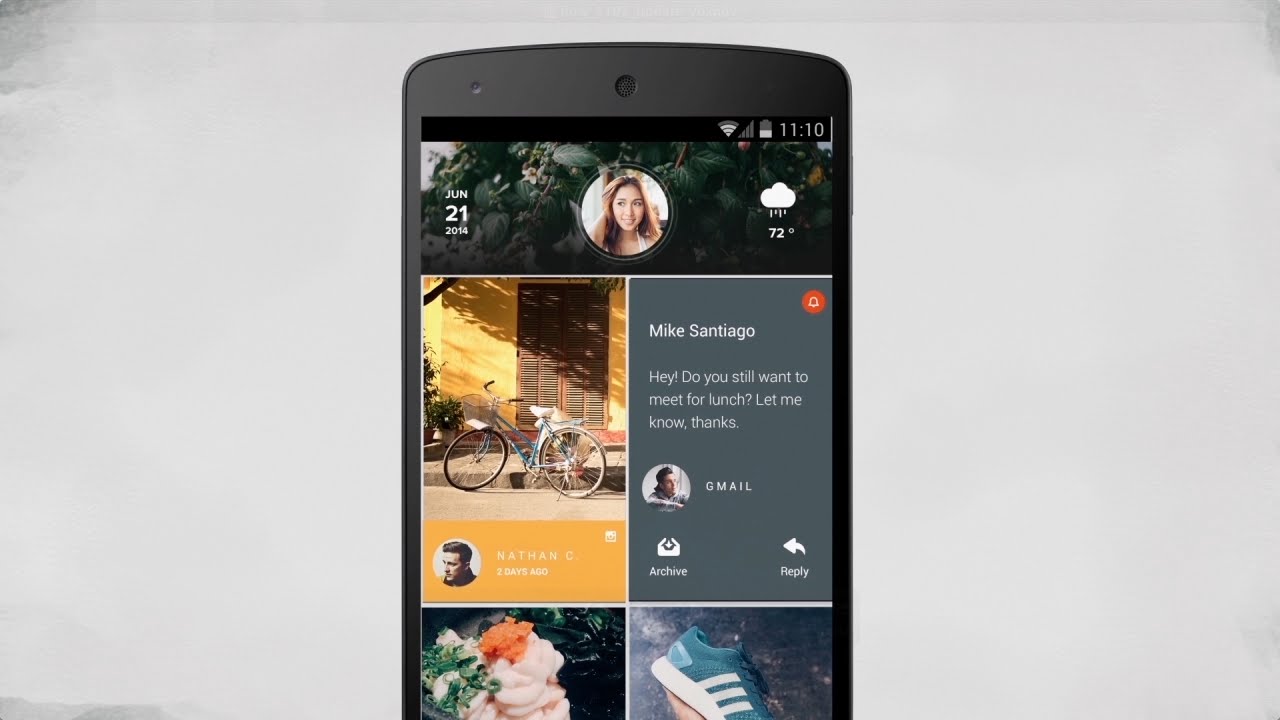
From the guys that brought us the Talon Twitter client, and the excellent EvolveSMS messaging app, now comes a new attempt at the Android launcher concept, called Blur. As crazy as it sounds, this gratis launcher attempts to take on the ultrapopular Google Now one, and introduces the ability to use it with third-party apps. Any app that is tailored for the launcher, which, for now, are the developer's own Talon and EvloveSMS, can appear as a separate page on your homescreen, so you can just swipe around to get access to these tailored apps. This is different than the plethora of sidebar add-ons and launchers out there, and resembles the Google Now Launcher in a great way. Naturally, Blur also supports the goodies you can find with most popular interface replacements out there, like widgets, text, icons, homescreen and drawer grid resizing, landscape option, and so on. Hiding apps and unread counts are added as well. Even the "OK Google" buzzword is active on Blur, so if you want to give a nice sidelined alternative to the Google Now launcher a try, hit the source link below. Make sure you watch the clip first, since a video is worth a thousand pictures, as the old saying goes.
Don't let your hopes up, Flow is still in beta, but that pesky invitation process is no more, as you can take the latest iteration for a spin from the link above, and have fun with the widget system that was just added, for instance. Flow's simple premise is organized around social media as an endless feed on your homescreen, as you can see in the video below. It currently lets you interact there with Twitter, Facebook, Instagram, Tumblr, and Feedly, with Reddit on the way.
ZERO got released back in October, and recently received such a major update that it feels like a brand new piece. ZERO prides itself on being just 1MB in size, and yet offering some fancy 3D effects, animations and transparencies. It is amazingly fast, too, with 0.2 seconds to launch, and offers free premium themes, as well as HD wallpapers and icons, with easy switching between them. As for fucntionality, besides the usual frills, you can speed up games and apps by cleaning up memory (RAM) and boosting performance with a single tap, or perform fast app search and quickly lock of the phone in a single touch.
1. Google Now launcher
Google has been working on the Google Now Launcher (formerly known as the Google Experience Launcher) for a bit before its official launch last year, slowly expanding the availability of the app to more devices. It ultimately released the Google Now Launcher into the Play Store free for all, though. The best two features of the Google Now Launcher are, not surprisingly, ways to access Google Now/Google Search faster. If you have a supported device, and you were to install the Google Now Launcher, Google Now itself would permanently fit itself to the left of your default homescreen. And, if you want to get at Google Search, you just have to say "OK Google" when you're on your homescreen. The launcher can even import your homescreen setup from your current launcher if you want.

2. Nokia Z Launcher

3. APUS Launcher
Ever wondered how your phone will behave with an extremely light and extremely barebones launcher? Well, this day has arrive, as the new APUS launcher has "small" and "fast" right into the title in the Play Store. The developer mentions that APUS is just 1 MB, which is ten times less than popular launchers like NOVA, GO, or APEX. In addition, the claims are for two times faster turning of homescreens, precisely on account of the tiny footprint of the new launcher. Naturally, you can't expect the layers and layers of features and functionality that are available with most of the popular full-fledged interface replacements, either. APUS houses apps, folders, shortcuts and widgets on your homescreen, has an app drawer and basic settings and connectivity toggles in the notification bar, and that's that. The only perk you are given are smart folders for app categorization, and the ability to get curated app search and recommendations from the launcher itself. Long story short, if you want your launcher out of the way, and would like it to consume the least amount of resources, while keeping its basic functionality intact, give APUS a try.

4. EverythingMe Launcher

5. Aviate
Another time and location-aware launcher, it sounds a lot like Google Now to us, and we’d indeed call Aviate the Google Now of launchers. Aviate features one dynamically changing main home panel called ‘Spaces’, a second one with ‘Collections’ of apps, a third one that is an alphabetical list of all your apps, and a last one with settings and nearby places. The first and the last one feel like the bread and butter of the launcher, as they are the ones you’d use the most. All in all, Aviate is about simplicity and getting rid of clutter. Minimalists will love it - it brings relevant information in a clean and modern interface.

6. Terrain Home

7. UR Launcher
UR Launcher is an amazing new piece, just released a few days ago, and already amassing accolades. It features the oh-so-trendy minimalistic and lightweight take on the Android launcher paradigm. It's a no-frills launcher that helps you get to your apps faster, fitting everything you need in a handy pop-out bar. Just touch the tab and get access to your recent apps, phone settings, and customization options. No more endless searching in your app drawer. Apps are sorted by profiles, called UR moods, that group together your apps by activity. Apps you need most are shown right when you need them. Moods are changed according to activity, location and preference.
In addition, UR Launcher sport a Recommended Apps section, where you can preview curated apps for each mood, discovering up-and-coming apps before everybody else. Lightning-fast search filters results from the web, your apps and your contacts. Get results fast, sorted by what you use most. Last but not least, there are tons of HD wallpapers and beautiful icon packs to make your phone one-of-a-kind. You can even assign a different wallpaper to each mood, how about that.

8. Blur
From the guys that brought us the Talon Twitter client, and the excellent EvolveSMS messaging app, now comes a new attempt at the Android launcher concept, called Blur. As crazy as it sounds, this gratis launcher attempts to take on the ultrapopular Google Now one, and introduces the ability to use it with third-party apps. Any app that is tailored for the launcher, which, for now, are the developer's own Talon and EvloveSMS, can appear as a separate page on your homescreen, so you can just swipe around to get access to these tailored apps. This is different than the plethora of sidebar add-ons and launchers out there, and resembles the Google Now Launcher in a great way. Naturally, Blur also supports the goodies you can find with most popular interface replacements out there, like widgets, text, icons, homescreen and drawer grid resizing, landscape option, and so on. Hiding apps and unread counts are added as well. Even the "OK Google" buzzword is active on Blur, so if you want to give a nice sidelined alternative to the Google Now launcher a try, hit the source link below. Make sure you watch the clip first, since a video is worth a thousand pictures, as the old saying goes.

9. Flow Home (Beta)
Don't let your hopes up, Flow is still in beta, but that pesky invitation process is no more, as you can take the latest iteration for a spin from the link above, and have fun with the widget system that was just added, for instance. Flow's simple premise is organized around social media as an endless feed on your homescreen, as you can see in the video below. It currently lets you interact there with Twitter, Facebook, Instagram, Tumblr, and Feedly, with Reddit on the way.

10. ZERO Launcher
ZERO got released back in October, and recently received such a major update that it feels like a brand new piece. ZERO prides itself on being just 1MB in size, and yet offering some fancy 3D effects, animations and transparencies. It is amazingly fast, too, with 0.2 seconds to launch, and offers free premium themes, as well as HD wallpapers and icons, with easy switching between them. As for fucntionality, besides the usual frills, you can speed up games and apps by cleaning up memory (RAM) and boosting performance with a single tap, or perform fast app search and quickly lock of the phone in a single touch.







Things that are NOT allowed: