Thanks to Samsung, Apple's Smart Battery Case is no longer the ugliest thing ever!
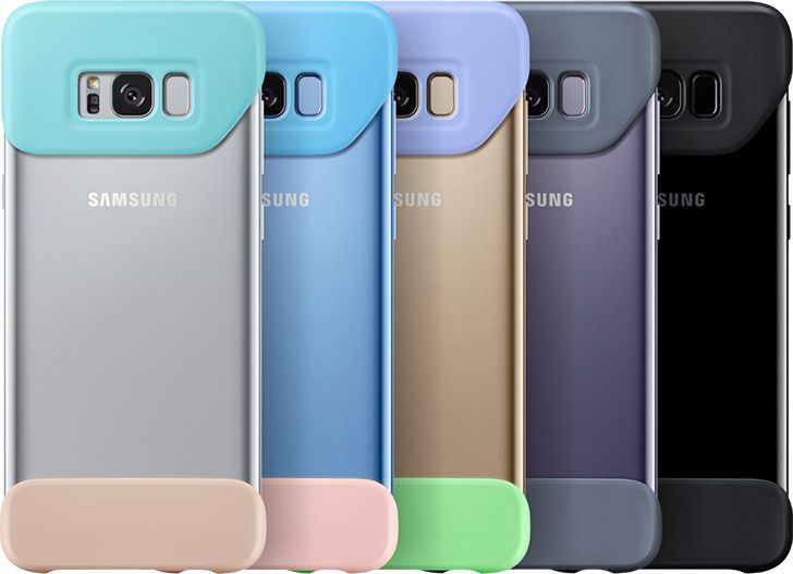
Samsung Official - "I have an idea. Let's make it ugly AND pointless!" Samsung Designer - "Say no more, fam."
What in the name of Satan's pet boar Cortez is going on here?! I demand an explanation! Samsung obliged: "The complementary hues of each cover add a unique geometric vibe that enhances Galaxy S8 and S8+'s design..." - goes the marketing blurb, obviously written by someone who never vibed with geometry and is color-blind.
This case killed my vibe.
Actually, the only remarkable geometry shown here is the Galaxy S8's, whose lanky back is left exposed and vulnerable to every mishap you'll ever have during your 24-month installment plan. The rest is a wicked mess! Apple's case has looks that would have stupefied the late Steve Jobs, but at least it has symmetry. Samsung's has nothing – it's two pieces (2Piece!) of cheap material awkwardly tacked onto the $750 pinnacle of mobile technology. Heck, it would look stupid on a $50 Amazon Fire tablet!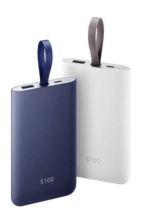
How's it hangin'? *wink*
ALSO READ
Follow us on Google News




Things that are NOT allowed:
To help keep our community safe and free from spam, we apply temporary limits to newly created accounts: