Symbian^3 refreshed UI to bring updated homescreen, contemporary looks to the platform

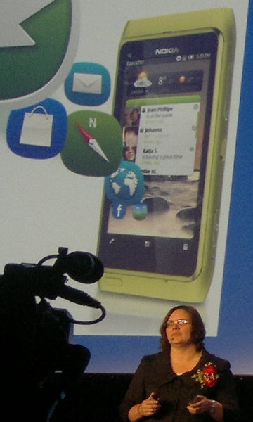
Jo Harlow presenting the refreshed Symbian^3 UI
Demonstrated on Nokia's currentflagship, the Nokia N8, the new UI looks much more compact with a thinner status barlooking similar to the one on Android. The call menu on the bottomhas also become much slimmer, while in the middle, widgets no longerlook cramped. However minor this update might seem, it gives arefreshed contemporary look to Symbian^3. The new interface mighthelp Nokia in its attempt to push 150 million more Symbian handsetsin the near future, but its a shame that such developments come whenthe platform is in the process of getting abandoned.
source: My Nokia Blog




Things that are NOT allowed: