Switching from Android to iOS Part 2: You might be using it wrong
This article may contain personal views and opinion from the author.
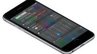
After deciding to make the switch and getting through the initial setup process, it is time to dig in and really make yourself at home on your new platform.
It probably shouldn't need to be said, but switching from Android to iOS can be difficult and frustrating, just as making the switch from iOS to Android might be. We all have learned not just how to use our mobile devices but how to make our smartphones work for us, and switching platforms requires relearning and adjusting how to get things done. The two platforms may be able to do the same general things, but the process of getting those things done can be just different enough to cause problems if you're not willing to adapt.
You might be using it wrong
One of the most frustrating aspects of using iOS in the first month of this experiment was to not allow myself to default back to grabbing my Nexus when things got rough. Surprisingly though, it wasn't until I swapped my SIM card back into my Nexus for a day that I realized I was using my iPhone wrong. The biggest difference between Android and iOS is that apps on Android can become a more native part of the system, whereas iOS is a system designed to push you into apps.
Not acknowledging this difference at first led me to not feel as productive in iOS as I was in Android. On Android, I've got all of my most-used apps buried in folders across two homescreens, and I've got three must-have widgets (Todoist, Timely, and Weather Timeline) for quick access to info. Apps didn't need to be prominently displayed because most interactions were initiated from the notification tray of Android. About 90% of the emails I receive are deleted directly from my notification tray or lock screen; messages are responded to from the notification tray (or at least the reply button will bump me straight to where I need to be in the app); and, content notifications brought me directly into the app where I needed to be.
Attempting this on iOS led to one month of struggle because notifications and Today screen (aka widgets) share the tray at the top of the screen. While you can do most of the same things from notifications in iOS, focusing on that element made me miss my widgets. I didn't want to have to lose that info, take up space on my homescreen, or have to dig into apps to get what I wanted. So, I decided I needed to rid myself of the notification screen completely in favor of the Today screen.
To fix my troubles, apps I normally would have bundled into folders needed to be pulled out onto the homescreen for easier and faster access (the slow iOS folder animations also needed to be avoided at all costs.) Once the app shortcuts were easier to access, I could jump into the app when I saw a notification without checking the notification tray at all. And, once I stopped using the notification tray so much, I was able to focus the pull-down shade on the Today screen for easy access to widget info.
Getting into the groove
Once I made some changes to how I used iOS, things fell into place and everything was pretty smooth. There were some things here or there that I didn't quite like or preferred how it worked on Android. Nothing was a dealbreaker and there were also some little things that were better, but overall it was a bunch of little trade-offs.
For example, dictation is slightly better on Android in terms of understanding names and autocorrecting words based on context, but (in a bonus for a grammar nerd like me) iOS can do more in terms of punctuation. So with iOS, I could say things like "open/close parenthesis" or "quote/end quote" and it would put in the proper punctuation where those options don't exist on Android.
iOS was pretty quick to learn from its mistakes (to a point) as well. When I first started, it couldn't understand my wife's name (Nadja) but it eventually figured it out (the same happened with Google). And, when I first started using Apple Music, if I misspelled an artist's name even slightly, Apple Music would return nothing at all and I'd have to go to YouTube (a Google property) to figure out what I was doing wrong (like searching "Little Dicky" rather than "Lil Dicky".) Just one month later, I'm not seeing those sorts of problems anymore, but other strange issues have persisted, like Siri constantly claiming that it couldn't find contact information for people who were obviously in my contact list.
Overall though, I found iOS to be solid, smooth, relatively easy to use, and I could understand why it's the platform of choice for so many people. I don't know that I would be able to accept the singular hardware design handed down by Apple each year (the iPhone 6 Plus was crazy slippery and I refuse to use a case on well-designed hardware), but I can certainly see why someone might choose Apple.
Next time...
All that said, the barriers to switching were too high for me and I'm happy to be back with my Nexus 6P. But, I'll get into that in the next (and likely final) installment.
Follow us on Google News





Things that are NOT allowed:
To help keep our community safe and free from spam, we apply temporary limits to newly created accounts: