Spotlight: Sapphire UI launcher bows down to Google services and simplicity of use

Can you imagine an Android launcher that's cleaner and purer than Google Now? With its simplicity of form and function, Sapphire UI is kind of difficult to put into words, but here's the gist of it. The launcher is based around Google+ and Google Now, facilitating its voice recognition abilities and offering customizable gesture controls.
Posing as a Google Plus companion, Sapphire's core functionality is designed around a few common mechanics. First, you can touch & hold the background to access a context menu and gain access to Settings, Widgets, and some other stuff. You can also tap the floating button to enter the Fabrication menu, opening a line of shortcuts to different parts of the launcher. There's also logging in to your Google Account to access Google Plus specific features right from the Settings menu.
Reaching the 'Settings' menu, we get reasonably deep customization options, such as selecting the number of Workspace rows and columns, extending workspace, and the launcher's meat and potatoes - creating and viewing custom gesture controls. You can also adjust the input settings for gesture usage, tailoring them to your unique needs.
To really get Sapphire UI, you must try it out for yourself. If what you've read so far hasn't sealed the deal, you should really consider the Google Plus Integration (view, post, and share to your feed), the exceedingly simple navigation, the Google Now shortcut bar, those lovely dashboard cards, the quick access to Google Plus; the optimization for Android L & M that's in place, and the light toll taken upon your device's battery life.
Sapphire UI is currently in beta, and we definitely wouldn't recommend it to the casual user looking for something visually intense and completely straightforward. Power users and Google faithful, though, should pounce on it immediately and help the developers with their cause.
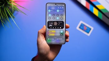
Sapphire UI's flagship feature has to be the Dashboard, which is where you'll see a bunch of cards containing data and toggles to connection, brightness settings, and other features - a familiar sight from Google Now, but definitely not the same thing.
Reaching the 'Settings' menu, we get reasonably deep customization options, such as selecting the number of Workspace rows and columns, extending workspace, and the launcher's meat and potatoes - creating and viewing custom gesture controls. You can also adjust the input settings for gesture usage, tailoring them to your unique needs.
To really get Sapphire UI, you must try it out for yourself. If what you've read so far hasn't sealed the deal, you should really consider the Google Plus Integration (view, post, and share to your feed), the exceedingly simple navigation, the Google Now shortcut bar, those lovely dashboard cards, the quick access to Google Plus; the optimization for Android L & M that's in place, and the light toll taken upon your device's battery life.
| Developer: Ryan Gocal | Download: Android |
| Category: Personalization | Price: Free (with in-app purchases) |


Things that are NOT allowed: