Spotify major update intros redesigned Home, personalized shortcuts

Spotify is redesigning its mobile app again, although this time only the Home screen if getting a facelift. No matter what Android or iOS devices you're using to listen to your favorite tunes – smartphone or tablet, the Home screens will look slightly different starting today.
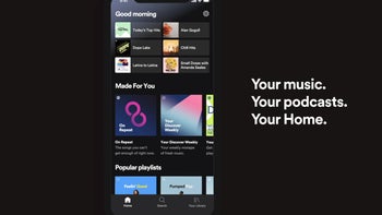
A refreshed user interface has been implemented to allow Spotify users to access familiar content easier than ever. You can now tap to access your favorite podcast, the playlist you listen to every morning, or the album you prefer during your workouts.
Spotify's Home screen has become a space where users can find their favorite content. Moreover, Spotify announced that the screen and content will change along throughout the day to fit the user's schedule.
If you're a new Spotify user, you might not see the new UI right away, but once you have 30 days of listening history, you should start to see these recommendations.
A refreshed user interface has been implemented to allow Spotify users to access familiar content easier than ever. You can now tap to access your favorite podcast, the playlist you listen to every morning, or the album you prefer during your workouts.
Six recommended playlists will be positioned at the top of the Home screen, which will change according to the time of day. Below these six recommendations, Spotify will add your top podcasts, “made for you” playlists, recommendations for new discoveries based on your listening, and even more content.
If you're a new Spotify user, you might not see the new UI right away, but once you have 30 days of listening history, you should start to see these recommendations.


Things that are NOT allowed: