Sony Xperia Z3 vs Galaxy Note 3: first look
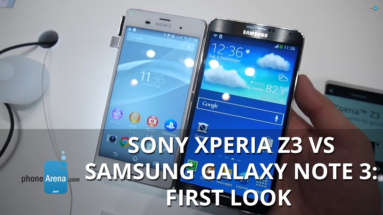
It's barely been six months since the Z2 was announced, and now we are getting the Xperia Z3. In line with our tradition to compare newly-announced flagships with current bestsellers, we are pitting the Z3 against Samsung's Note 3 phablet, despite the fact that those two don't share much in common, besides the amount of RAM.
Design
The Z3's 146 x 72 x 7.3 mm dimensions are an improvement over the Z2, though it is still a big handset, thanks to the wide top and bottom bezels. Tell that to the Note 3, though, whose 151.2 x 79.2 x 8.3 mm chassis makes it even more unwieldy to handle than the Z3. Granted, you can operate it with a stylus, but the compactness round stays with the Z3. In terms of design, the Note 3 gives way to the the svelte 7.3mm glass unibody of the Xperia Z3, which on top of that comes with waterproof abilities. The only downside here is that the Z3 chassis is sealed, so you can't swap the 3100 mAh battery, whereas the Note 3 has a removable "dimpled" battery cover, which lets you swap the 3200 mAh juicer on the go.
Displays
The Z3 screen remains a 5.2" 1080p Triluminos display, and Sony is now touting its ability to hit 600 nits of peak brightness, rivalling the Galaxy S5's screen, which our test showed is one of the best in terms of outdoor visibility. Provided that Sony has kept screen reflectivity in check, the Z3 should be great for use outdoors, even in direct sunlight. The 5.7" 1080p display of the Note 3 sports lower peak brightness, but Samsung puts great antireflectance coating on its flagships, making them very discernible outdoors, too. As for the color representation, the Note 3 sports a typical oversatured look, even in professional screen mode, though Sony can certainly match some of that in the gallery and video player, where it employs the homebrew X-Reality engine.
Interface
Sony's Xperia interface has never been as complex as Samsung's TouchWiz, providing fewer unneeded options, and keeping the balance between stock Android looks, and a branded UI imagery. The Note 3, however, sports a smorgasbord of options, aided further by the S Pen stylus functionality, and the ability to split the screen in two separate apps, the so-called Multi Windows mode. TouchWiz still looks a bit weird, though, with different iconography design decisions in different sections, making it look like a patchwork.
Processor and memory
Both phones have 3 GB of RAM, but the Xperia Z3 beats Note 3's Snapdragon 800 processor with a 2.5 GHz quad-core Snapdragon 801. Thus, all other things being equal, sony's new phone is feeling superior to the Note 3, especially in the graphics rendering department. Both handsets offer a microSD slot for storage expansion.
Camera
Despite the highest camera resolution in the Android world, Sony's Xperia Z2 can't really do the 20 MP sensor justice, and scored lower than the S5 in our camera comparison tests. When it comes to the Note 3, and its run-of-the-mill 13 MP shooter, the new Xperia Z3 should shine with smoother 4K video recording, and more detailed photos, thanks to the faster image processing, and the new G Lens kit.
Expectations
The Xperia Z3 might not be a huge upgrade, but it is already much better than the Note 3 on several fronts, such as processing power, design and one-handed operability. The Note 3 offers more flexibility, however, allowing you to swap the battery on the go, and use the S Pen stylus for various tasks. Still, the Z3 is the more ergonomic one to handle, so unless you are in a particular use for a stylus, or just ought to have half an inch of screen diagonal more, the Xperia Z3 will arguably offer more bang for the buck, provided that the price of those remains roughly equal at the Z3's launch.





Things that are NOT allowed: