$900 Xperia XZ3 vs $1000 iPhone X: can you afford these babies?
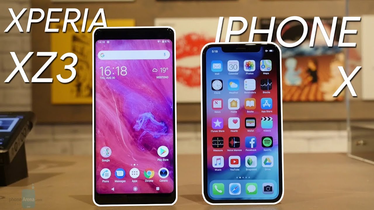
Only one of these can ever end up in an art gallery
And it's not a Sony
The Sony Xperia XZ3 keeps the design of its predecessor, and introduces only minor improvements. Most importantly, though, it's one pretty large phone! Even those the screen size difference isn't that big (6.0" for the XZ3 and 5.8" for the iPhone X), the XZ3 is considerably bigger than its opponent. This is mostly due to the larger top and bottom bezels, but also the thickness. Even though the XZ3 is thinner than its predecessor, its profile still measures 0.39" (9.9mm), whereas the iPhone X is significantly sleeker at 0.30" (7.7mm). This makes a huge difference when holding and using the handsets.
Still, Sony deserves credit for wanting to experiment with colors a little bit, so it has a total of four color variants for the XZ3, while Apple has just white and very dark gray for the iPhone X. Rumor is we're going to see a gold iPhone Xs this September.
Aside from all that, there are some little imperfections in Sony's ergonomics, such as the sharp power, volume and camera shutter keys found along the right-hand side, while such problems aren't found with the X.
With the help of its bigger dimensions, though, the Xperia XZ3 manages to escape one of the most disliked elements of modern phone-making, and that is the notch. If there is one thing to not enjoy in the iPhone X's design, that must be the screen notch at the top of the display. Still, it's a needed element to accommodate the Face ID module – something that the Xperia lacks.
Baby, all I want for Christmas... is OLED
Two spectacular displays – absolute feast for the eyes
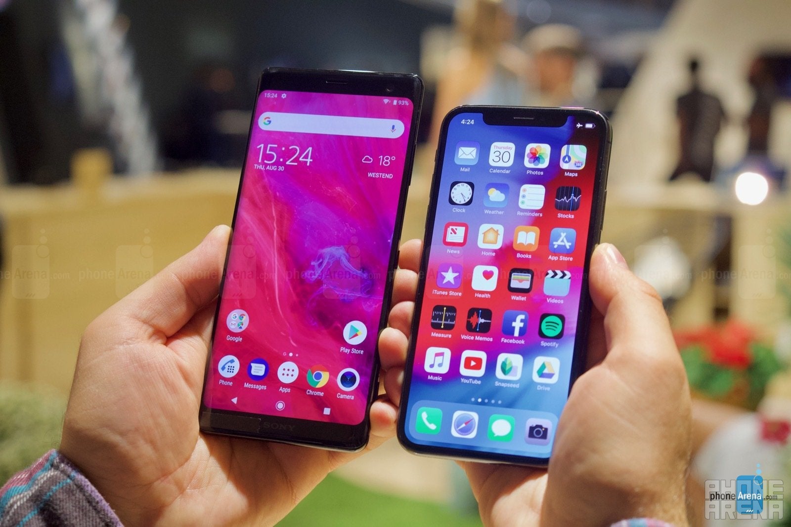
OLED is the way to go for high-end smartphones these days. This is also the main upgrade in the Xperia XZ3, as Sony has finally made the jump to OLED and a higher screen resolution. The result is a fantastic screen – one that is immediately better than anything the company has been using so far. It is a sizable 6" panel with a resolution of 1440 x 2880 pixels, and it also offers a bunch of optimizations and effects unique to Sony aiming to add a little bit of post-processing for an even punchier picture quality. The purist in us demands that we keep such effects off, but if you just enjoy the sweetened visuals, the possibility is certainly there with the XZ3.
Even though the iPhone X has a slightly lower resolution, at 1125 x 2436 pixels, its 5.8" OLED display is just as impressive, and the seamless shiny bezel running around it is unlike anything you can see in other phones right now.
Probably the most interesting thing in the XZ3's display, aside from the fact that it's gorgeous, is that it's slightly curved along the edges, similarly to what Samsung's done with the S9. In addition to the aesthetic quality of this, though, Sony has also tried to build some actual functionality around this design feature, but we have to say the results aren't flawless. Let us tell you more about this in the following section...
Software: Sony tries its hand at gimmicks
The iPhone just works
It's great that Sony will be launching the Xperia XZ3 with Android 9 Pie, although by the time it hits the market, we guess some of its Android rivals will already be running Android 9. More importantly in the context of this comparison, the iPhone X will also be running the latest software available, iOS 12, so at least in the beginning, both Sony and Apple will be having up-to-date software running on their flagships. Apple will continue to support the iPhone X much longer than Sony though, and the following updates to Android will surely be delivered with some delay to the XZ3, even more so when you take into account that the XZ4 (or whatever it ends up being called) will be launched at some point early next year, so we can imagine Sony's focus will have shifted to the new handset.
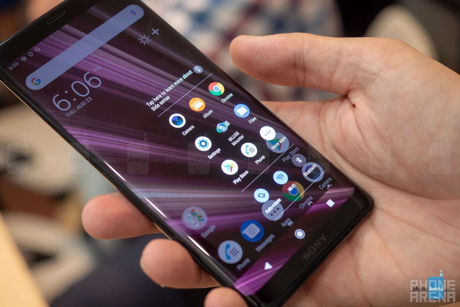
Anyway, the user interface running on the XZ3 is almost identical to what was found on Sony's previous phones. An interesting new feature Sony's added is Side Sense. It's mostly a gimmick that will unlikely become an everyday tool for consumers, but it's worth mentioning. Upon double-tapping somewhere along the edges of the phone, a small 3x3 grid of app icons appears. The thing is the apps will be different based on things like time of day, or day of the week, and of course – depending on the user. This feature aims to be context aware, and thus proactively direct the user to their next app destination based on their recent usage tendency. This actually isn't a new idea, but the real problem here is the gesture that's needed to call it up. In our short time with the phone so far, the Side Sense app grid happened to pop up accidentally, and it also happened to not pop up a few times as we were trying to summon it. Sony claims it's doing some really sophisticated detection shenanigans to avoid reliability issues with Side Sense, but at least with this version of the software, we could already see certain issues with it.
Over on the iPhone, things are far more predictable, dare we say they just work. Of course, Apple changed things up quite a bit with the introduction of the new gesture-based interface on the iPhone X, where the user needs to swipe up from the bottom of the screen in order to go home – a gesture that has successfully replaced the venerable home button. And, while Sony's Android phones are known to be fairly optimized and well-performing, the Apple iPhone X definitely runs faster and smoother. It also gives you access to Apple's complete ecosystem of products and services – something that a non-Apple phone cannot do.
The XZ3 camera is great, but the iPhone X can do the cool stuff
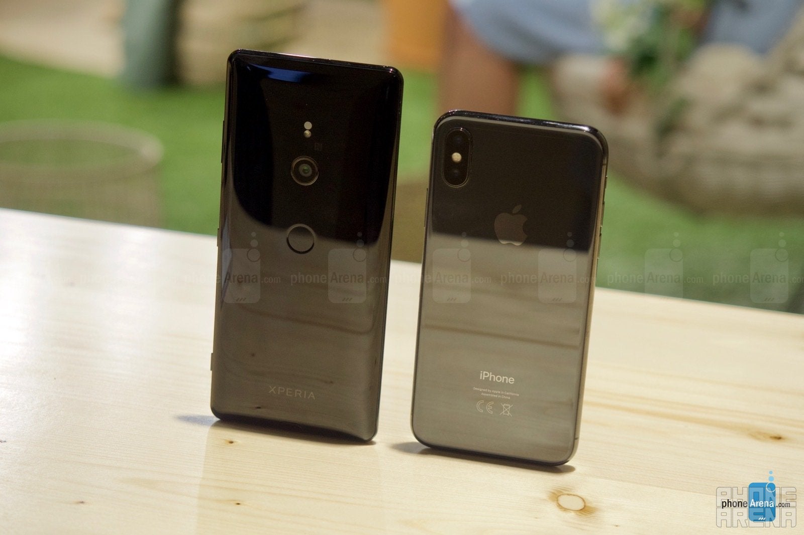
Stuff is happening in the Sony camp, but not as far as the camera department is concerned. The XZ3 relies on the same 19 MP shooter that was found in the XZ2, and it's just that: a single camera with F2.0 aperture that can still done some fancy stuff like HDR video recording or 960 fps slow-motion clips. However, over in Apple land, the iPhone X has been entertaining users with a dual rear camera capable of doing, 2x optical zoom and snazzy portrait photo effects. Even more so, it lets users take fancy bokeh portraits of themselves using the front camera, plus all the Animoji nonsense. Speaking of the front camera, Sony has a new, 13 MP selfie shooter in the XZ3, but unfortunately we weren't allowed to download and examine photos off the XZ3. We'll have to wait for a final unit to see how much better it is.
There's a new, simplified camera interface in the Xperia XZ3, which aims to give you only the essentials options, but should you need more control, all the familiar modes and advanced settings are also accessible, just hidden in a sub-menu. Over in the iPhone, things have been this way ever since the beginning, so nothing specific to talk about here. A notable new feature on the XZ3 is that it'll try to detect when you're taking and raising the phone with the intention to take a picture. Upon doing that, it'll launch the camera for you, so you don't have to launch it yourself. It sounds helpful, but if you have experience with this type of features, you may know that they often end up fairly unreliable, and may prove to be more distracting than helpful (especially when they get activated when they shouldn't).
You can check our Xperia XZ2 review to see the kind of images you can expect from the main XZ3 camera.
Expectations
Just spend the extra $100
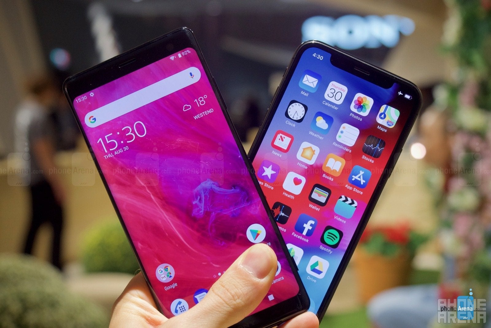
On the whole, the Xperia XZ3 is a very powerful Android 9 smartphone. If you happen to be OS-agnostic, though, it turns out it's definitely worth it to check out the Apple iPhone X, which is an all-round better smartphone.
Sure, but doesn't the iPhone X cost the mind-boggling $1000, you may ask. Yes, it does! But guess what – the Sony Xperia XZ3 will be sold at $900 unlocked in the US! All of a sudden, both phones are pretty much competitors on an almost level playing field. And when we put things this way, it gets really hard to recommend the XZ3 over the iPhone X. In fact, it should be your choice only and if you simply must have an Android phone.





Things that are NOT allowed: