Sony Xperia XZ2 vs Xperia XZ1 interface comparison: Has anything changed at all?
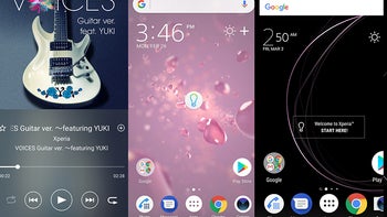
Sony's new flagship phone, the Xperia XZ2, has a new design that differs quite a lot from the slightly older XZ1. The new phone has a curved glass back which is quite different from everything Sony has done in the past. You will find no more rough and square edges on board, which would probably be viewed positively by all those Sony naysayers. However, the lack of a headphone jack is dumbfounding.
But has anything changed on the interface side? It's true that we are no longer in the ages when every new phone generation drastically changed the interface of the device. Nowadays, you will be hard-pressed to spot any major difference between the interfaces of two immediate device generations.
Has Sony introduced any interface differences on its new device? Let's see how the interface of the Xperia XZ2 stacks up against the XZ1 and see for ourselves.
As you can clearly see above, aside from a search box with rounded corners and the XperiaUI interface has hardly moved forward. Not that it is in a dire need of an overhaul, but you will be correct if you feel it is starting to look a bit dated and long in the tooth already, with certain interface elements not exactly feeling like it's 2018.
At this point, it probably won't be worth it for Sony to overhaul its existing interface any more, as the alternative could be a bit more appealing - a true stock Android with a slew of essential Sony services and features would probably be a better alternative to revamping XperiaUI from the grounds up.





Things that are NOT allowed: