Some stock Apple apps score redesigned icons in iOS 11 Beta 4
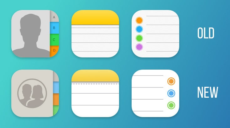
The Reminders and Notes app icons are now a line shorter than before, which we think works better for what is already a very small, self-contained design piece, as it manages to still convey the same information visually and looks less cramped to boot. However, we can't really wrap our heads around why the bullet points on the Reminders app have gone from the usual left-hand side to the right-hand side of the icon. Redmond Pie suggests that this may be an oversight on part of Apple's software developers, as the icon may have simply been mirrored like that during development. This is something that could easily change in time for the final release of iOS 11, unless it's an intentional design choice.
Aside from the three revamped icons, iOS 11 Beta 4 also brings a plethora of minor tweaks to the icons of the following stock iOS apps: Compass, Control Center, iBooks, iTunes Store, Home, Mail, Messages, News, Phone, Photos, Settings, Weather. The changes in these icons are, however, very minor for the most part and not noticeable unless you compare them to the old ones side-by-side.
via RedmondPie
Follow us on Google News











Things that are NOT allowed:
To help keep our community safe and free from spam, we apply temporary limits to newly created accounts: