Skin deep: 5 things to note in the new Galaxy S8 interface from these high-res photos
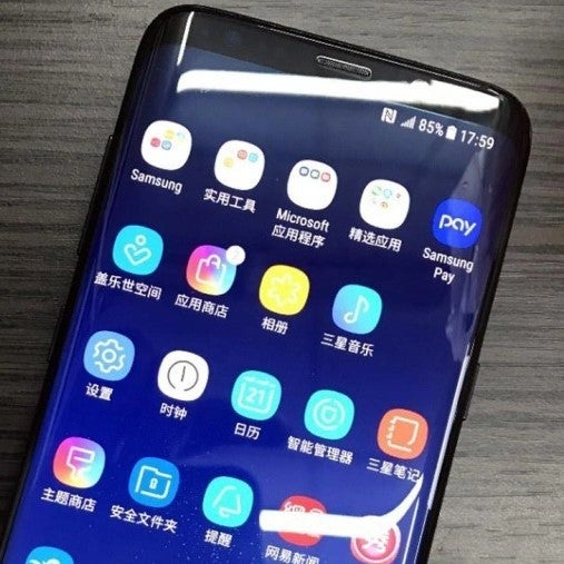
Thankfully, the latest leaked pictures of what is supposedly a Galaxy S8 handset somewhere in China, showcase the interface in a higher resolution than the blurry shots we've seen so far, so here are a few conclusions we can draw about what's coming down the pipe in Samsung's next UX iteration.
We don't know if older Samsung phones will get the goods - after all, the S8 comes with a pretty funky 18.5:9 screen, and unorthodox 2960 x 1440 resolution that these icons may have been meant for, though scaling them would be a walk in the park for a company with the resources of Samsung, or for icon pack makers, so stay tuned.
source: /Leaks
Follow us on Google News




Things that are NOT allowed:
To help keep our community safe and free from spam, we apply temporary limits to newly created accounts: