Should Android phones be embracing the notch? (results)
Last week, we asked you whether Android phones follow in Apple's footsteps, and embrace the notch to reach higher screen-to-body ratios, yet letterbox videos or provide unsightly scenes in full-screen apps, or should they be following in the footsteps of Samsung and Xiaomi with its Mi Mix series in trimming the bezels all around, yet abstaining from cutouts and other general patchwork. Well, nearly 73% of our 2950 respondents are adamant against any bezel cutouts, big or small. About 20% are in the "I don't care" camp, while just 7% think it is a svelte idea, as long as it brings higher screen-to-body ratio. Mark that, gentle or brutal copycats!
Copycat legalities aside, the "notch" allows a manufacturer to boast extremely high screen-to-body ratios. The new Asus Zenfone 5 boasts 83.69% of it in our benchmark calculations, which is a bit higher than the iPhone X's 82.35%, as the Zenfone has narrower notch, and still, the Galaxy S9, which sports an oldfashioned uninterrupted, but very thin top bezel, beats them both with 84.36%, which only gives way to the Essential Phone's 84.85%, but this one has the most minimalistic "notch" of them all.
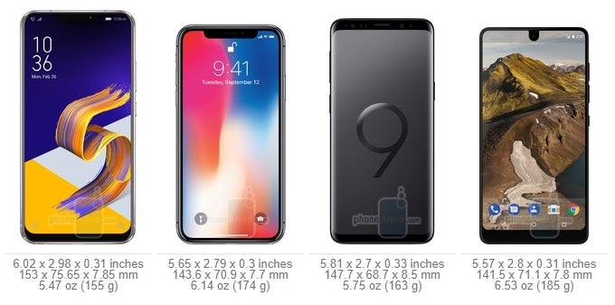
| ZenFone 5 | iPhone X | Galaxy S9 | Essential |
|---|---|---|---|
| 83.69% screen-to-body ratio | 82.35% screen-to-body ratio | 84.36% screen-to-body ratio | 84.85% screen-to-body ratio |







Things that are NOT allowed: