Should Android phones be embracing the notch?
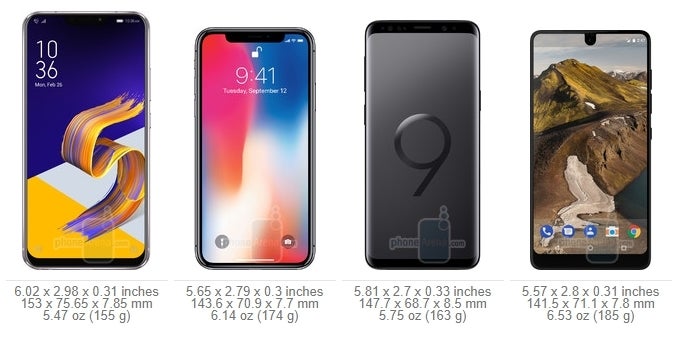
| ZenFone 5 | iPhone X | Galaxy S9 | Essential |
|---|---|---|---|
| 83.69% screen-to-body ratio | 82.35% screen-to-body ratio | 84.36% screen-to-body ratio | 84.85% screen-to-body ratio |
Copycat legalities aside, the "notch" allows a manufacturer to boast extremely high screen-to-body ratios. The new Asus Zenfone 5 boasts 83.69% of it in our benchmark calculations, which is a bit higher than the iPhone X's 82.35%, as the Zenfone has narrower notch, and still, the Galaxy S9, which sports an oldfashioned uninterrupted, but very thin top bezel, beats them both with 84.36%, which only gives way to the Essential Phone's 84.85%, but this one has the most minimalistic "notch" of them all.
Thus, without further ado, our question is should Android phones follow in Apple's footsteps, and embrace the notch to reach higher screen-to-body ratios, yet letterbox videos or provide unsightly scene in full-screen apps, or should they be following in the footsteps of Samsung, or maybe Xiaomi with its Mi Mix series, trying to trim the bezels all around, yet abstaining from cutouts and other general patchwork. Pick your poison, and tell us what you think in the comments.
Should Android phones be embracing the notch?
NOtch on my watch!
72.64%
Notch you worry, it gives the best screen-to-body ratios
7.19%
Whatever, everyone copies everyone
20.17%
Follow us on Google News





Things that are NOT allowed:
To help keep our community safe and free from spam, we apply temporary limits to newly created accounts: