Samsung's new TouchWiz vs HTC Sense UI 7 comparison results: here is the winner!
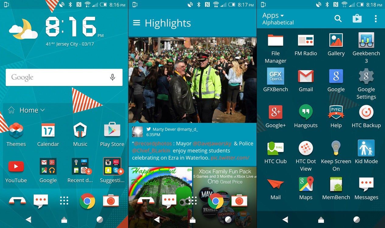
Apart from showing us their newest flagship phones, Samsung and HTC also introduced the newest renditions of their user interfaces - respectively, the newest TouchWiz and Sense 7 UI. It's so hard to give an definite answer to this question - after all, it's a subjective type of preference, so each and every user has to decide themselves.
Both Sense UI and TouchWiz have their own strengths and weaknesses - Sense UI is a boasts slightly less features and is a bit lighter, while TouchWiz is still among the most functional and feature-rich once out there.
Some time ago, we decided to ask you which one you like better, the new TouchWiz or Sense UI 7. Well, we have the results here and according to them, HTC's UI has attracted more fans to its cause while TouchWiz remains second. Sense 7 wins by a pretty small margin, mind you - 1,528 voters (51.26%) have claimed that it's a better solution than Samsung's offering, which got 1,453 votes (48.74%).
The results show us that while Samsung is definitely on the right path with slimming TouchWiz down and making it more streamlined than before, it still misses the ingredient that makes HTC's UI more appealing to Android aficionados. Regardless, Samsung really showed that it can improve its products in the right direction, TouchWiz included. It will be pretty curious to procure a similar comparison a year from now and see what the status quo will be at the time.







Things that are NOT allowed: