Samsung probably surprised a lot of people at CES 2014 earlier this month, when it announced its latest high-end tablets, at the same time revealing a brand
new UX called Magazine. Initially, we thought that the new interface was designed exclusively for tablets. However, unofficial
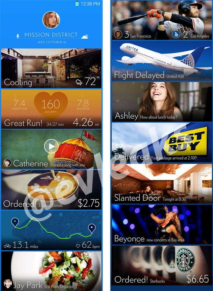
images of a similar UX, allegedly for Samsung’s smartphones, also appeared during CES. And now we have even more screenshots that seem to show the fresh UX.
Just like the first time, the new images come from @evleaks. As many may have observed while looking at Samsung’s Magazine UX, there are similarities between it, Flipboard and Windows Phone’s Metro / Modern UI. Apparently, Samsung had a revelation and now believes that a tile-based interface could be better than its
good old TouchWiz.
Of course, for now we can’t know if Samsung intends to use this new UX (click on the image to zoom in) on any of its upcoming Android smartphones. This can be just an experiment that the company might not find suitable for non-tablets. Still, Samsung hopefully knows that it needs to change TouchWiz, and it looks like at least it’s trying.
Would current Samsung users like to see something similar to this on next generation Galaxy handsets? Let us know in the comments.
source
@evleaks


Things that are NOT allowed: