Samsung is on the right track with its new One UI interface for easy one-handed operation (poll results)
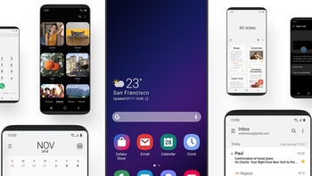
Dubbed One UI, Samsung's newest interface will start replacing the current Experience UI as soon as the holidays are done, at least for the Galaxy Note 9, S9 and S9+ owners. The company has revolutionized navigation and display content by putting the actionable content situated in the bottom half of the usable screen canvas, with big, fat, juicy icons and switches to tap on, while the glanceable or readable one is at the top where your thumb can't reach anyway.
We asked you yesterday if this approach is indeed the best one for today's big screens and the eventual foldable phones, as Samsung claims, and the attitude seems to be overwhelmingly positive. Just 8% of you think that the current content positioning on large handsets or one-handed modes that simply shrink the content to manageable heights, making icons microscopic in the process, are good enough solutions.
Samsung's new One UI is considered the best solution for using today's giant handsets with one hand by 47% of our respondents just based on its presentation while 45% won't to first put it through its paces before they make up their mind. Overall, it seems that Samsung is finally on the right track in its mobile interface effort and that was the only big missing piece of its Galaxy puzzle.






Things that are NOT allowed: